
case study
Transforming how customers seek support
For several years, I redesigned and expanded “Contact Apple Support,” also known as “Get Support”, the global triage and routing gateway for customers seeking expert help with their products.
Role
Sr. Interaction Designer
Employer
Apple
Timeline
4 years
Core Team
Me, PM, 2 EMs,
2 Analysts, PjM
Context
I was the sole designer on a core team of seven
I worked with a product manager, two program analysts representing the Contact Center and Service (repair) organizations, two engineering managers, and a project manager.
My Duties
UX / UI Design
Design for a11y & i18n
Visual Design
Prototyping
User Testing
Design specifications
Feature & Bug Ticket Writing
Stakeholder Presentations
QA & Sign Off
User Problem
Customers weren’t getting the best help available
Customers instinctively called Apple or walked into the Genius Bar — but each channel only handles certain issue types (hardware, software, services). This led to long waits, unnecessary travel, unsatisfactory experiences, and high support costs.
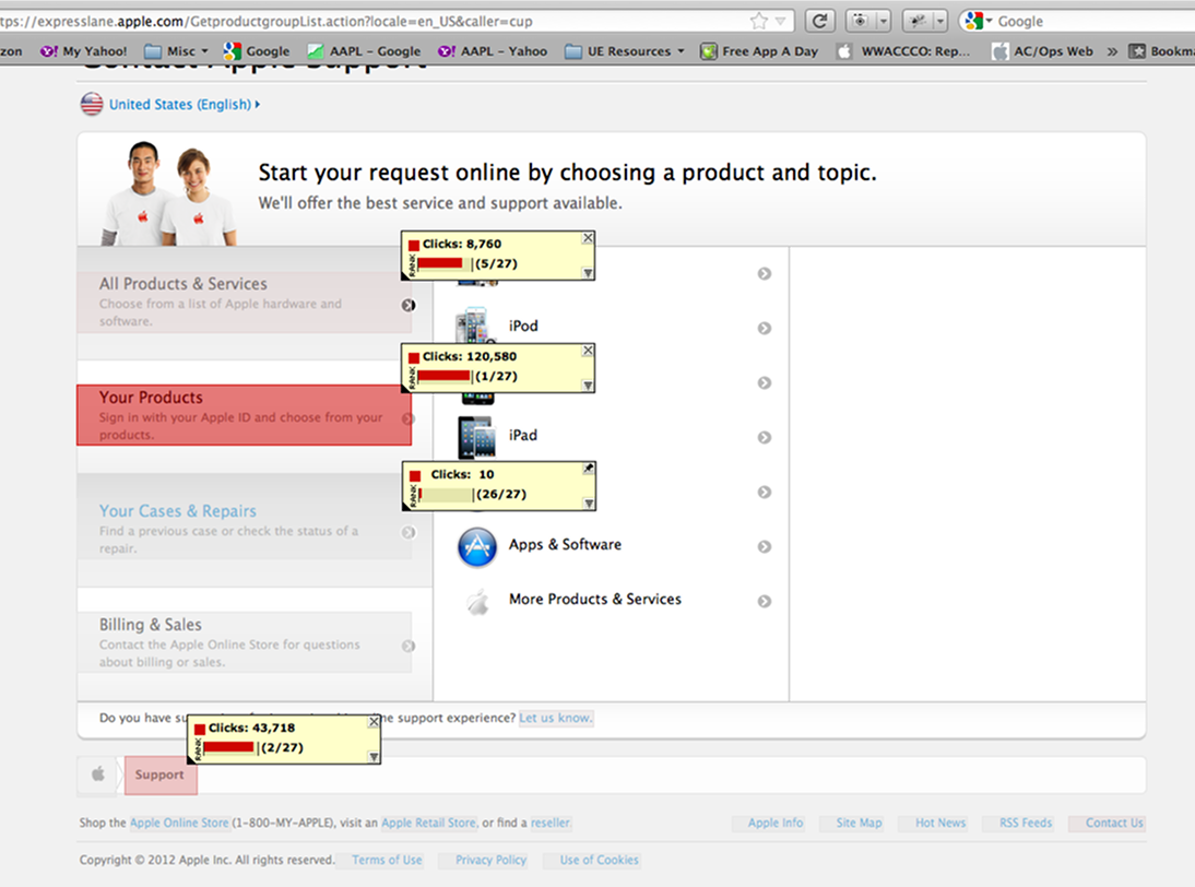
Business Problem
We could help, but our traffic and conversions were low
Contact Apple Support (CAS) could save customers time while routing them to the best help channel for their issue.
But CAS was neither intuitive nor visually appealing. This prevented MarCom and Retail from partnering with us, which was necessary to increase traffic.
Factors
Too many clicks, continue buttons
Information overload
Dated “service department” style
Partners weren’t interested
Vision & Goals
Be the preferred starting point for every expert support journey
Our mission was to maximize CAS’s value for both customers and Apple by:
- Increasing conversions and customer satisfaction rates
- Building credibility with MarCom and Retail
- Consolidating Genius Bar booking under CAS
- Modularizing the interface for faster updates
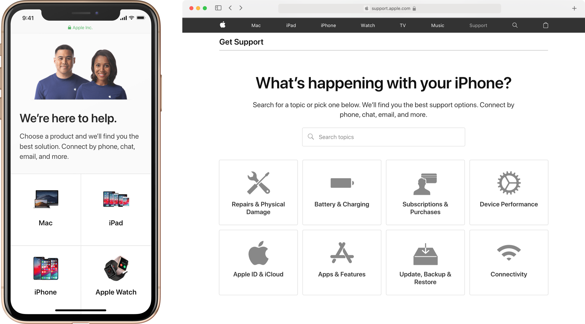
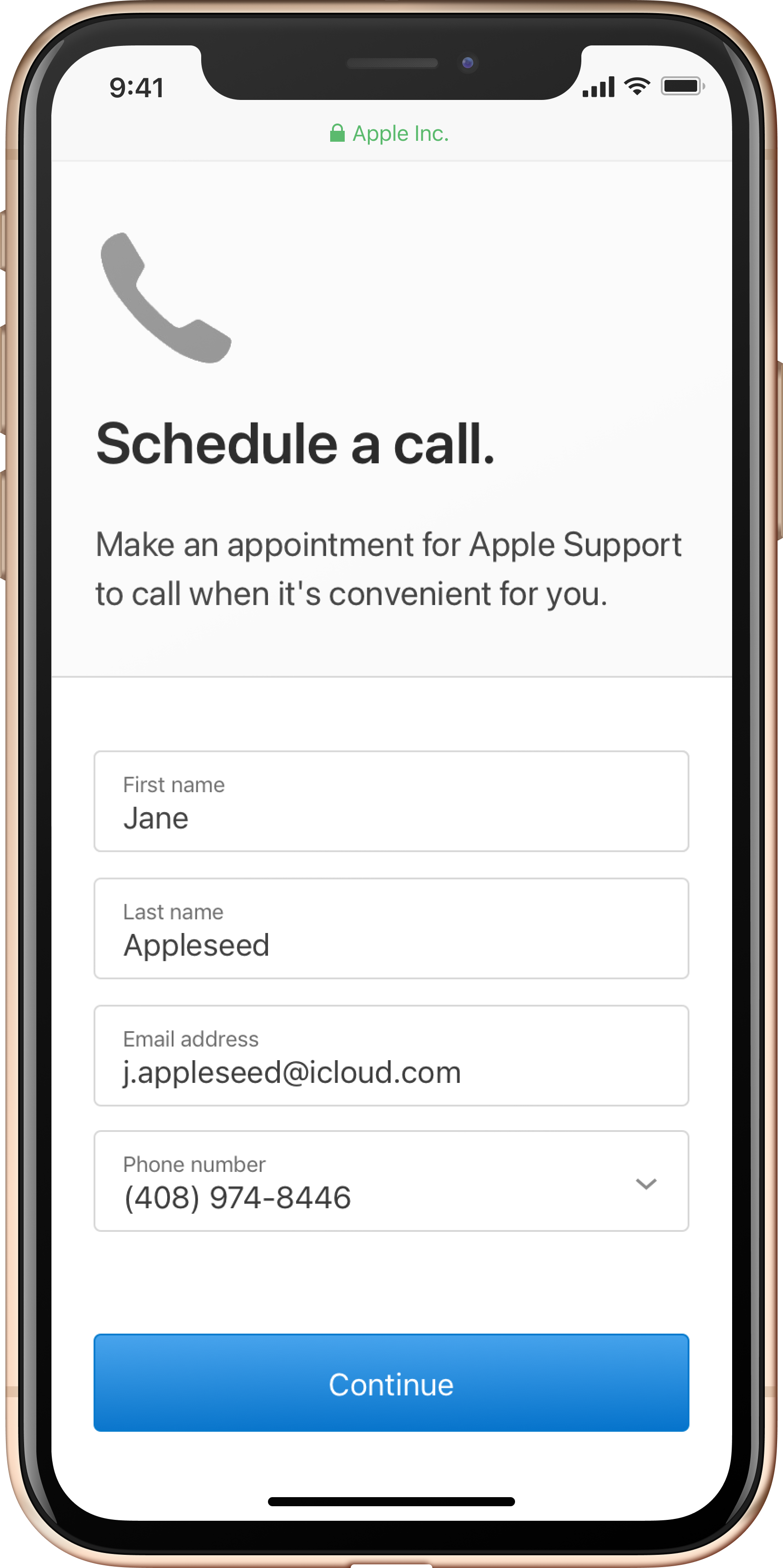
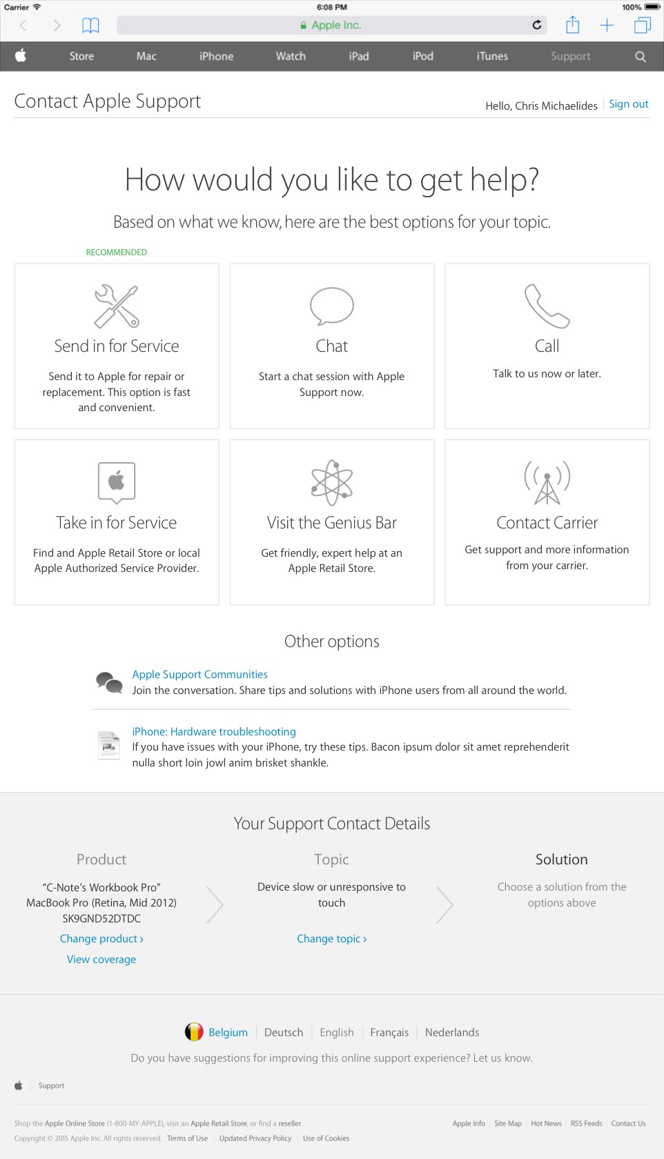
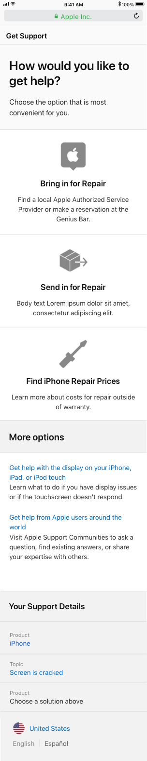
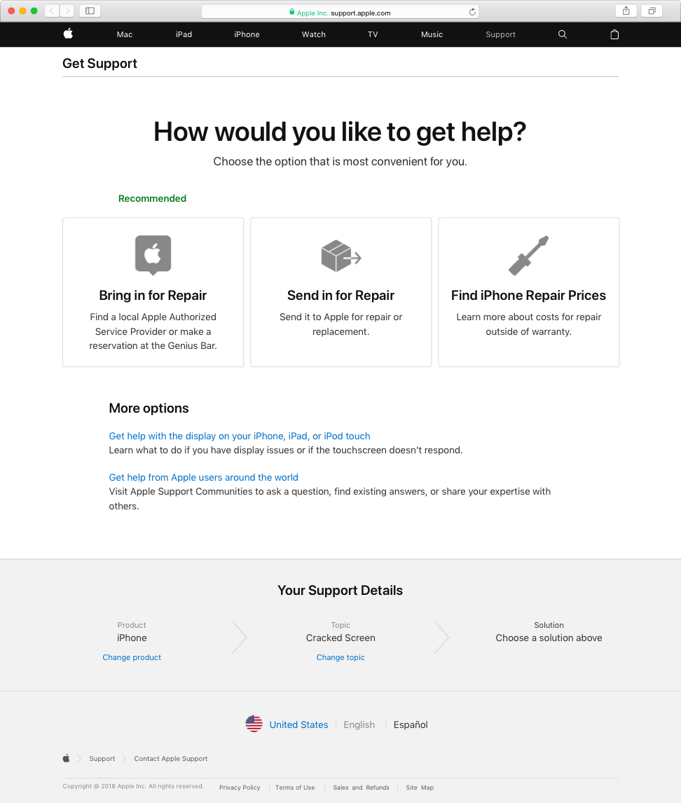
Solution
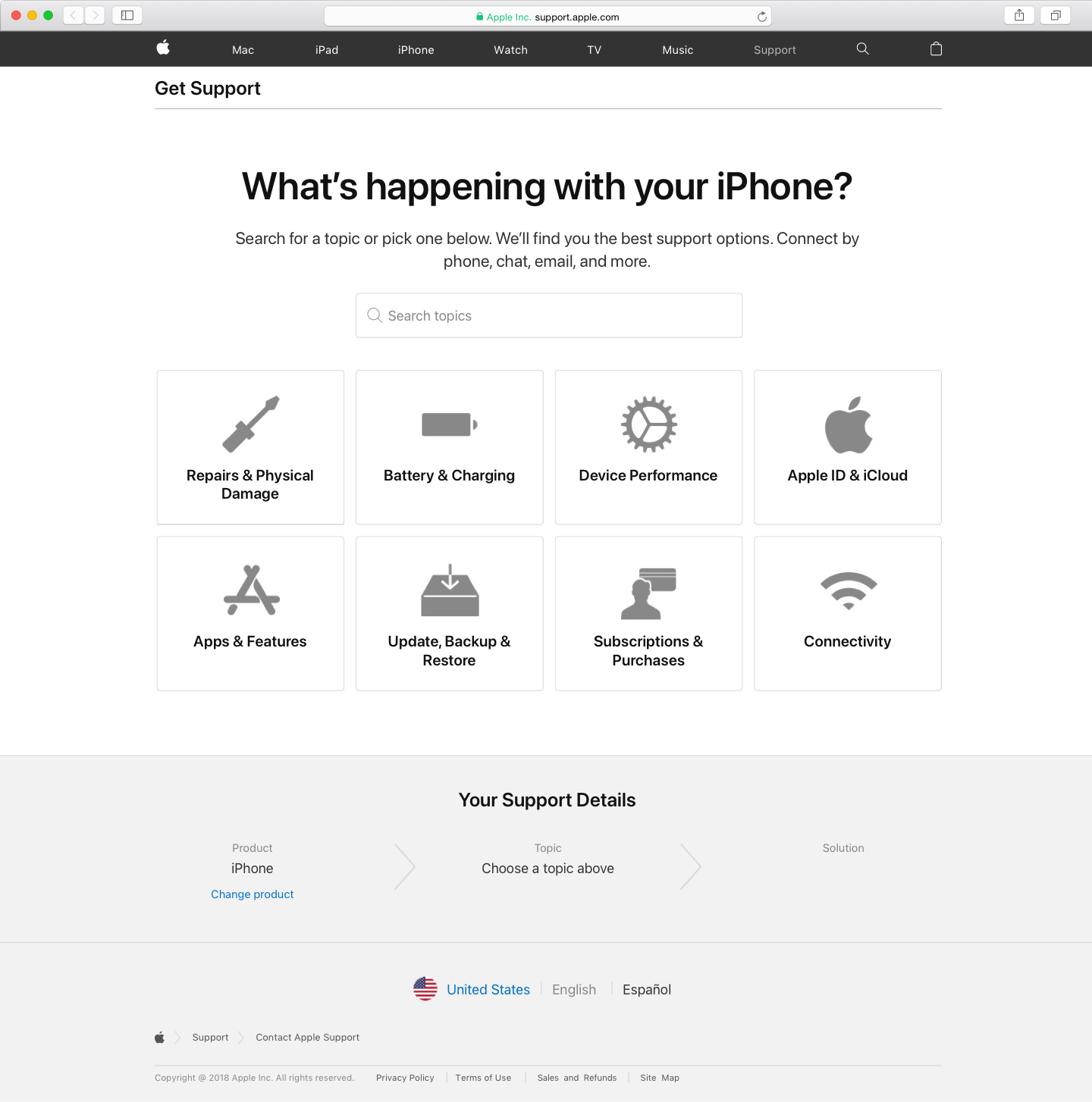
The new Contact Apple Support (aka Get Support)
The redesigned CAS delivered a focused, on-brand, and responsive experience inspired by the clear and competent communication of Apple Geniuses and Advisors.
Results
Major increases in scale and effectiveness over four years
2x
Conversion rate increase
40%
of expert support requests begin in CAS, a 27% increase
200M
Customer minutes saved
100M+
Visits annually
Each year there was a main focus, and small enhancements
Year 1
Full redesign +
↑ 48%
Increase in conversion rate
7%
Shift in customers starting with CAS vs calling directly
Year 2
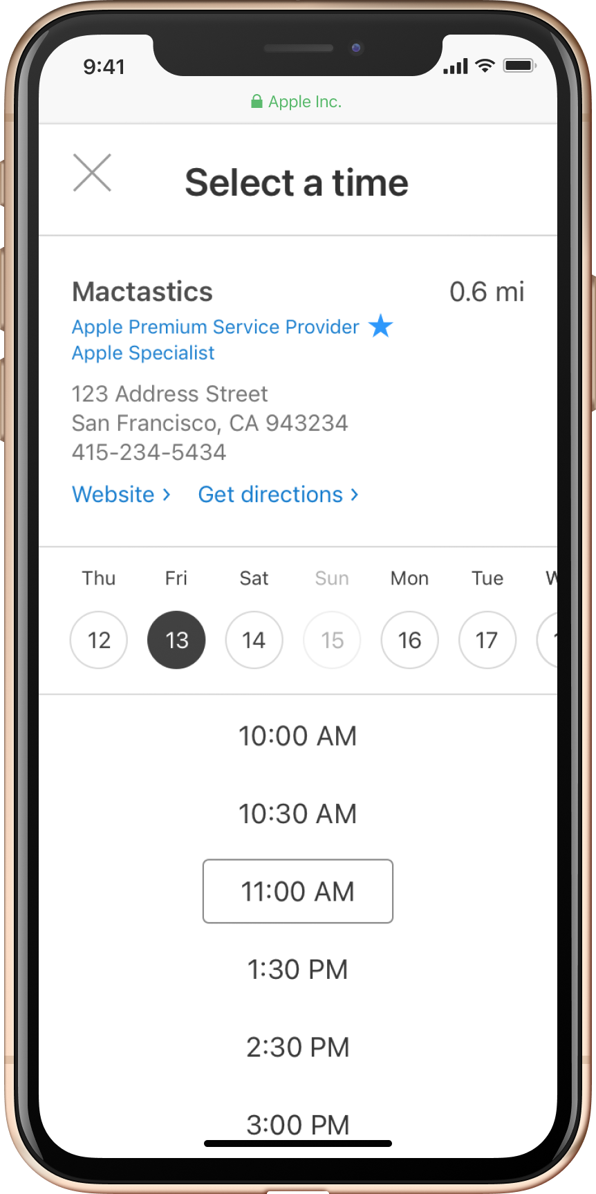
Genius Bar appointment booking
18%
Shift of intended Genius Bar appts to Call or Chat
↑ 11%
Increase in Retail NPS
Year 3
iPhone-first responsive redesign
↑ 58%
Increase in conversion rate on iPhone
↑ 37%
Increase in conversion rate overall
Year 4
Third party repair appointments
↑ 20%
Avg increase in appt booking for participating repair shops
Year 5
Design system reskin
Applied the site-wide design system for cohesion and efficiency
Process overview
Full redesign + examples from other years
I’ll describe the year 1 process because it was the most end-to-end, with examples from later years to complete the story.
Strategy
Understand Current State
I reviewed top flows and analytics data. People weren’t using CAS for billing and sales, so we cut it. Many users bounced via breadcrumb, so we clarified what CAS is at entry points.
User Research
I sat at Genius bars observing interactions and interviewing customers. I listened to support calls and interviewed phone advisors.
Top Insights
Customers Value
Trust, price, speed, convenience
Customers Struggle To
Provide serial number, Apple ID, date of purchase
Good Service Is
Courteous, knowledgable, and gives options
Result
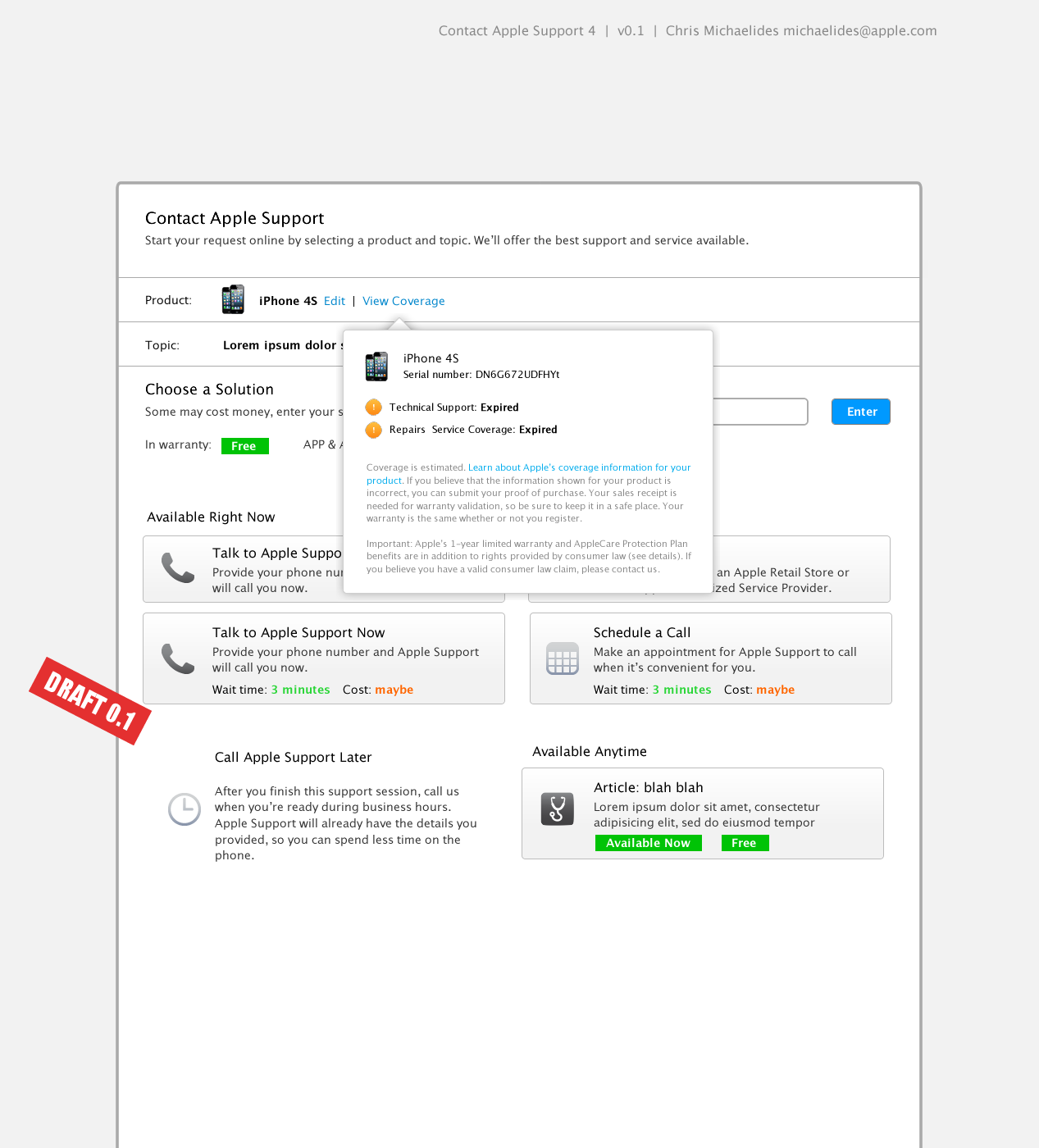
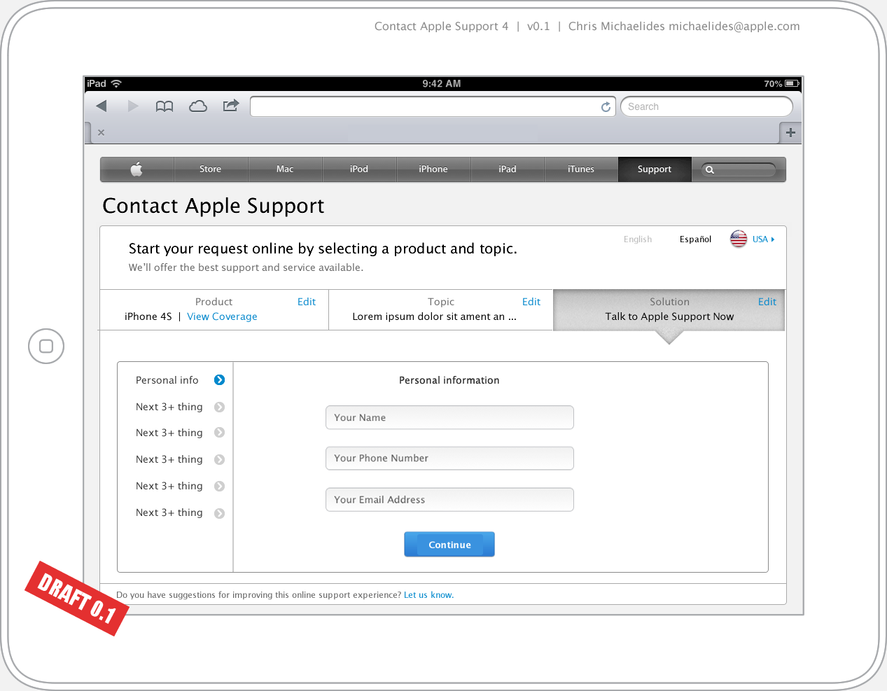
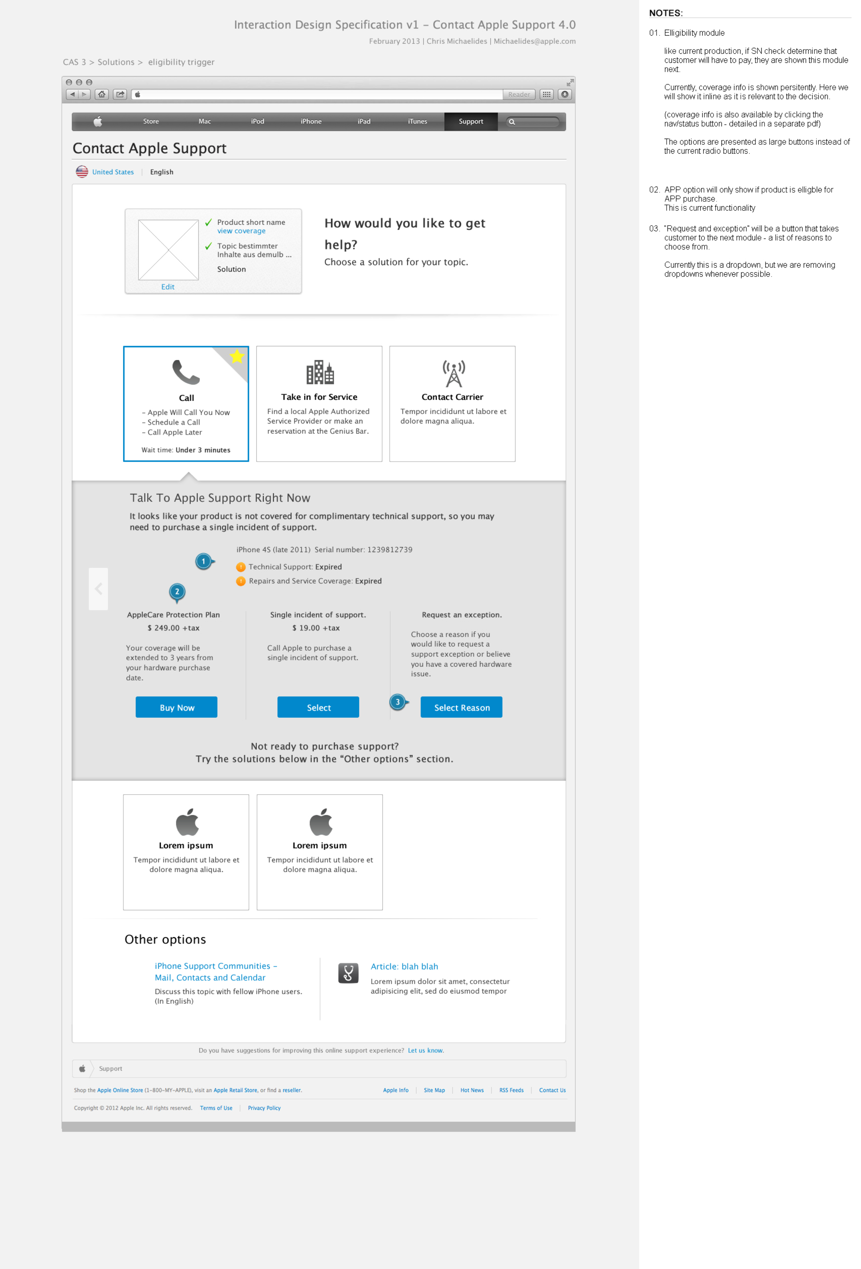
These insights shaped our guiding principles and led me to defer serial number collection and sign in until after users have chosen their solution.
Scope
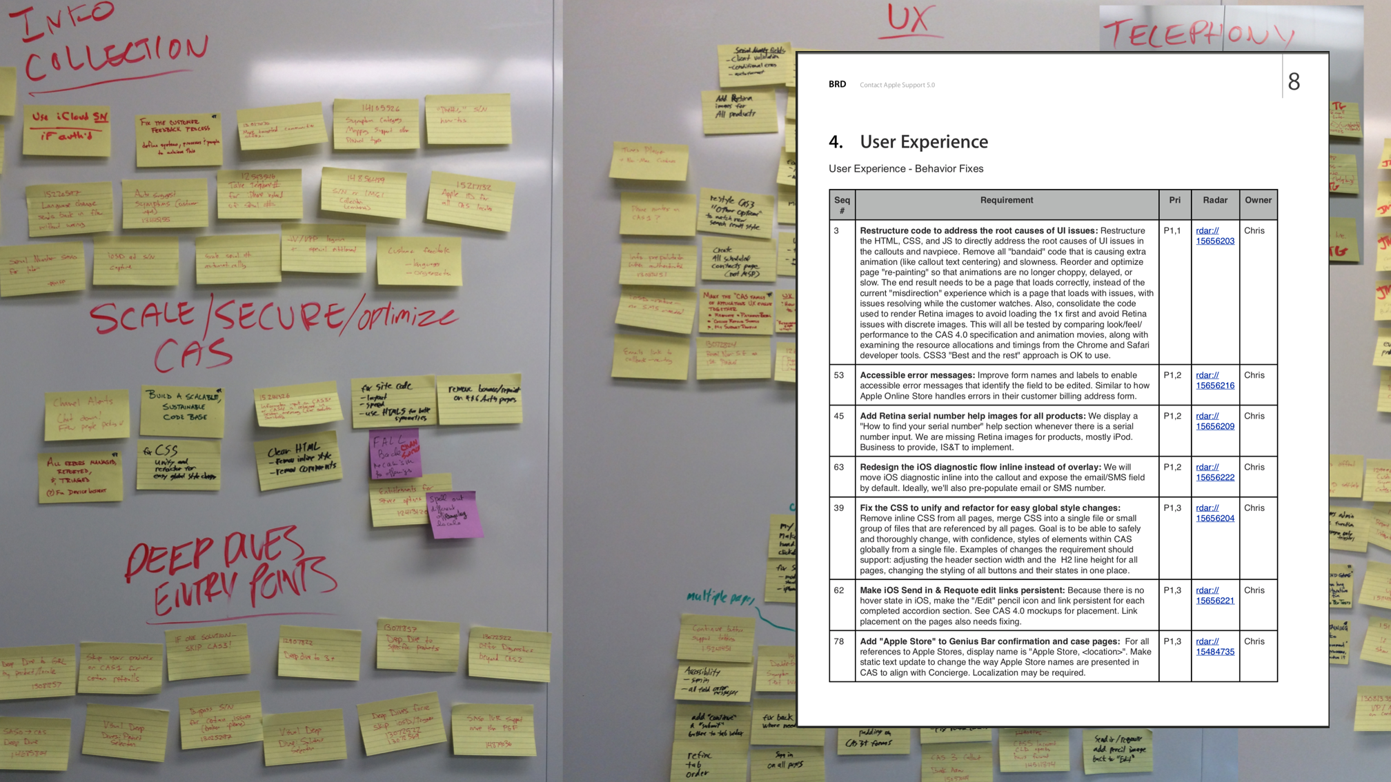
Feature requirements and prioritization
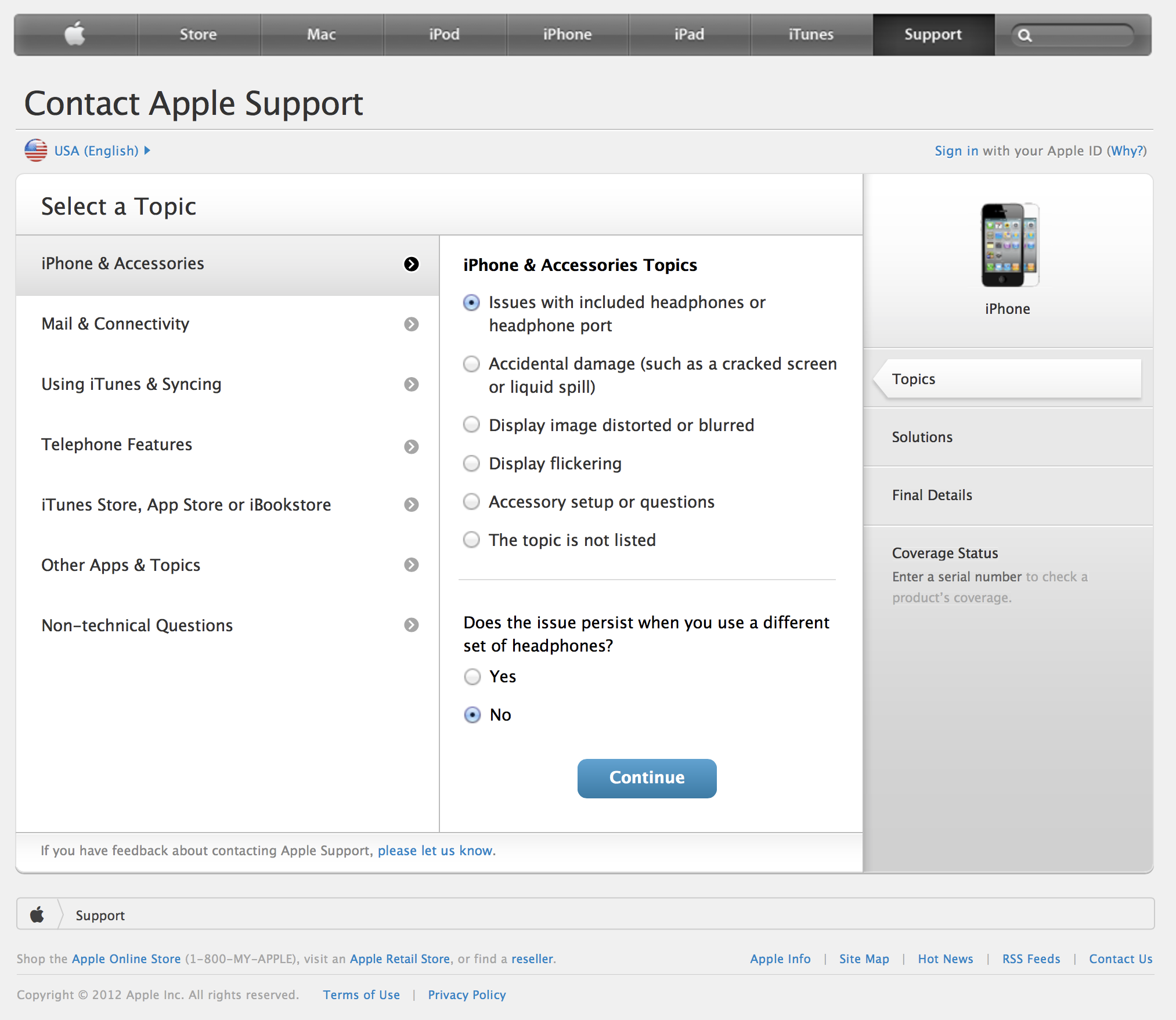
In year 1, scope and timeline were already set before I joined, causing issues with UI quality, accessibility, and roadmap alignment. Going forward, I worked with the core team to determine scope, resources, requirements, and priorities collaboratively.
Guiding Principles
Early on, we codified some principles to shape the scope and tone of CAS. The screen flows should feel like talking to an Apple Genius.
Route to resolution, not deflection
Kind, knowledgeable, effective
Warm transfers, orient with no data loss
I created UX principles to align with stakeholders and guide my work
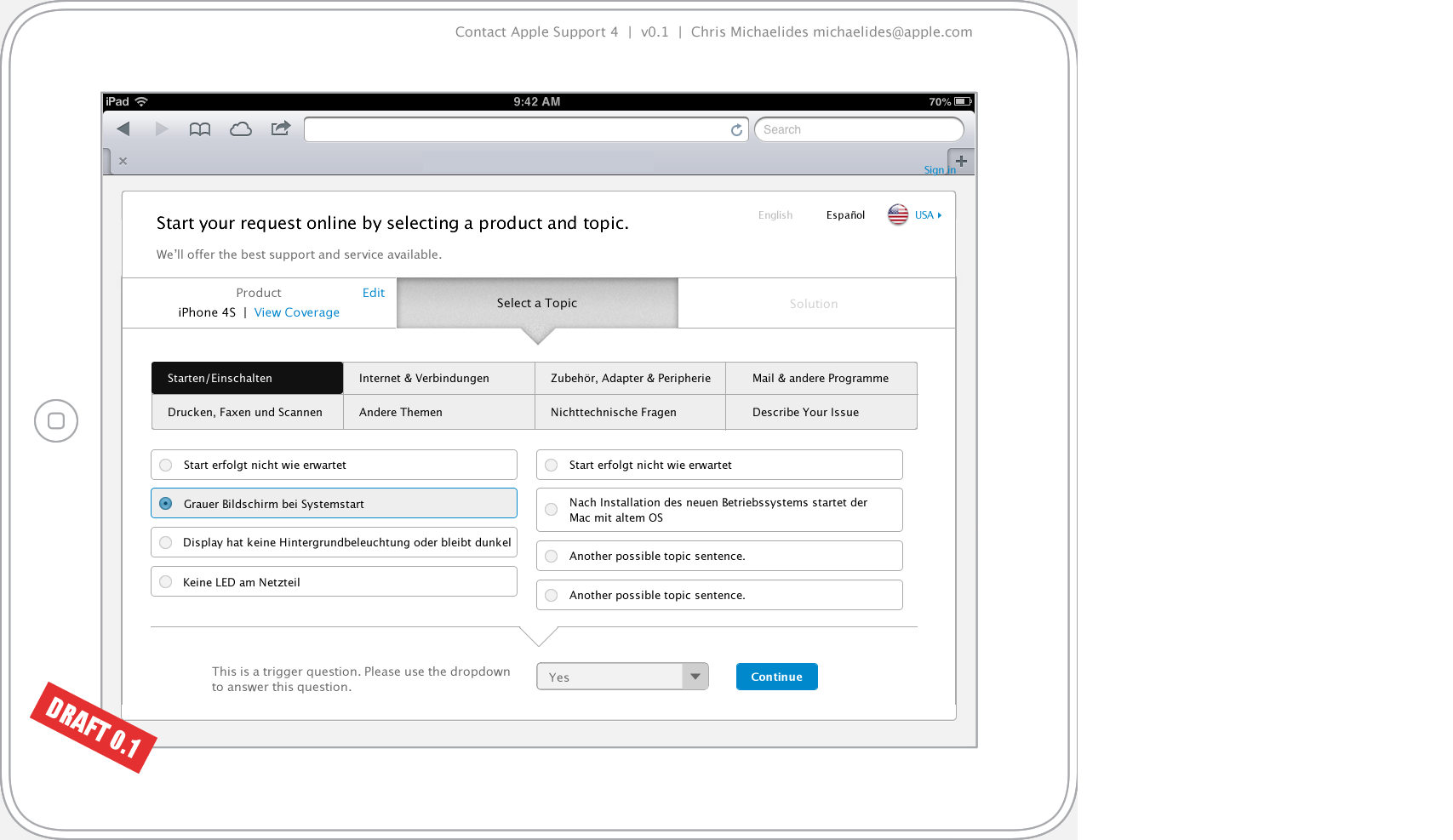
Focus, one task per view
Conversation, not form submission
iPad first = large buttons
Fast = direct selection
Status as navigation, not a case report
Reuse templates & patterns
Structure
I learned the system and business rules
Business logic varied by country, product, issue, warranty status, trigger question responses, and time of day, resulting in thousands of potential variations. To make sense of it, I partnered with the analysts to inventory system inputs, entry points, routing, and warranty logic.
Maps for shared understanding
I distilled this into a high-level system and flow diagram. This artifact became our shared reference for design, engineering, and QA.
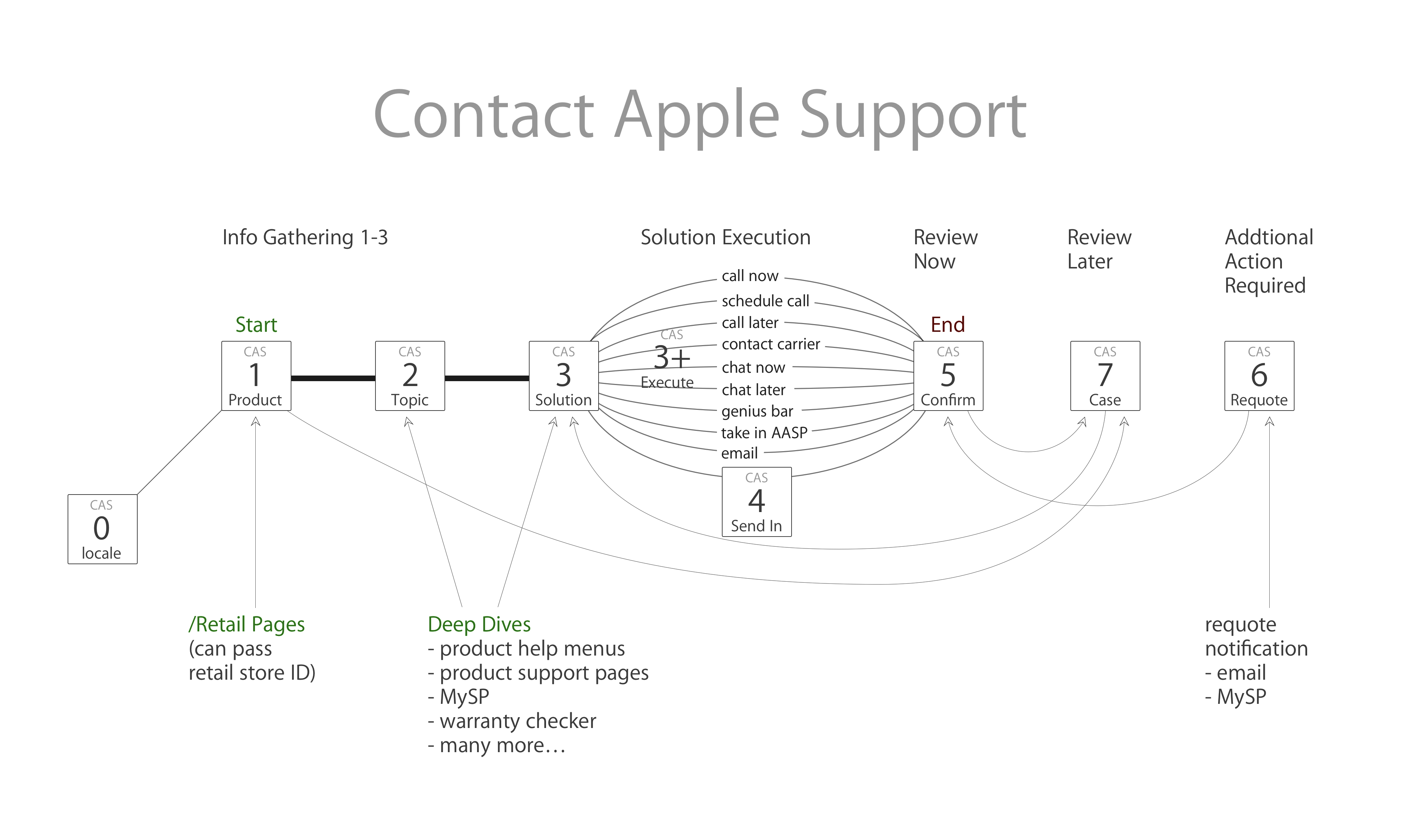
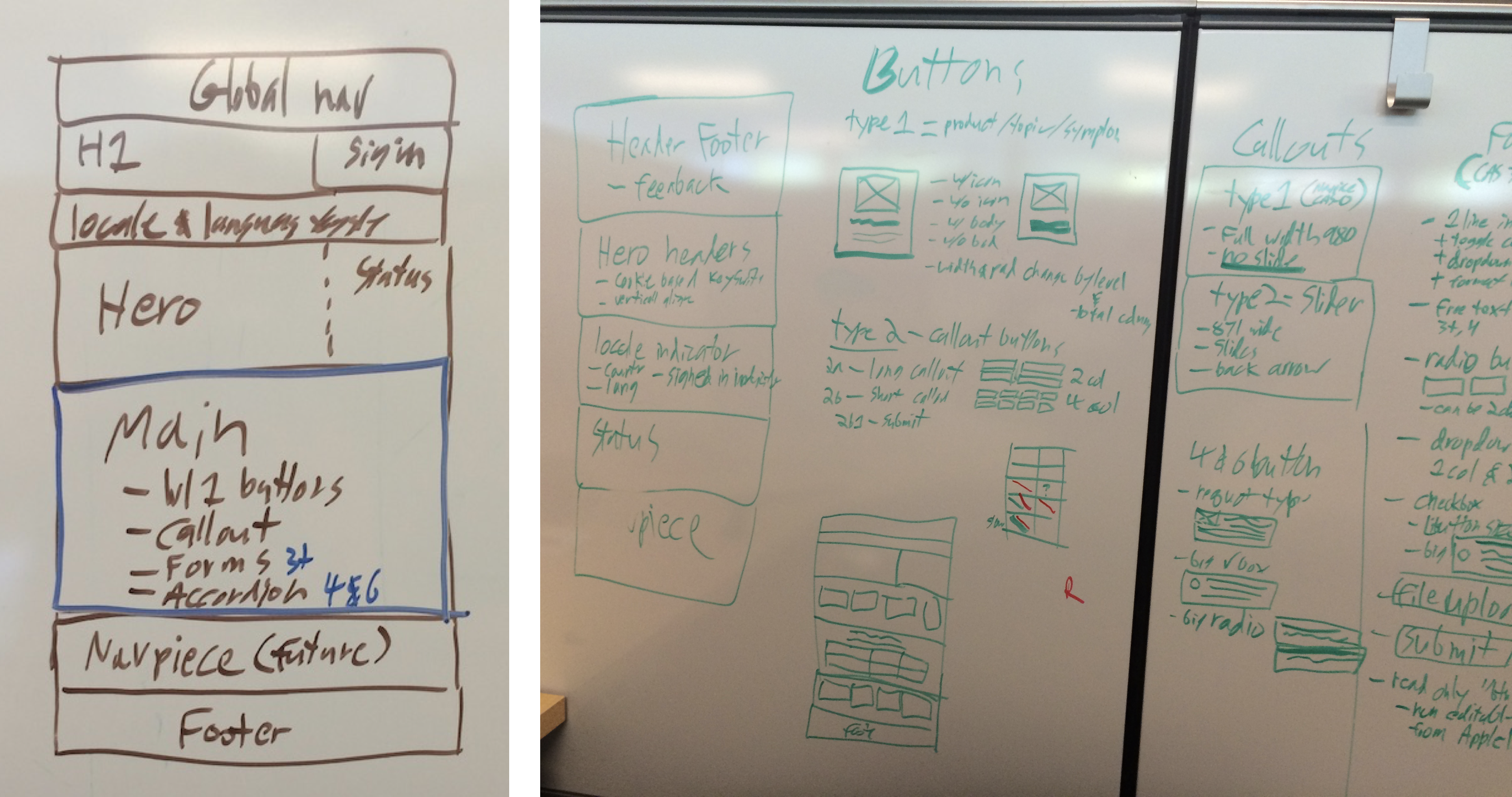
From that understanding, I designed a modular component and template framework, enabling us to assemble new flows from reusable building blocks.
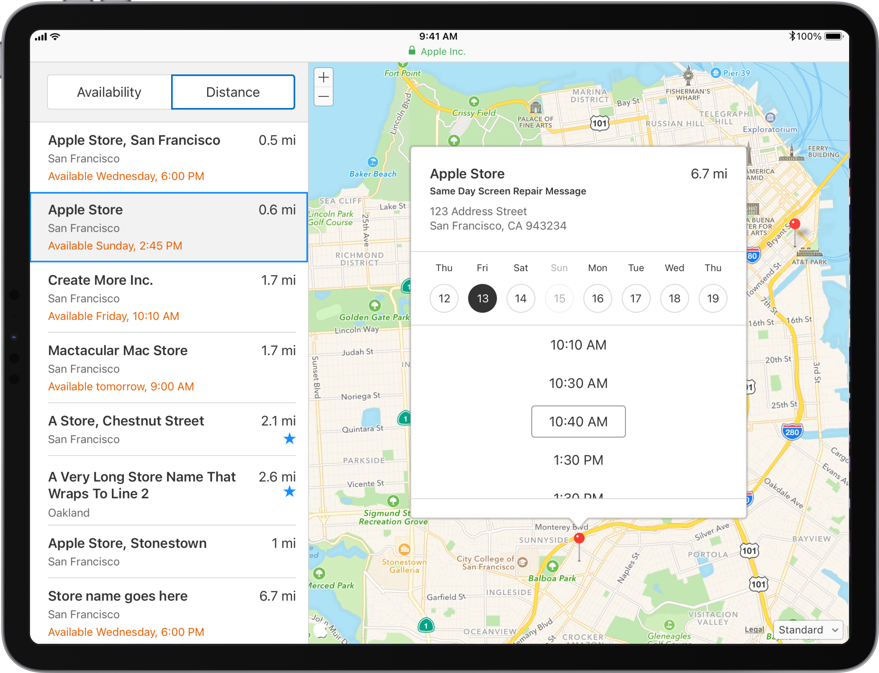
Year 2
Detailed flow example, electronic proof of purchase
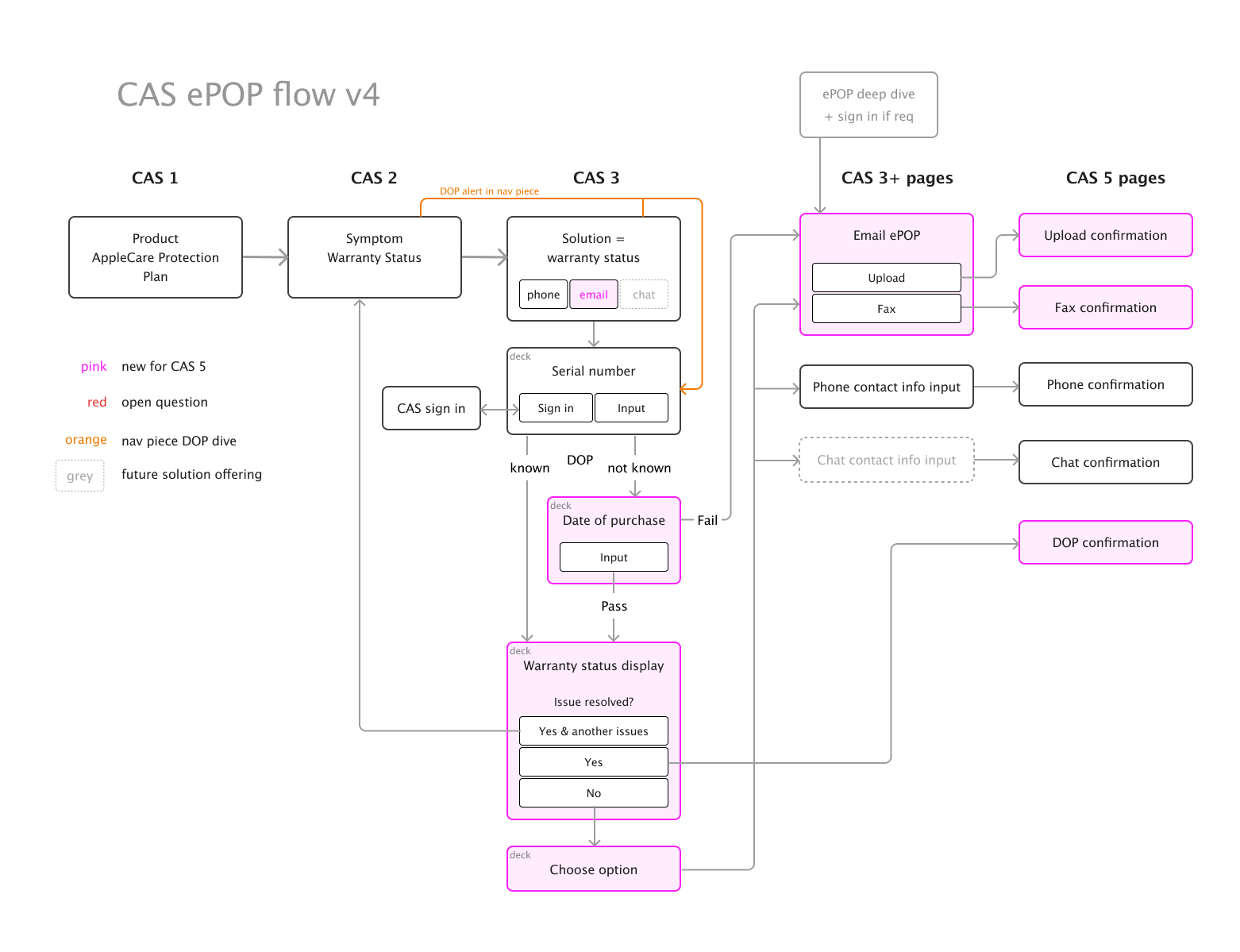
This is an example of the many enhancements I designed each year alongside the major initiatives. Contact centers needed a way to ask customers to upload their proof of purchase date (DOP) to resolve warranty disputes.
Skeleton
Ideation
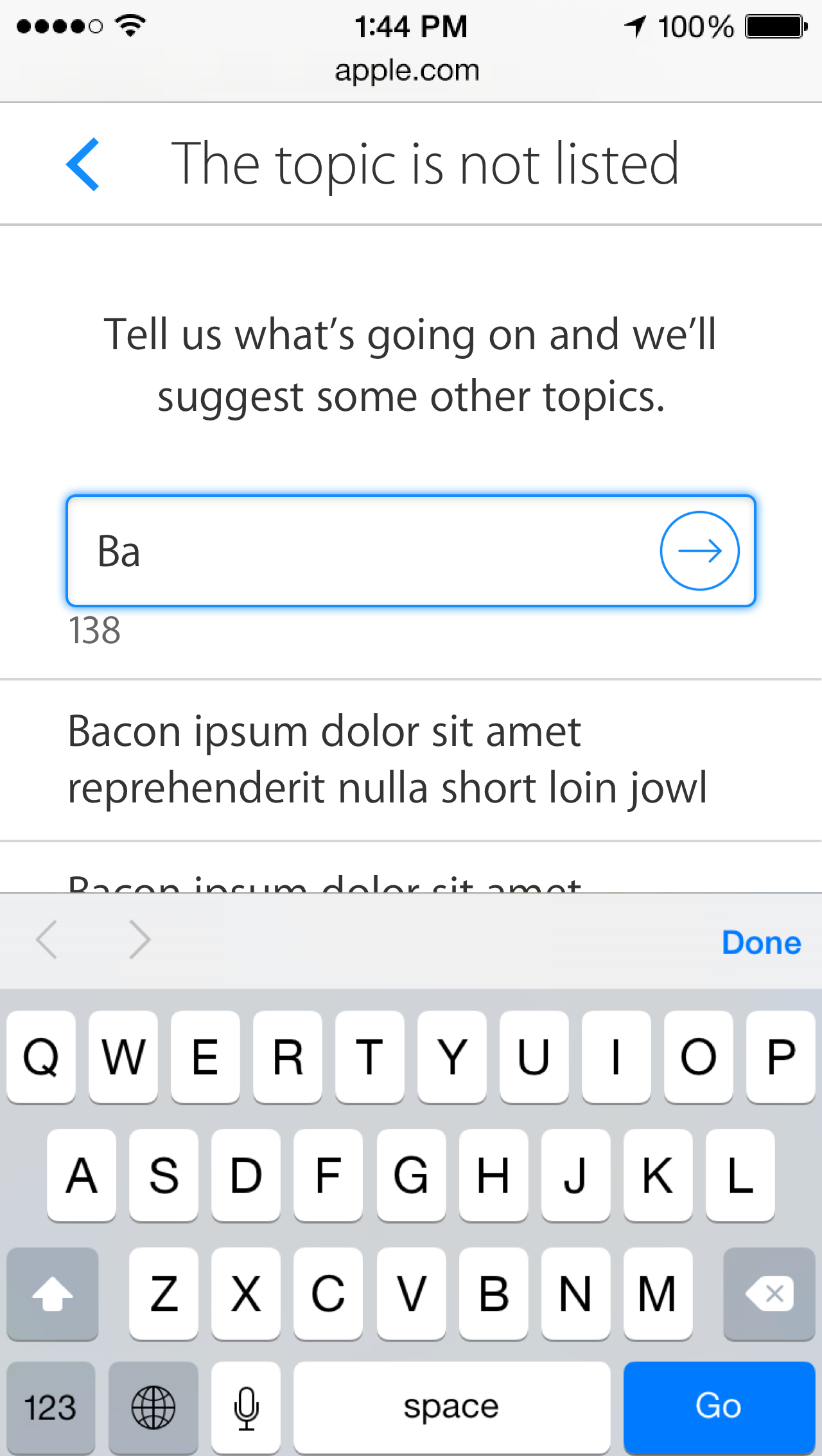
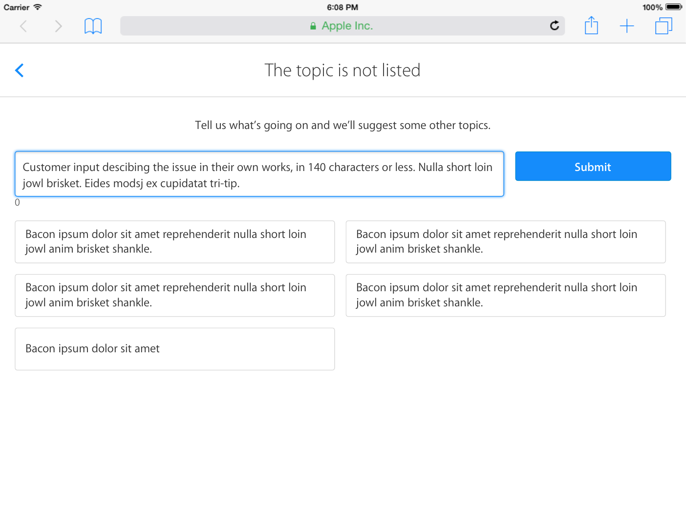
I explored layouts to simplify and clarify. Given that price is a top concern, I played with using price previews as an incentive to provide serial number. Sharing this revealed pricing constraints and helped me learn.
The design had to accommodate many trigger questions, and I was running into the same problem of overcrowding. I needed a different direction to hide complexity.
Pivotal moment - the “deck” pattern
To fit secondary menus and trigger questions in an iPad viewport, I designed a reusable “deck” pattern inspired by iTunes 11. It maintained focus through progressive disclosure and followed the accessibility team’s guidance to put secondary menus inline.
The deck design supported any number of secondary selections or trigger questions by sliding in the next item.
I prototyped these animations in Keynote, and provided detailed specs to engineering.
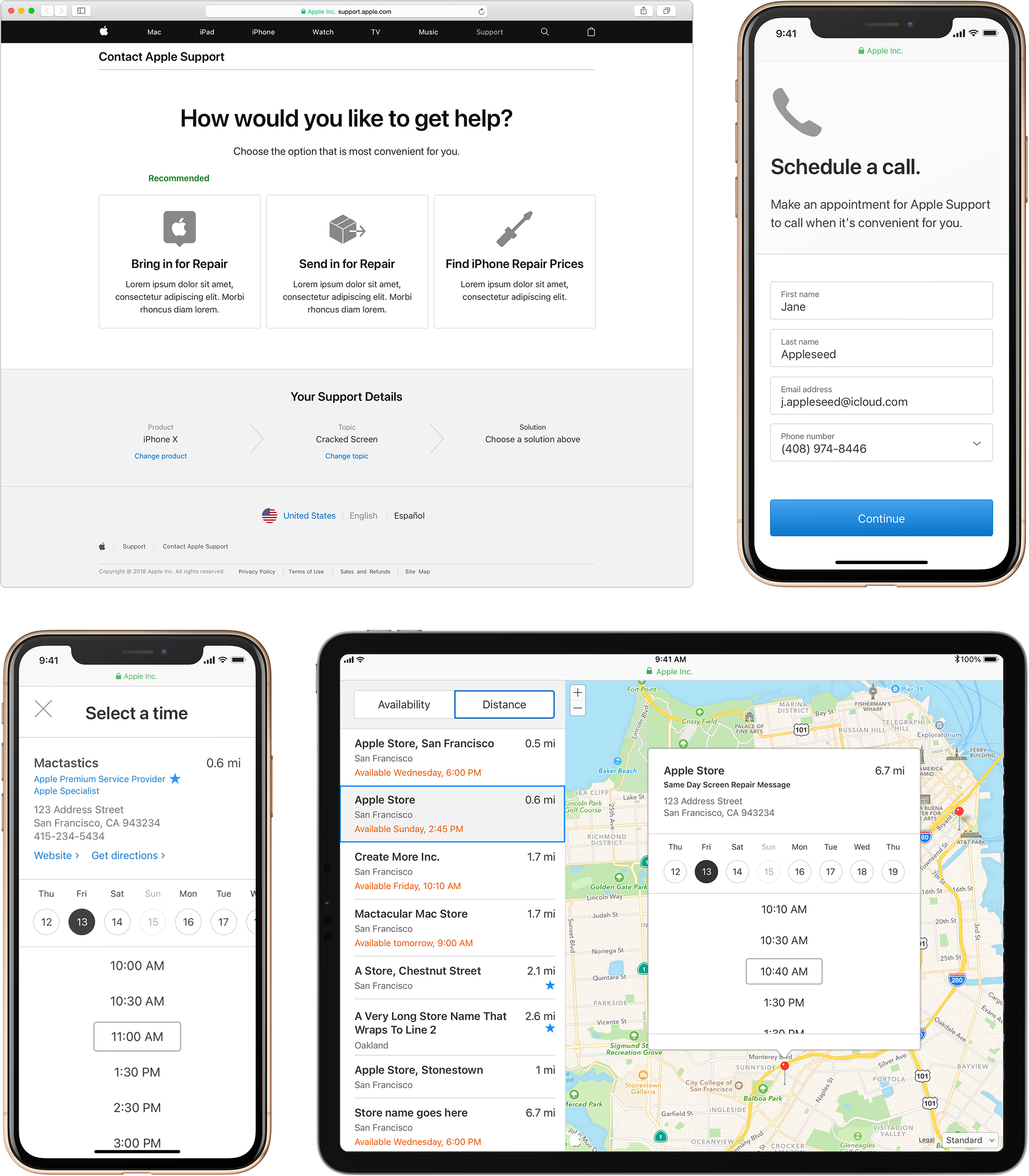
Year 3
When I redesigned the app to align with the new MarCom design system, I used a shared pattern to make the deck a modal.
Year 3
Prototyping for responsive design
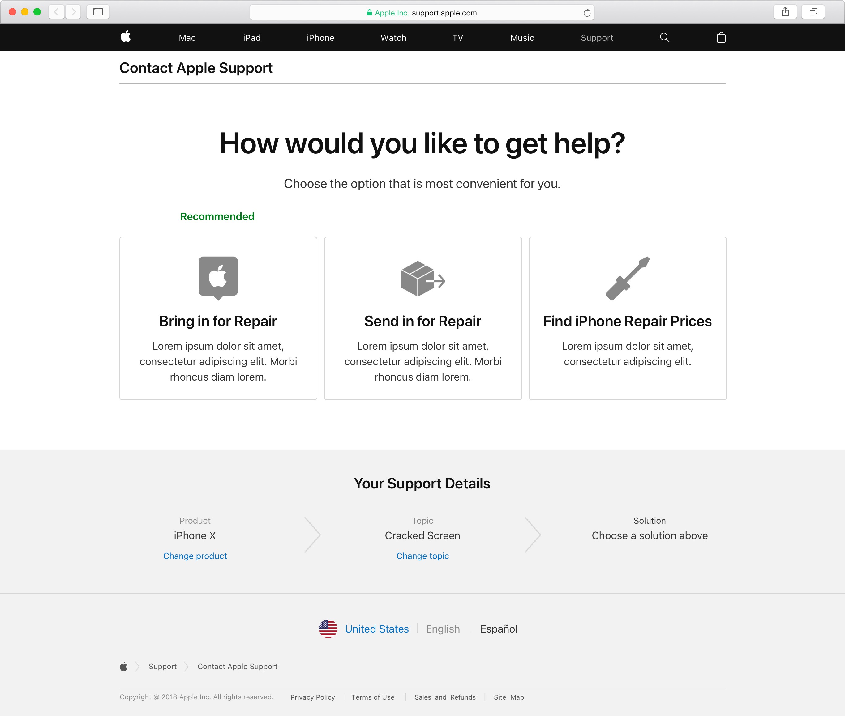
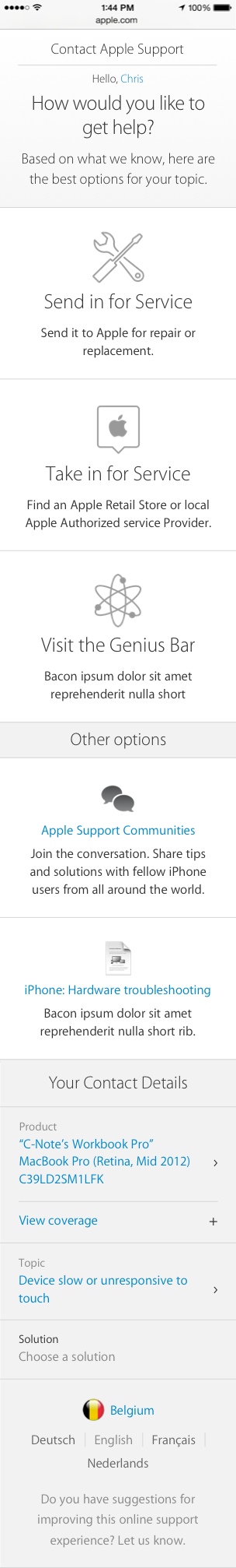
After a full redesign and a year of enhancements and Genius Bar flow refinements, I redesigned CAS to be fully responsive, using a mobile-first approach.
The lead UI engineer doubted this could be done with a single set of HTML, so I coded a prototype using flexbox and media queries to show them how it could be done.
Year 4
Validation
Service leadership wanted appointment booking for third party “Apple Authorized Service Providers” (AASPs). I suspected customers wouldn’t choose them due to low trust, so when testing this design, I also tested a data scenario where AASPs were closer and more available than Apple Stores.
Insights
Trust and credibility were top concerns
Genius Bar was always first choice
Some would consider an AASP if they had to
UI was clear; tasks completed easily
PSP icon was unclear
Result
This recalibrated KPI expectations and led to initiatives to build AASP trust and awareness. Leadership gained a clearer understanding of customer mindset.
Year 1
154 unique screen variants, specified
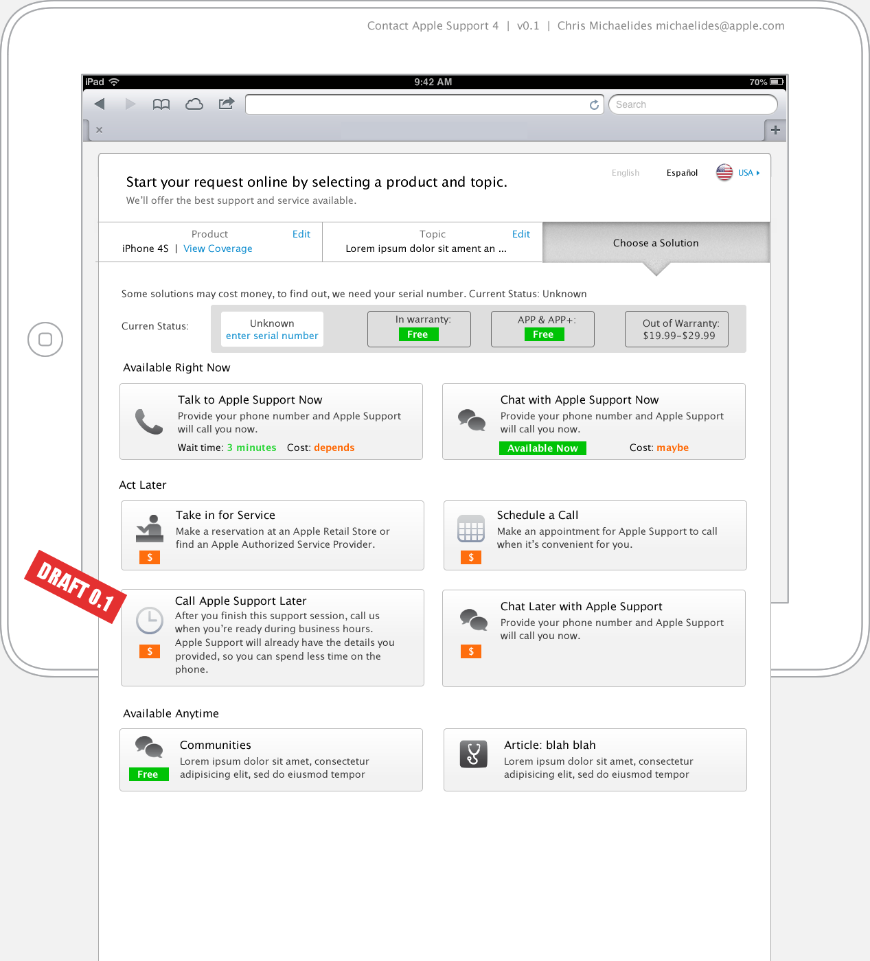
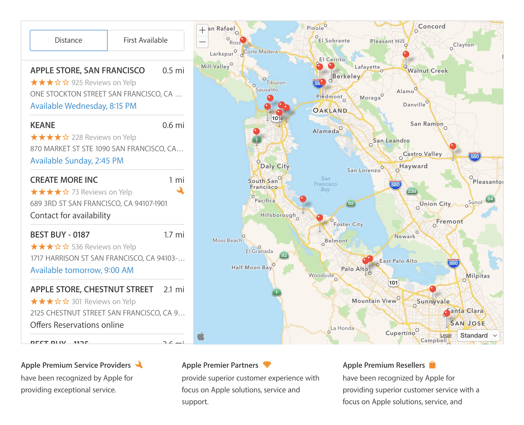
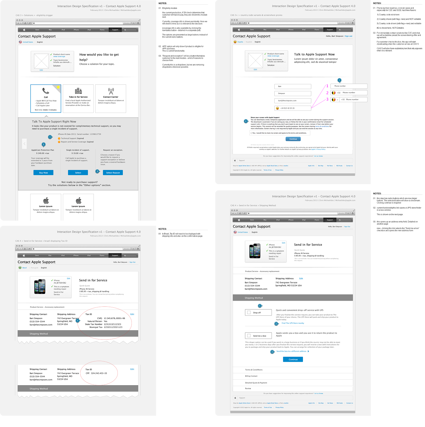
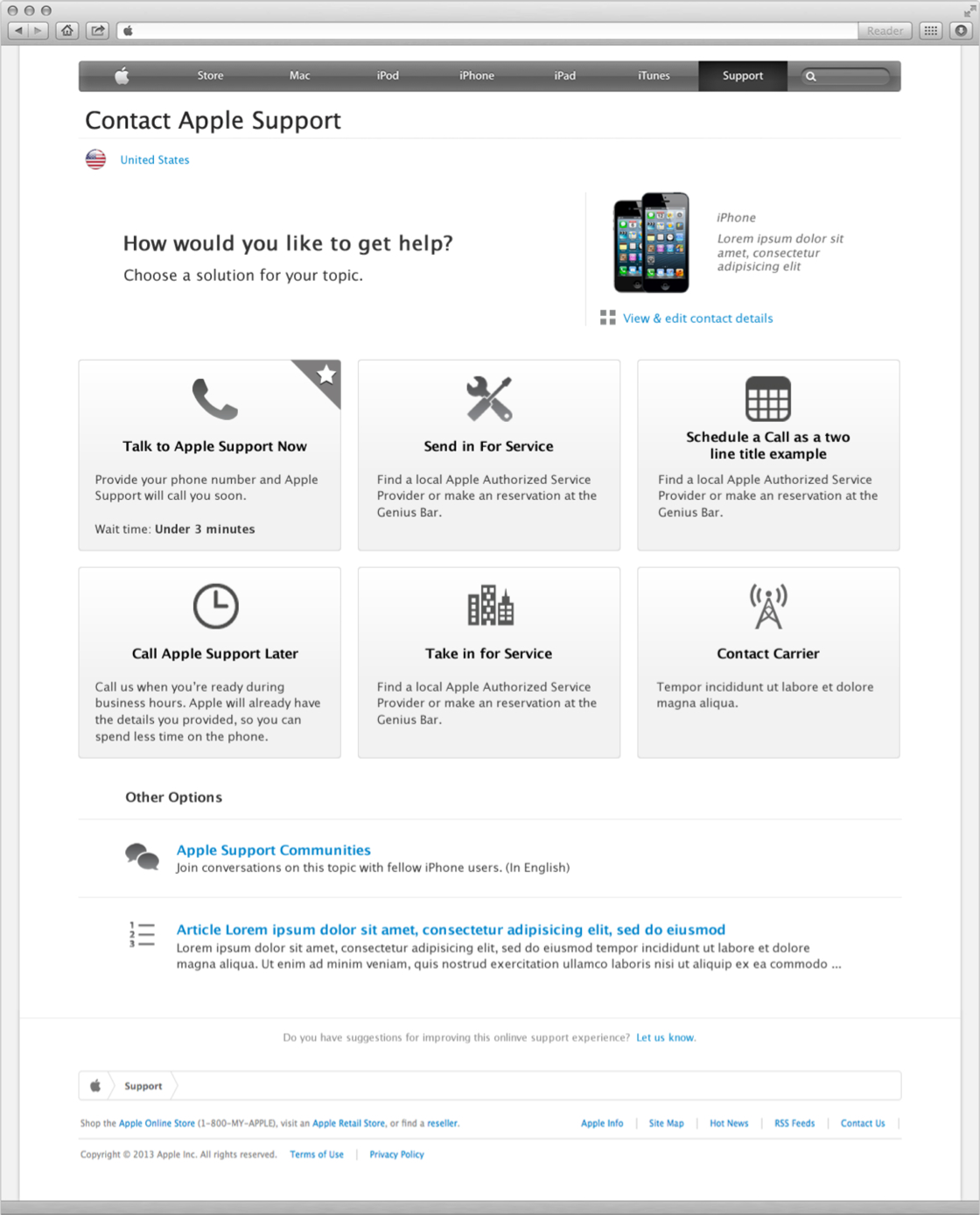
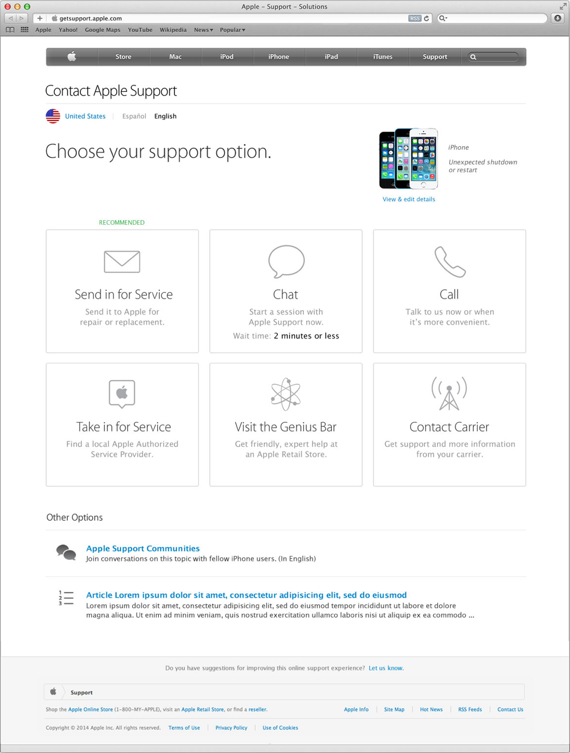
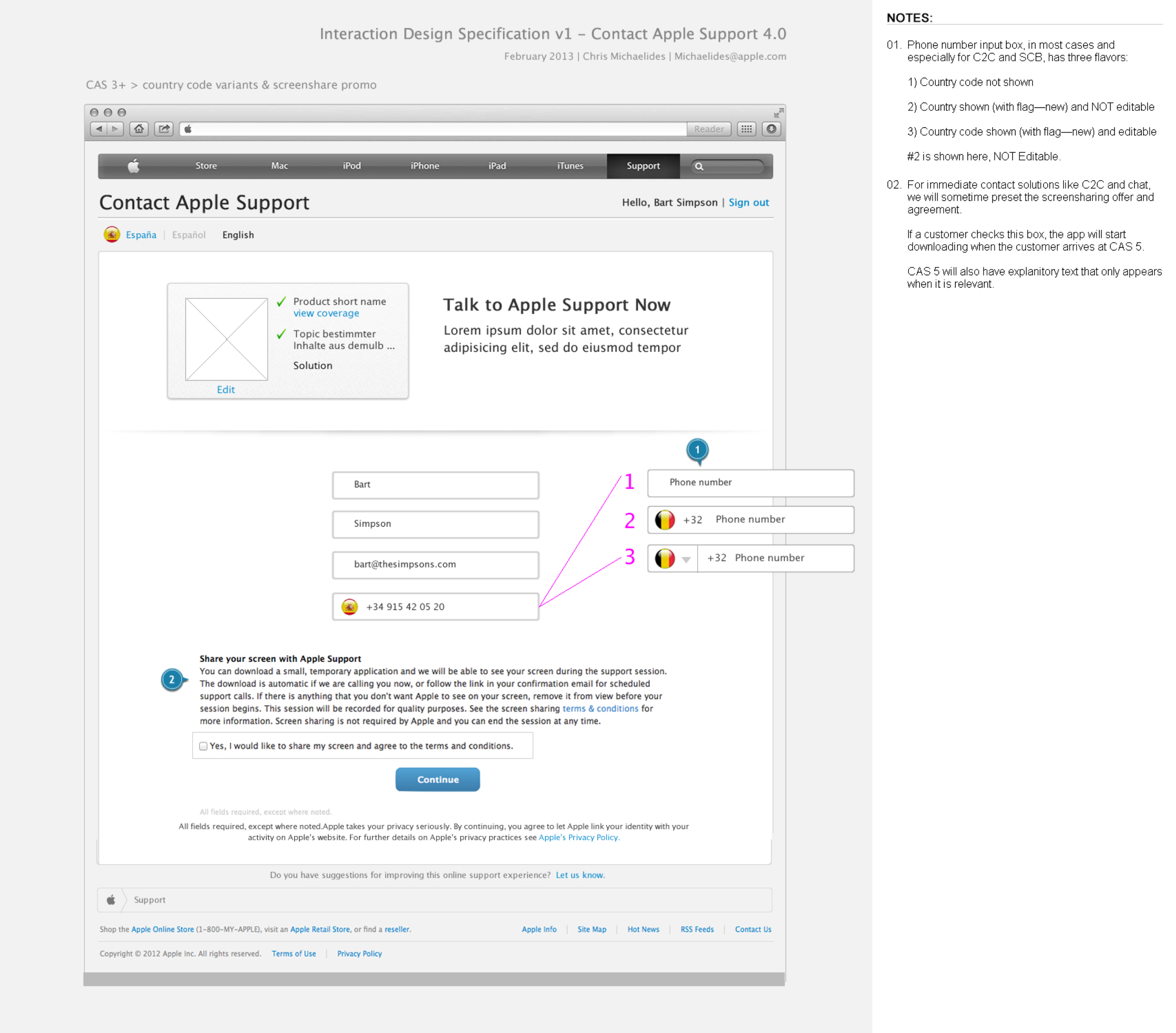
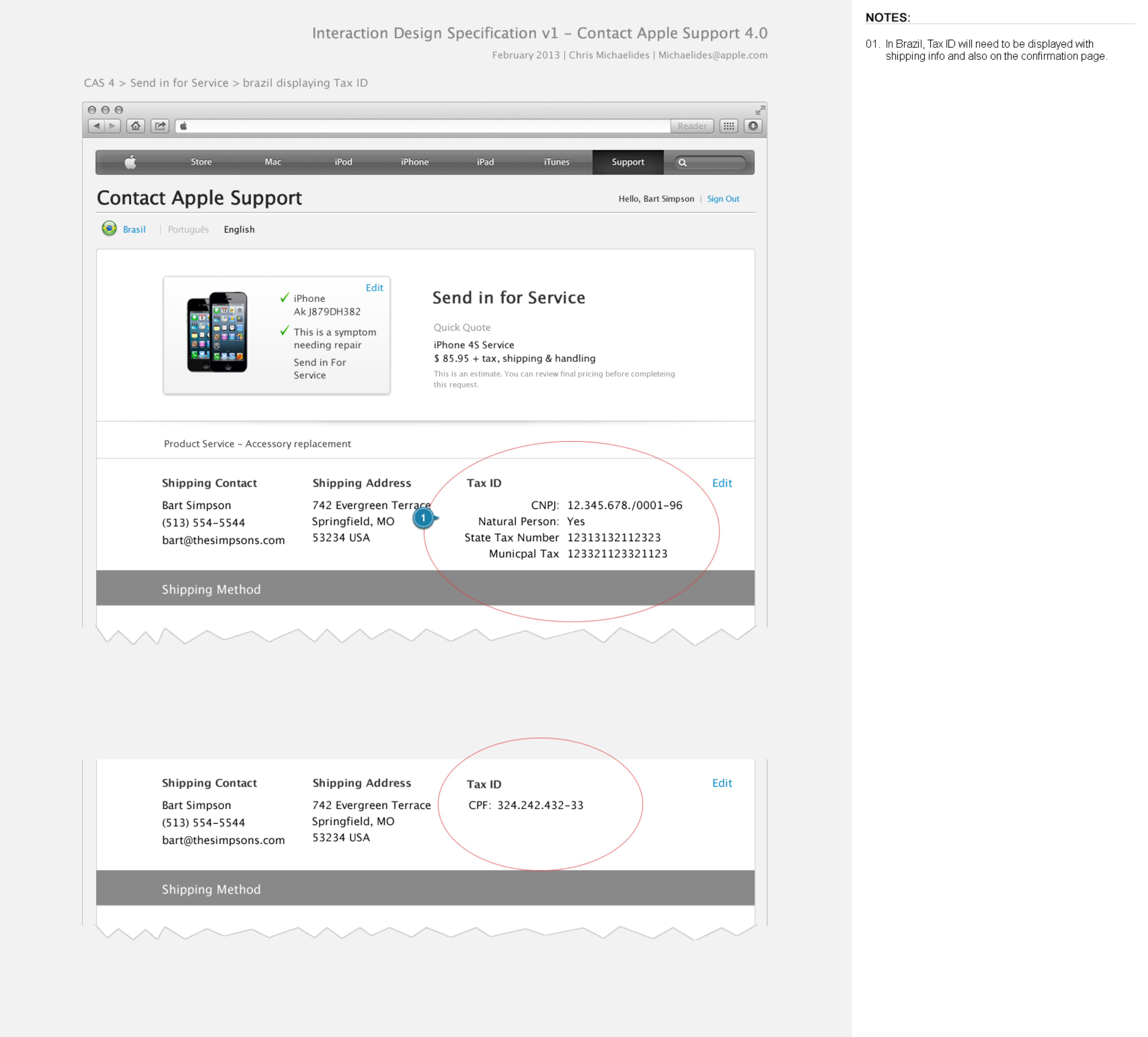
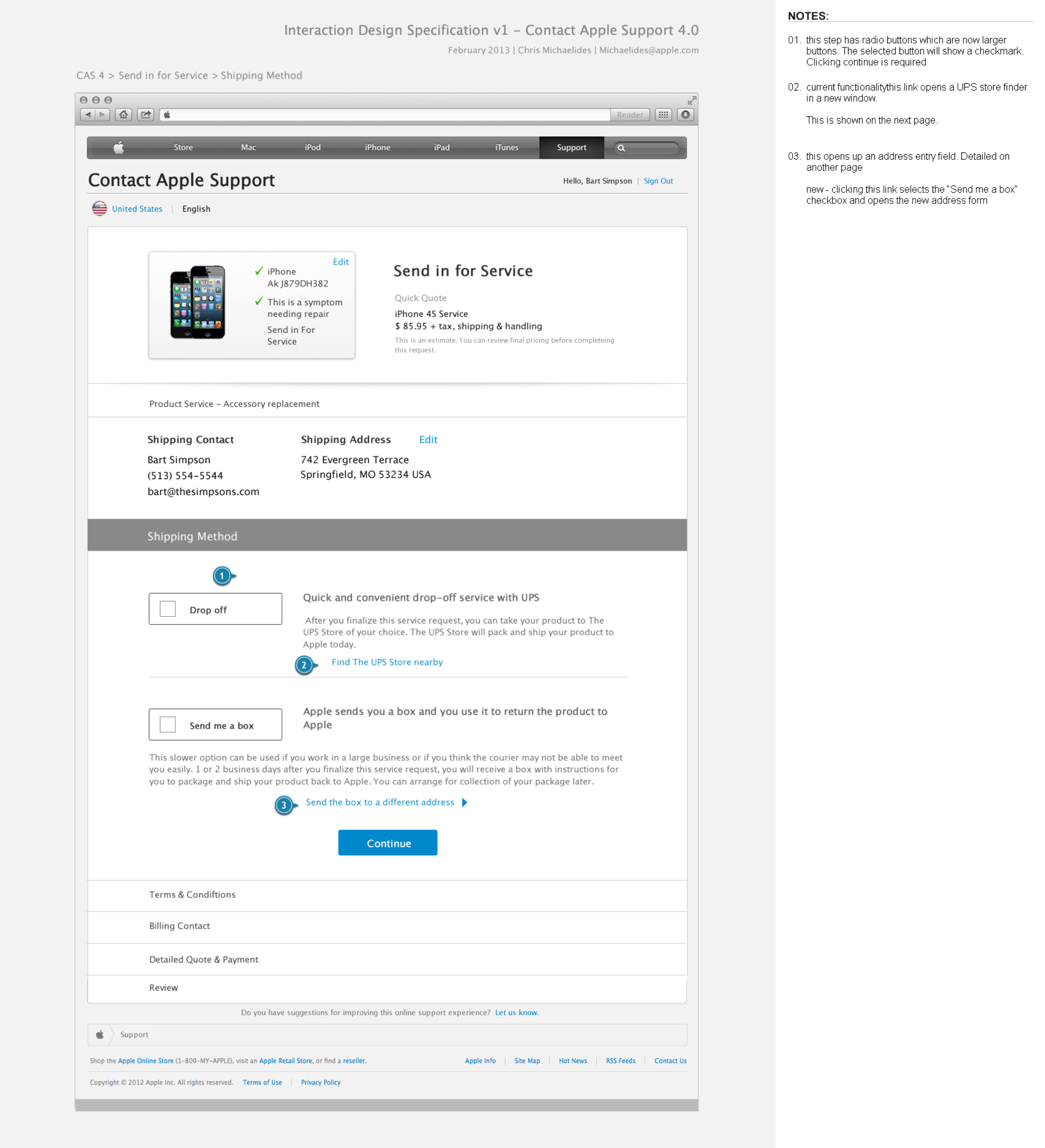
I created detailed wireframe specs for all functional variants. This enabled engineering to work while I created the final visual design. The shipping flow “Send in for Repair” uses an accordion-based design due to its unique complexity and data display requirements.
Accessibility
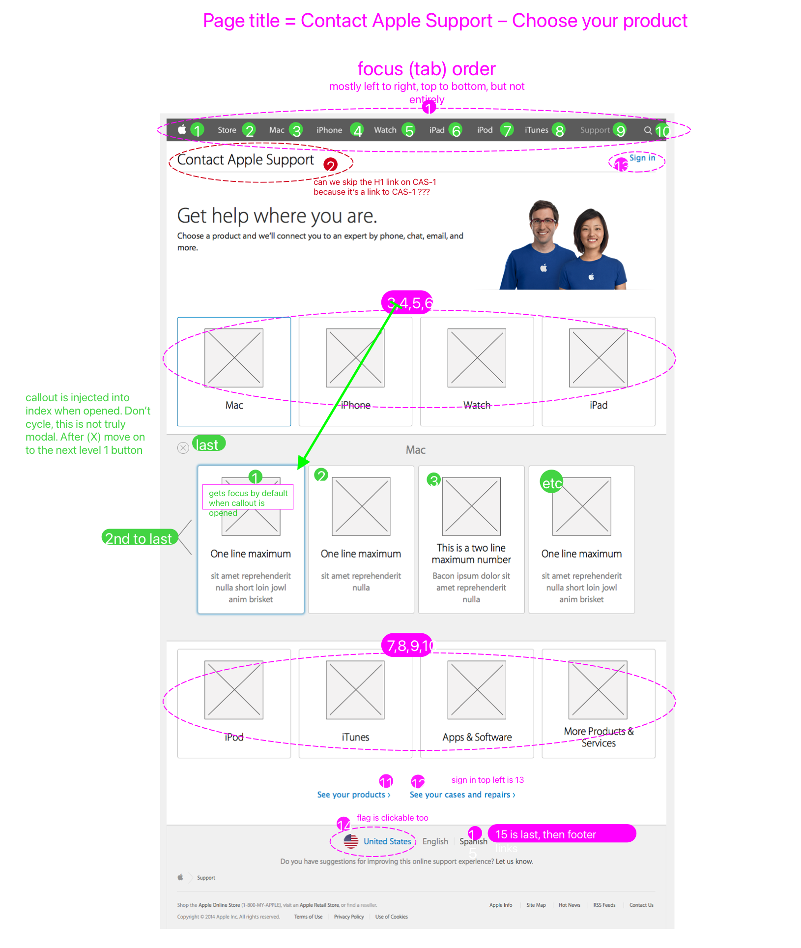
A11y is a priority for Apple. I’ve attended numerous trainings from the fabulous internal a11y team.
I engaged them early, which helped me choose the “deck” pattern and consulted them as needed for questions and sign-offs.
Because of them, I specify tab index, in addition to our requirements for keyboard navigation.
Surface
Content & internationalization
I worked closely with a writer to make language clear and encouraging. We refined text into key/value pairs for localization. I learned subtle distinctions like the difference between “select” and “choose.”
I collaborated with localization experts to ensure text and imagery fit each country. I reviewed builds in different languages to find and resolve text overflow bugs.
Visual design
I delivered four major visual updates to stay aligned with the evolution of apple.com.
Year 1
In the beginning, there was no design system in place. I worked with the Online Support creative director to identify suitable patterns and visual styles across apple.com that could be adapted.
When suitable patterns didn’t exist, I looked to the broader Apple ecosystem or designed new components.
Year 2
In year two, I built trust with Retail and MarCom creative directors through close collaboration and transparent design reviews.
Their confidence in my UX and visual design work was pivotal in Retail’s decision to hand over ownership of Genius Bar booking to CAS.
Year 3
I redesigned CAS to be responsive with an iPhone-first approach and incorporated components from the new MarCom design system used on our marketing pages.
Year 5
After year four, I moved on from CAS to lead design systems and operations for Online Support.
I returned temporarily two years later to align the UI with the MarCom design system once more.
Build & Ship
I was deeply involved in development
To ensure quality and fidelity, I attended sprint reviews and tested builds. I wrote tickets, created additional specs for clarity, and learned HTML and CSS to better communicate with engineers.
QA Testing
Regional teams tested builds. I wrote test scripts, provided screen flows by scenario, and collaborated with the core QA team. I triaged UI tickets, adding visual or behavioral expectations, and wrote many bug tickets myself.
Measure & Reflect
Finally, we measured what we’ve done, think about what could be better, and start planning again.
Each year, I found ways to work better. Whether it was educating teammates about UX design, being more active in requirements creation, or spending more time with engineers at their campus, I tried to improve how we work, not just our output.

Impact
We maximized the value of our service
2x
Conversion rate increase
40%
of expert support requests begin in CAS, a 27% increase
200M
Customer minutes saved
100M+
Visits annually
Goals Achieved


Modern UX increased IC & CSAT
Build trust and partnership with MarCom and Retail
Own Genius Bar Booking
More efficiently respond to partner requests


case study
Transforming how customers seek support
For several years, I redesigned and expanded “Contact Apple Support,” also known as “Get Support”, the global triage and routing gateway for customers seeking expert help with their products.
Role
Sr. Interaction Designer
Employer
Apple
Timeline
4 years
Core Team
Me, PM, 2 EMs,
2 Analysts, PjM
Context
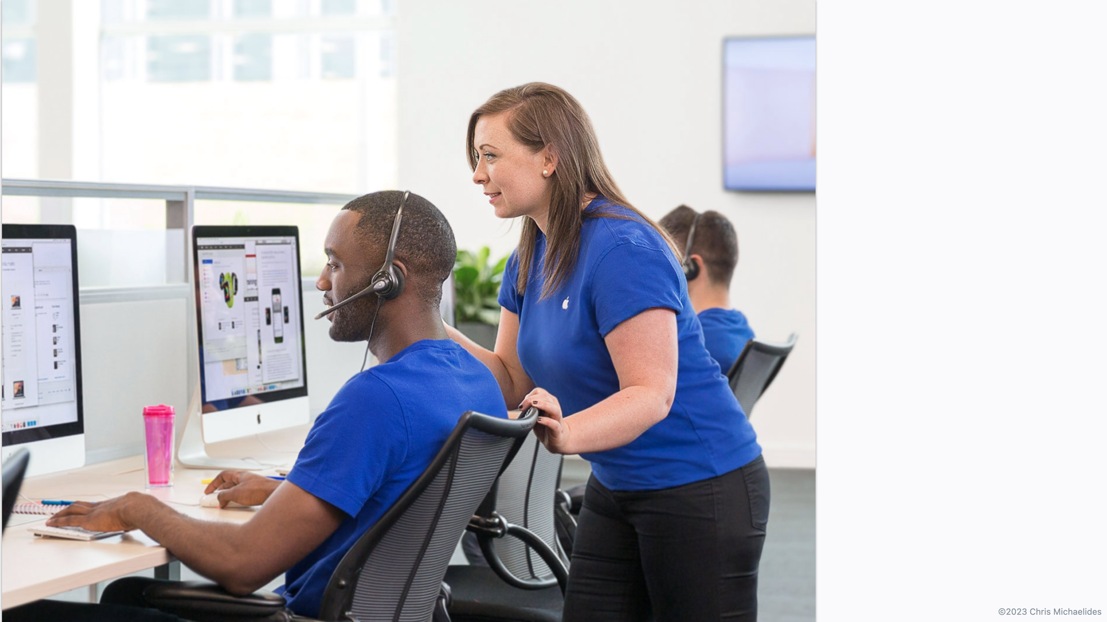
I was the sole designer on a core team of seven
I worked with a product manager, two program analysts representing the Contact Center and Service (repair) organizations, two engineering managers, and a project manager.
We were supported by colleagues in Data Science, Accessibility, Content design, Internationalization, and legal.
Stakeholders included leadership from the Support, Service, Retail, and MarCom organizations.
My Duties
UX / UI Design
Design for a11y & i18n
Visual Design
Prototyping
User Testing
Design specifications
Feature & Bug Ticket Writing
Stakeholder Presentations
QA & Sign Off
User Problem
Customers weren’t getting the best help available
Customers instinctively called Apple or walked into the Genius Bar — but each channel only handles certain issue types (hardware, software, services). This led to long waits, unnecessary travel, unsatisfactory experiences, and high support costs.
Business Problem
We could help, but our traffic and conversions were low
Contact Apple Support (CAS) could save customers time while routing them to the best help channel for their issue.
But CAS was neither intuitive nor visually appealing. This prevented MarCom and Retail from partnering with us, which was necessary to increase traffic.
Factors
Too many clicks, continue buttons
Information overload
Dated “service department” style
Partners weren’t interested
Vision & Goals
Be the preferred starting point for every expert support journey
Our mission was to maximize CAS’s value for both customers and Apple by:
- Increasing conversions and customer satisfaction rates
- Building credibility with MarCom and Retail
- Consolidating Genius Bar booking under CAS
- Modularizing the interface for faster updates
Solution
The new Contact Apple Support (aka Get Support)
The redesigned CAS delivered a focused, on-brand, and responsive experience inspired by the clear and competent communication of Apple Geniuses and Advisors.
Results
Major increases in scale and effectiveness over four years
2x
Conversion rate increase
40%
of expert support requests begin in CAS, a 27% increase
200M
Customer minutes saved
100M+
Visits annually
Each year there was a main focus, and small enhancements
Year 1
Full redesign +
↑ 48%
Increase in conversion rate
7%
Shift in customers starting with CAS vs calling directly
Year 2
Genius Bar appointment booking
18%
Shift of intended Genius Bar appts to Call or Chat
↑ 11%
Increase in Retail NPS
Year 3
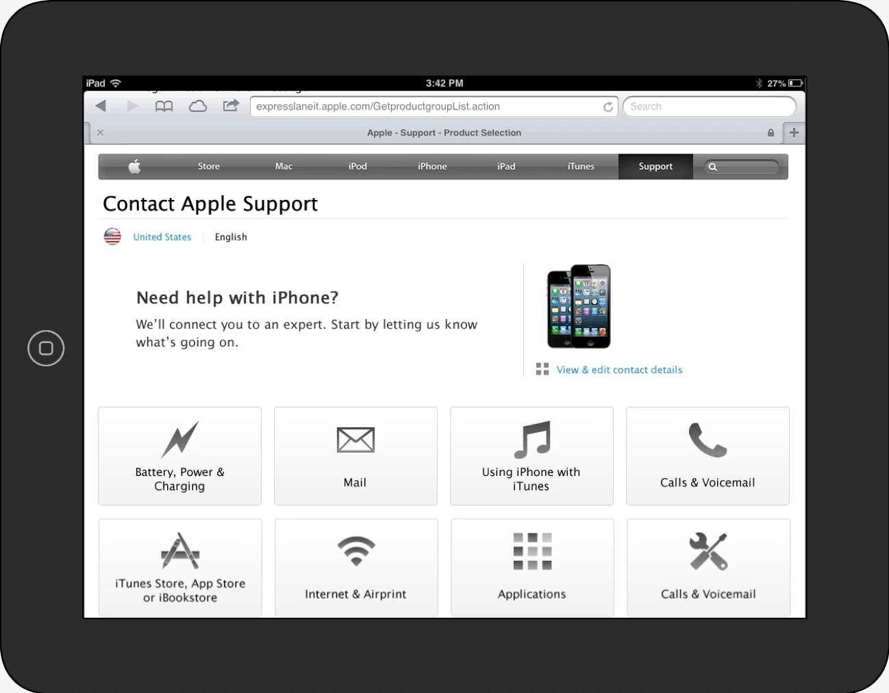
iPhone-first responsive redesign
↑ 58%
Increase in conversion rate on iPhone
↑ 37%
Increase in conversion rate overall
Year 4
Third party repair appointments
↑ 20%
Avg increase in appt booking for participating repair shops
Year 5
Design system reskin
Applied the site-wide design system for cohesion and efficiency
Process overview
Full redesign + examples from other years
I’ll describe the year 1 process because it was the most end-to-end, with examples from later years to complete the story.
Strategy
Understand Current State
I reviewed top flows and analytics data. People weren’t using CAS for billing and sales, so we cut it. Many users bounced via breadcrumb, so we clarified what CAS is at entry points.
User Research
I sat at Genius bars observing interactions and interviewing customers. I listened to support calls and interviewed phone advisors.
Top Insights
Customers Value
Trust, price, speed, convenience
Customers Struggle To
Provide serial number, Apple ID, date of purchase
Good Service Is
Courteous, knowledgable, and gives options
Result
These insights shaped our guiding principles and led me to defer serial number collection and sign in until after users have chosen their solution.
Scope
Feature requirements and prioritization
In year 1, scope and timeline were already set before I joined, causing issues with UI quality, accessibility, and roadmap alignment. Going forward, I worked with the core team to determine scope, resources, requirements, and priorities collaboratively.
Guiding Principles
Early on, we codified some principles to shape the scope and tone of CAS. The screen flows should feel like talking to an Apple Genius.
Route to resolution, not deflection
Kind, knowledgeable, effective
Warm transfers, orient with no data loss
I created UX principles to align with stakeholders and guide my work
Focus, one task per view
Conversation, not form submission
iPad first = large buttons
Fast = direct selection
Status as navigation, not a case report
Reuse templates & patterns
Structure
I learned the system and business rules
Business logic varied by country, product, issue, warranty status, trigger question responses, and time of day, resulting in thousands of potential variations. To make sense of it, I partnered with the analysts to inventory system inputs, entry points, routing, and warranty logic.
Maps for shared understanding
I distilled this into a high-level system and flow diagram. This artifact became our shared reference for design, engineering, and QA.
From that understanding, I designed a modular component and template framework, enabling us to assemble new flows from reusable building blocks.
Year 2
Detailed flow example, electronic proof of purchase
This is an example of the many enhancements I designed each year alongside the major initiatives. Contact centers needed a way to ask customers to upload their proof of purchase date (DOP) to resolve warranty disputes.
Skeleton
Ideation
I explored layouts to simplify and clarify. Given that price is a top concern, I played with using price previews as an incentive to provide serial number. Sharing this revealed pricing constraints and helped me learn.
The design had to accommodate many trigger questions, and I was running into the same problem of overcrowding. I needed a different direction to hide complexity.
Pivotal moment - the “deck” pattern
To fit secondary menus and trigger questions in an iPad viewport, I designed a reusable “deck” pattern inspired by iTunes 11. It maintained focus through progressive disclosure and followed the accessibility team’s guidance to put secondary menus inline.
The deck design supported any number of secondary selections or trigger questions by sliding in the next item.
I prototyped these animations in Keynote, and provided detailed specs to engineering.
Year 3
When I redesigned the app to align with the new MarCom design system, I used a shared pattern to make the deck a modal.
Year 3
Prototyping for responsive design
After a full redesign and a year of enhancements and Genius Bar flow refinements, I redesigned CAS to be fully responsive, using a mobile-first approach.
The lead UI engineer doubted this could be done with a single set of HTML, so I coded a prototype using flexbox and media queries to show them how it could be done.
Year 4
Validation
Service leadership wanted appointment booking for third party “Apple Authorized Service Providers” (AASPs). I suspected customers wouldn’t choose them due to low trust, so when testing this design, I also tested a data scenario where AASPs were closer and more available than Apple Stores.
Insights
Trust and credibility were top concerns
Genius Bar was always first choice
Some would consider an AASP if they had to
UI was clear; tasks completed easily
PSP icon was unclear
Result
This recalibrated KPI expectations and led to initiatives to build AASP trust and awareness. Leadership gained a clearer understanding of customer mindset.
Year 1
154 unique screen variants, specified
I created detailed wireframe specs for all functional variants. This enabled engineering to work while I created the final visual design. The shipping flow “Send in for Repair” uses an accordion-based design due to its unique complexity and data display requirements.
Accessibility
A11y is a priority for Apple. I’ve attended numerous trainings from the fabulous internal a11y team.
I engaged them early, which helped me choose the “deck” pattern and consulted them as needed for questions and sign-offs.
Because of them, I specify tab index, in addition to our requirements for keyboard navigation.
Surface
Content & internationalization
I worked closely with a writer to make language clear and encouraging. We refined text into key/value pairs for localization. I learned subtle distinctions like the difference between “select” and “choose.”
I collaborated with localization experts to ensure text and imagery fit each country. I reviewed builds in different languages to find and resolve text overflow bugs.
Visual design
I delivered four major visual updates to stay aligned with the evolution of apple.com.
Year 1
In the beginning, there was no design system in place. I worked with the Online Support creative director to identify suitable patterns and visual styles across apple.com that could be adapted.
When suitable patterns didn’t exist, I looked to the broader Apple ecosystem or designed new components.
Year 2
In year two, I built trust with Retail and MarCom creative directors through close collaboration and transparent design reviews.
Their confidence in my UX and visual design work was pivotal in Retail’s decision to hand over ownership of Genius Bar booking to CAS.
Year 3
I redesigned CAS to be responsive with an iPhone-first approach and incorporated components from the new MarCom design system used on our marketing pages.
Year 5
After year four, I moved on from CAS to lead design systems and operations for Online Support.
I returned temporarily two years later to align the UI with the MarCom design system once more.
Build & Ship
I was deeply involved in development
To ensure quality and fidelity, I attended sprint reviews and tested builds. I wrote tickets, created additional specs for clarity, and learned HTML and CSS to better communicate with engineers.
QA Testing
Regional teams tested builds. I wrote test scripts, provided screen flows by scenario, and collaborated with the core QA team. I triaged UI tickets, adding visual or behavioral expectations, and wrote many bug tickets myself.
Measure & Reflect
Finally, we measured what we’ve done, think about what could be better, and start planning again.
Each year, I found ways to work better. Whether it was educating teammates about UX design, being more active in requirements creation, or spending more time with engineers at their campus, I tried to improve how we work, not just our output.

Impact
We maximized the value of our service
2x
Conversion rate increase
40%
of expert support requests begin in CAS, a 27% increase
200M
Customer minutes saved
100M+
Visits annually
Goals Achieved
Modern UX increased IC & CSAT
Build trust and partnership with MarCom and Retail
Own Genius Bar Booking
More efficiently respond to partner requests

case study
Transforming how customers seek support
For several years, I redesigned and expanded “Contact Apple Support,” also known as “Get Support”, the global triage and routing gateway for customers seeking expert help with their products.
Role
Sr. Interaction Designer
Employer
Apple
Timeline
4 years
Core Team
Me, PM, 2 EMs,
2 Analysts, PjM
2x
Conversion rate increase
200M
Customer minutes saved
40%
Of all support requests begin in CAS, up 27%
Context
I was the sole designer on a core team of seven
I worked with a product manager, two program analysts representing the Contact Center and Service (repair) organizations, two engineering managers, and a project manager.
We were supported by colleagues in Data Science, Accessibility, Content design, Internationalization, and legal.
Stakeholders included leadership from the Support, Service, Retail, and MarCom organizations.
My Duties
UX / UI Design
Design for a11y & i18n
Visual Design
Prototyping
User Testing
Design specifications
Feature & Bug Ticket Writing
Stakeholder Presentations
QA & Sign Off
User Problem
Customers weren’t getting the best help available
Customers instinctively called Apple or walked into the Genius Bar — but each channel only handles certain issue types (hardware, software, services). This led to long waits, unnecessary travel, unsatisfactory experiences, and high support costs.
Business
Problem
We could help, but our traffic and conversions were low
Contact Apple Support (CAS) could save customers time while routing them to the best help channel for their issue.
But CAS was neither intuitive nor visually appealing. This prevented MarCom and Retail from partnering with us, which was necessary to increase traffic.
Factors
Too many clicks, continue buttons
Information overload
Dated “service department” style
Partners weren’t interested
Vision & Goals
Be the preferred starting point for every expert support journey
Our mission was to maximize CAS’s value for both customers and Apple by:
- Increasing conversions and customer satisfaction rates
- Building credibility with MarCom and Retail
- Consolidating Genius Bar booking under CAS
- Modularizing the interface for faster updates
Solution
The new Contact Apple Support (aka Get Support)
The redesigned CAS delivered a focused, on-brand, and responsive experience inspired by the clear and competent communication of Apple Geniuses and Advisors.
Results
Major increases in scale and effectiveness over four years
2x
Conversion rate increase
40%
of expert support requests begin in CAS, a 27% increase
200M
Customer minutes saved
100M+
Visits annually
Each year there was a main focus, and small enhancements
Year 1
Full redesign +
↑ 48%
Increase in conversion rate
7%
Shift in customers starting with CAS vs calling directly
Year 2
Genius Bar appointment booking
18%
Shift of intended Genius Bar appts to Call or Chat
↑ 11%
Increase in Retail NPS
Year 3
iPhone-first responsive redesign
↑ 58%
Increase in conversion rate on iPhone
↑ 37%
Increase in conversion rate overall
Year 4
Third party repair appointments
↑ 20%
Avg increase in appt booking for participating repair shops
Year 5
Design system reskin
Applied the site-wide design system for cohesion and efficiency

Process overview
Full redesign + examples from other years
I’ll describe the year 1 process because it was the most end-to-end, with examples from later years to complete the story.
Strategy
Understand Current State
I reviewed top flows and analytics data. People weren’t using CAS for billing and sales, so we cut it. Many users bounced via breadcrumb, so we clarified what CAS is at entry points.
User Research
I sat at Genius bars observing interactions and interviewing customers. I listened to support calls and interviewed phone advisors.
Top Insights
Customers Value
Trust, price, speed, convenience
Customers Struggle To
Provide serial number, Apple ID, date of purchase
Good Service Is
Courteous, knowledgable, and gives options
Result
These insights shaped our guiding principles and led me to defer serial number collection and sign in until after users have chosen their solution.
Scope
Feature requirements and prioritization
In year 1, scope and timeline were already set before I joined, causing issues with UI quality, accessibility, and roadmap alignment. Going forward, I worked with the core team to determine scope, resources, requirements, and priorities collaboratively.
Guiding Principles
Early on, we codified some principles to shape the scope and tone of CAS. The screen flows should feel like talking to an Apple Genius.
Route to resolution, not deflection
Kind, knowledgeable, effective
Warm transfers, orient with no data loss
I created UX principles to align with stakeholders and guide my work
Focus, one task per view
Conversation, not form submission
iPad first = large buttons
Fast = direct selection
Status as navigation, not a case report
Reuse templates & patterns
Structure
I learned the system and business rules
Business logic varied by country, product, issue, warranty status, trigger question responses, and time of day, resulting in thousands of potential variations. To make sense of it, I partnered with the analysts to inventory system inputs, entry points, routing, and warranty logic.
Maps for shared understanding
I distilled this into a high-level system and flow diagram. This artifact became our shared reference for design, engineering, and QA.
From that understanding, I designed a modular component and template framework, enabling us to assemble new flows from reusable building blocks.
Year 2
Detailed flow example, electronic proof of purchase
This is an example of the many enhancements I designed each year alongside the major initiatives. Contact centers needed a way to ask customers to upload their proof of purchase date (DOP) to resolve warranty disputes.
Skeleton
Ideation
I explored layouts to simplify and clarify. Given that price is a top concern, I played with using price previews as an incentive to provide serial number. Sharing this revealed pricing constraints and helped me learn.
The design had to accommodate many trigger questions, and I was running into the same problem of overcrowding. I needed a different direction to hide complexity.
Pivotal moment - the “deck” pattern
To fit secondary menus and trigger questions in an iPad viewport, I designed a reusable “deck” pattern inspired by iTunes 11. It maintained focus through progressive disclosure and followed the accessibility team’s guidance to put secondary menus inline.
The deck design supported any number of secondary selections or trigger questions by sliding in the next item.
I prototyped these animations in Keynote, and provided detailed specs to engineering.
Year 3
When I redesigned the app to align with the new MarCom design system, I used a shared pattern to make the deck a modal.
Year 3
Prototyping for responsive design
After a full redesign and a year of enhancements and Genius Bar flow refinements, I redesigned CAS to be fully responsive, using a mobile-first approach.
The lead UI engineer doubted this could be done with a single set of HTML, so I coded a prototype using flexbox and media queries to show them how it could be done.
Year 4
Validation
Service leadership wanted appointment booking for third party “Apple Authorized Service Providers” (AASPs). I suspected customers wouldn’t choose them due to low trust, so when testing this design, I also tested a data scenario where AASPs were closer and more available than Apple Stores.
Insights
Trust and credibility were top concerns
Genius Bar was always first choice
Some would consider an AASP if they had to
UI was clear; tasks completed easily
PSP icon was unclear
Result
This recalibrated KPI expectations and led to initiatives to build AASP trust and awareness. Leadership gained a clearer understanding of customer mindset.
Year 1
154 unique screen variants, specified
I created detailed wireframe specs for all functional variants. This enabled engineering to work while I created the final visual design. The shipping flow “Send in for Repair” uses an accordion-based design due to its unique complexity and data display requirements.
Accessibility
A11y is a priority for Apple. I’ve attended numerous trainings from the fabulous internal a11y team.
I engaged them early, which helped me choose the “deck” pattern and consulted them as needed for questions and sign-offs.
Because of them, I specify tab index, in addition to our requirements for keyboard navigation.
Surface
Content & internationalization
I worked closely with a writer to make language clear and encouraging. We refined text into key/value pairs for localization. I learned subtle distinctions like the difference between “select” and “choose.”
I collaborated with localization experts to ensure text and imagery fit each country. I reviewed builds in different languages to find and resolve text overflow bugs.
Visual design
I delivered four major visual updates to stay aligned with the evolution of apple.com.
Year 1
In the beginning, there was no design system in place. I worked with the Online Support creative director to identify suitable patterns and visual styles across apple.com that could be adapted.
When suitable patterns didn’t exist, I looked to the broader Apple ecosystem or designed new components.
Year 2
In year two, I built trust with Retail and MarCom creative directors through close collaboration and transparent design reviews.
Their confidence in my UX and visual design work was pivotal in Retail’s decision to hand over ownership of Genius Bar booking to CAS.
Year 3
I redesigned CAS to be responsive with an iPhone-first approach and incorporated components from the new MarCom design system used on our marketing pages.
Year 5
After year four, I moved on from CAS to lead design systems and operations for Online Support.
I returned temporarily two years later to align the UI with the MarCom design system once more.
Build & Ship
I was deeply involved in development
To ensure quality and fidelity, I attended sprint reviews and tested builds. I wrote tickets, created additional specs for clarity, and learned HTML and CSS to better communicate with engineers.
QA Testing
Regional teams tested builds. I wrote test scripts, provided screen flows by scenario, and collaborated with the core QA team. I triaged UI tickets, adding visual or behavioral expectations, and wrote many bug tickets myself.
Measure & Reflect
Finally, we measured what we’ve done, think about what could be better, and start planning again.
Each year, I found ways to work better. Whether it was educating teammates about UX design, being more active in requirements creation, or spending more time with engineers at their campus, I tried to improve how we work, not just our output.

Impact
We maximized the value of our service
2x
Conversion rate increase
40%
of expert support requests begin in CAS, a 27% increase
200M
Customer minutes saved
100M+
Visits annually
Goals Achieved
Modern UX increased IC & CSAT
Build trust and partnership with MarCom and Retail
Own Genius Bar Booking
More efficiently respond to partner requests