
case study
Elevating performance with Design Systems & Operations
How I tripled productivity for the AppleCare Support design team while also improving quality and morale.
Role
Lead Designer
Employer
Apple
Timeline
18 mos
Core Team
Me, FTE
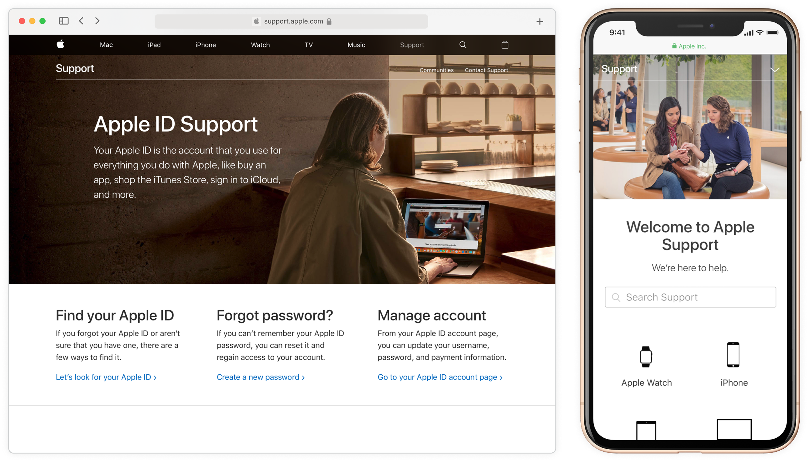
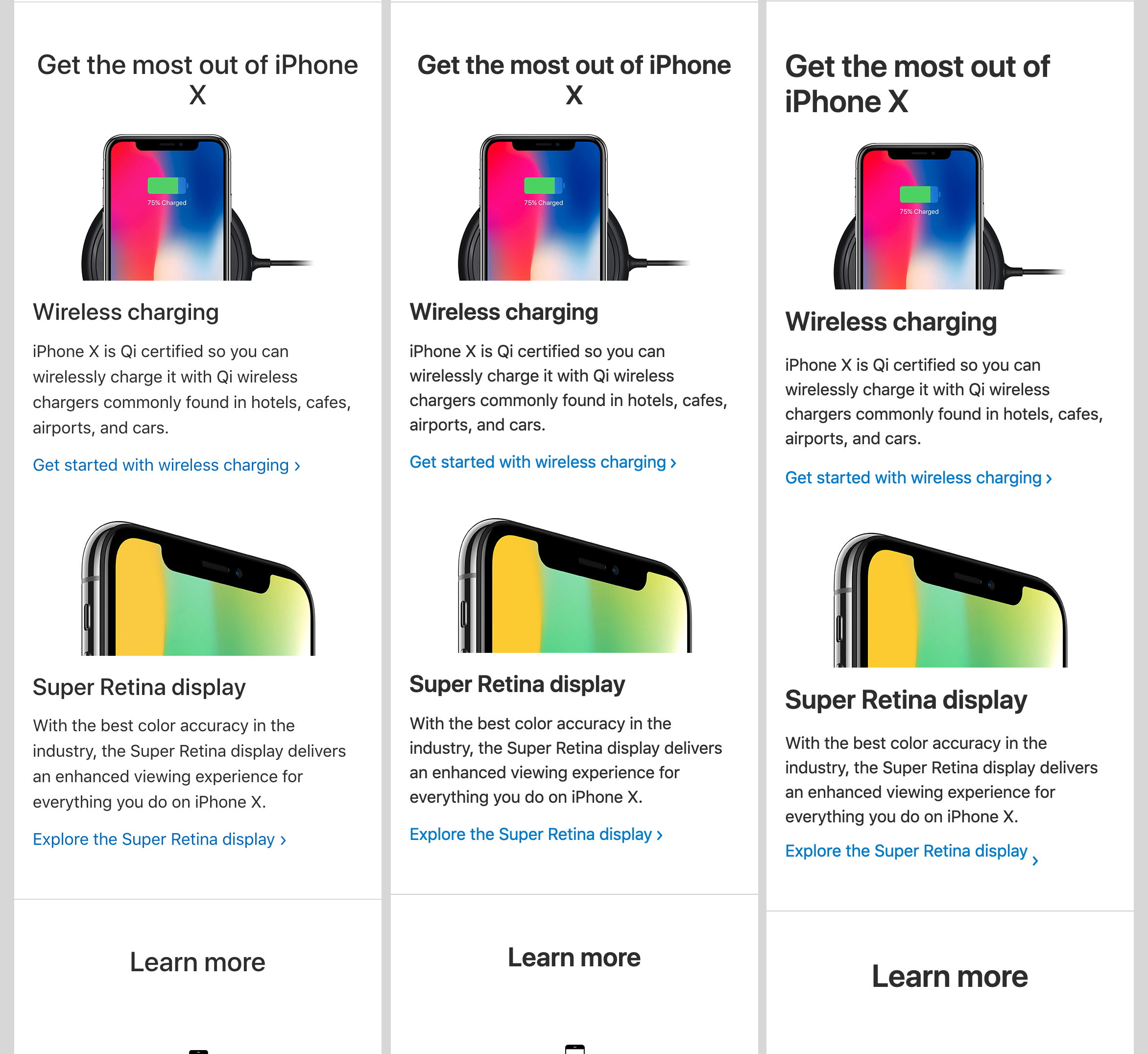
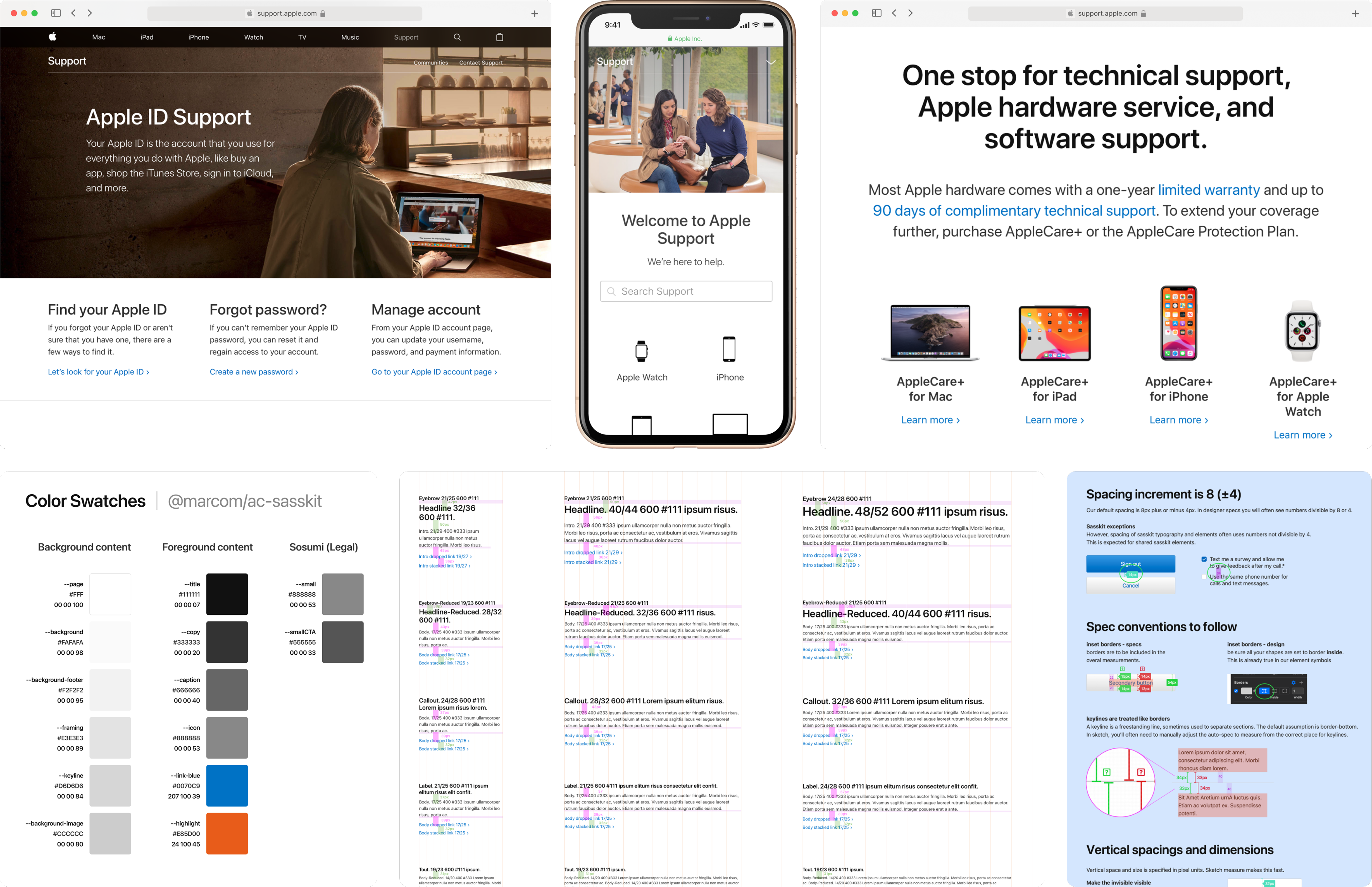
Apple Support pages made with foundational components and standards
Context
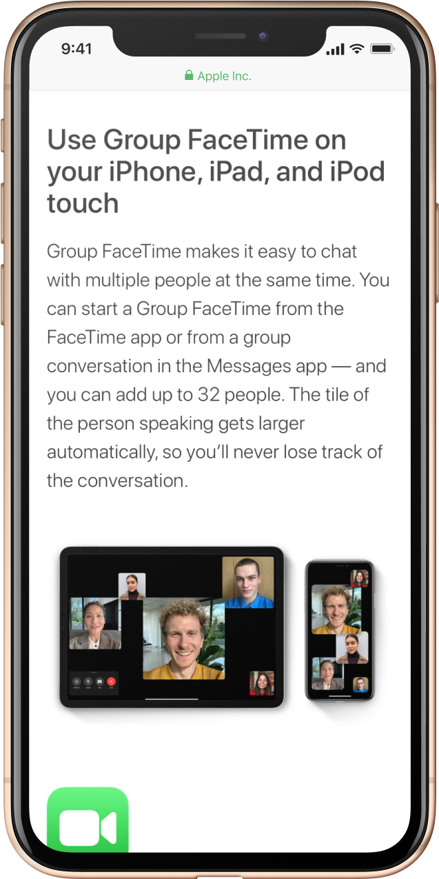
Millions of customers globally come to support.apple.com to get help with their Apple products.
Serving customers in 100+ countries in 30 languages with 10,000+ articles, discussion forums, AppleCare service tools, and live or scheduled support, including Genius Bar booking, the Support site’s scale and complexity made UI consistency a challenge for our 12 person design team. It was time for a design system.
While Support leadership was hesitant to fund the creation of a design system, Marketing Communications (MarCom) had recently built one for apple.com’s marketing pages. Adopting MarCom’s system would allow AppleCare Support to take its first steps toward a shared component infrastructure.
Problem
The design team couldn’t keep up with partner requests.
Quality and consistency was slipping.
Our process wasn’t scaling. Contractors added capacity but required significant guidance because standards and pattern knowledge were tribal and not documented.
Engineering flagged UI inconsistency as a blocker to adopting a shared component framework.
Factors
Fragmented team culture and workflows
No formal design system or shared UI kits
No formal standards or review gates
Solution
To address our needs, I developed and implemented a “Team Elevation Plan” to support the design team across three areas
Culture & Collaboration
Establish and run weekly design critiques, forums, and office hours, to foster communication and shared perspective.
Design System & Tools
Provide the necessary awareness, training, and tools to drive adoption of the MarCom design system framework.
Standards & Processes
Formalize expectations, documentation, and review gates to ensure consistency for more seamless development.
Key Artifacts
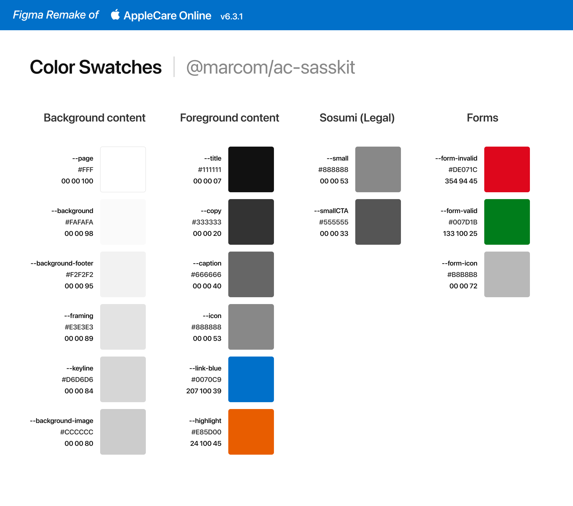
Design Kit (Sketch File)
Starter files containing foundational styles, components, and templates. My goal was to make it simpler to designs across three breakpoints with consistency.
Figma Update
To show how I’d build this design kit today, I remade it in Figma. Improvements:
- Variable modes for breakpoints and light/dark theme
- Tokens for type styles, for ease of maintenance
- Refactored type lockup components into one using variants & properties
Check out the Figma File

password
I’ll-be-back
For image gallery, increase your viewport width.
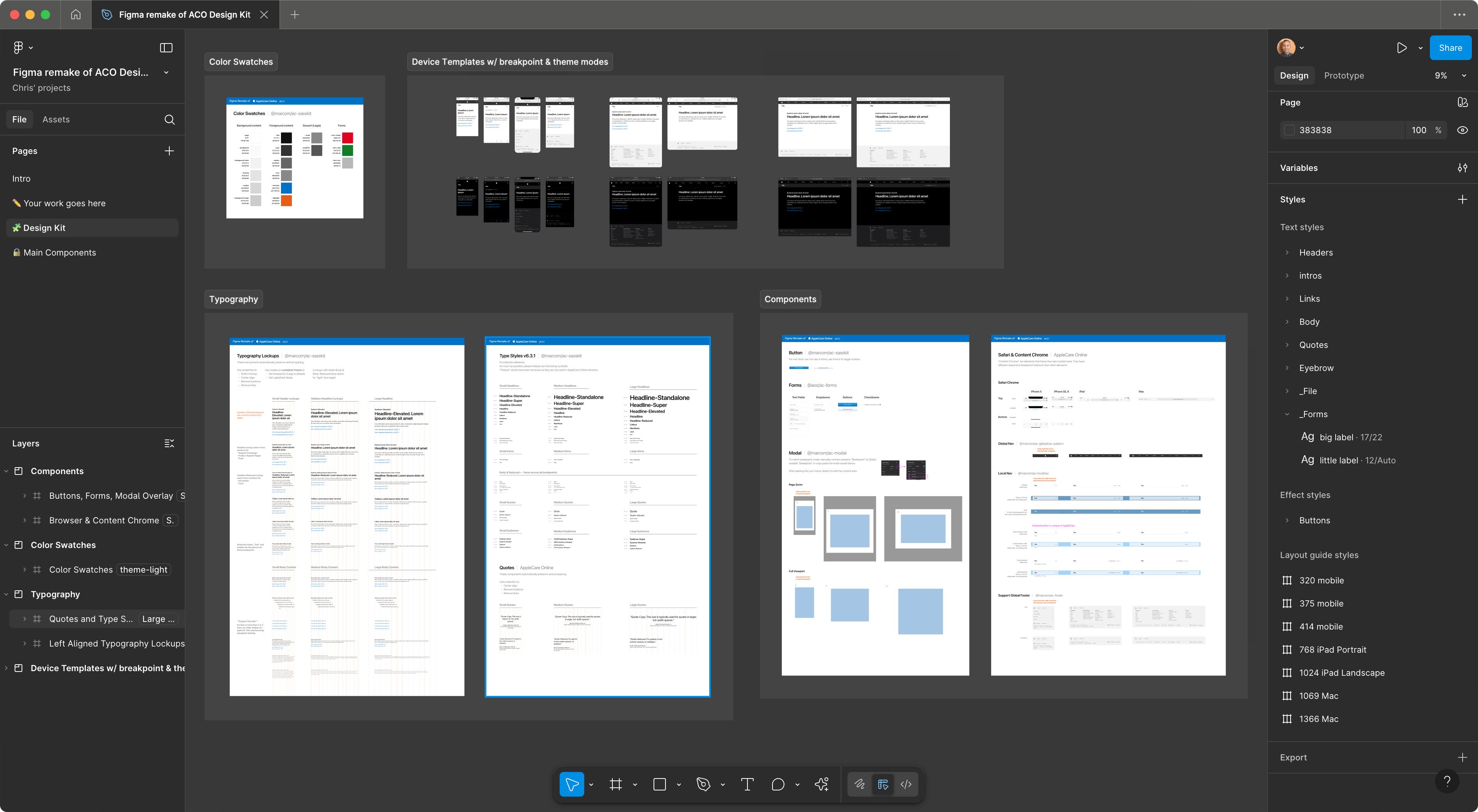
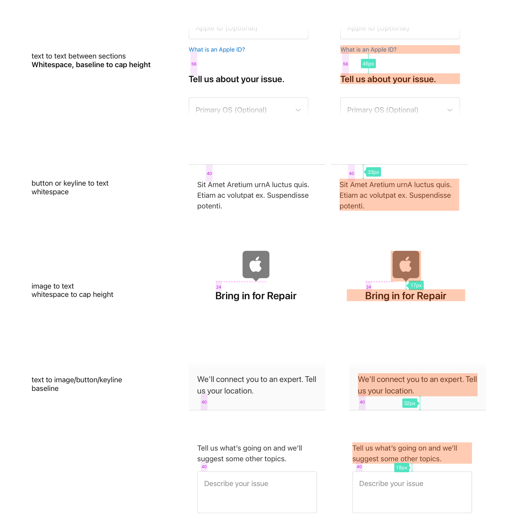
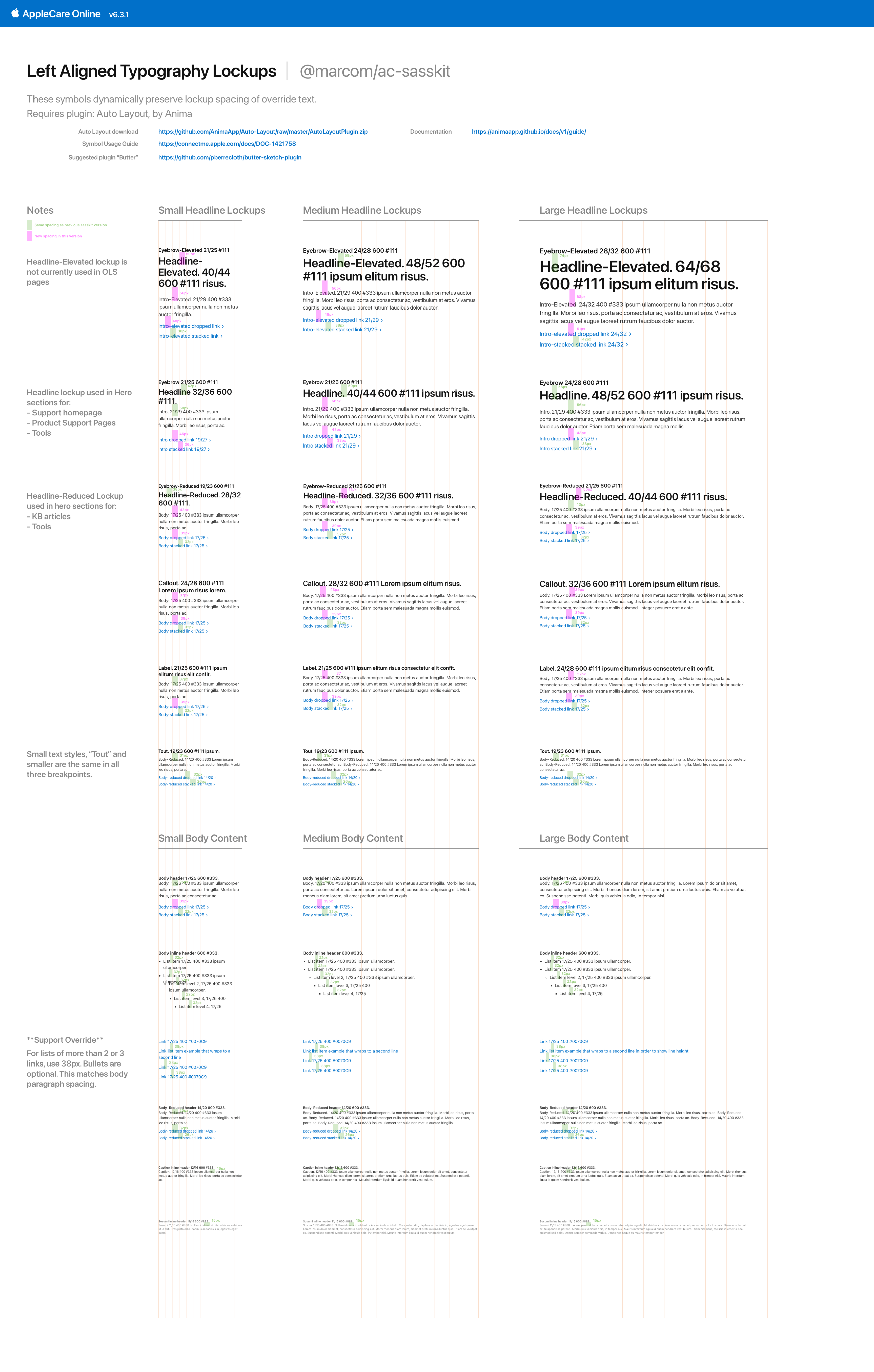
In Figma, I built text lockups so they automatically adapt to the breakpoint.
Standards
Reference docs with guidance for our Support use cases. My goal was to standardize how we spaced and spec’d mockups, so engineering could confidently begin to use shared components across AppleCare projects.
Processes & Reviews
To accelerate contractors and ensure components and standards were applied correctly, the two design managers and I established clear structures and expectations for deliverables and procedures by project type.
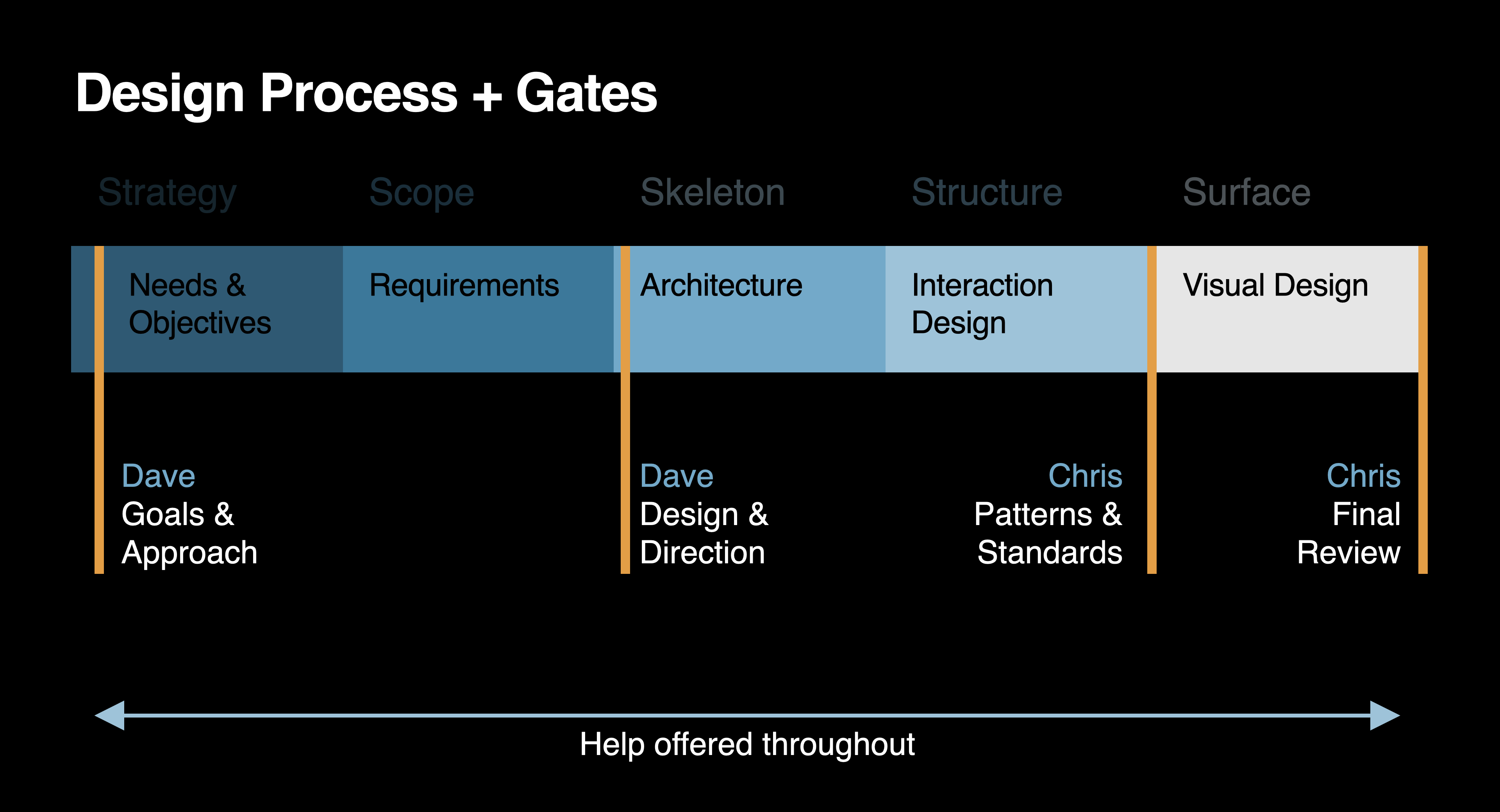
We introduced gate reviews to keep work on track. The creative director (CD) administered the strategic gates, and I administered the standards gates.
Results
3x
Faster design delivery for 12 UX designers
10,000+
Updated pages and app screens
0 ➔ 1
Design operations established
Process
I began by initiating a relationship with the MarCom design systems team
We discussed shared goals, and the rationale of their system. I became the point of contact for AppleCare, and joined their system governance meetings.
We earned buy-in across AppleCare teams
The FTE and I presented to teams and leadership across AppleCare. We shared what design systems are, their value, and how we might use the MarCom system. This socialization helped build trust and momentum for adoption.
To understand the MarCom system, I deconstructed it
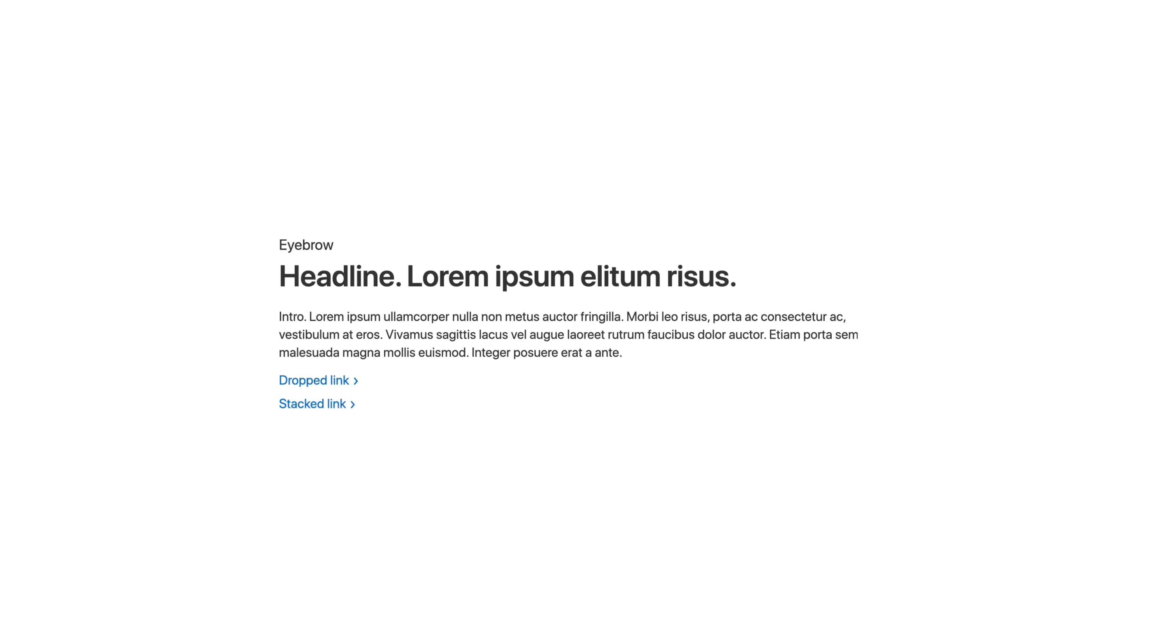
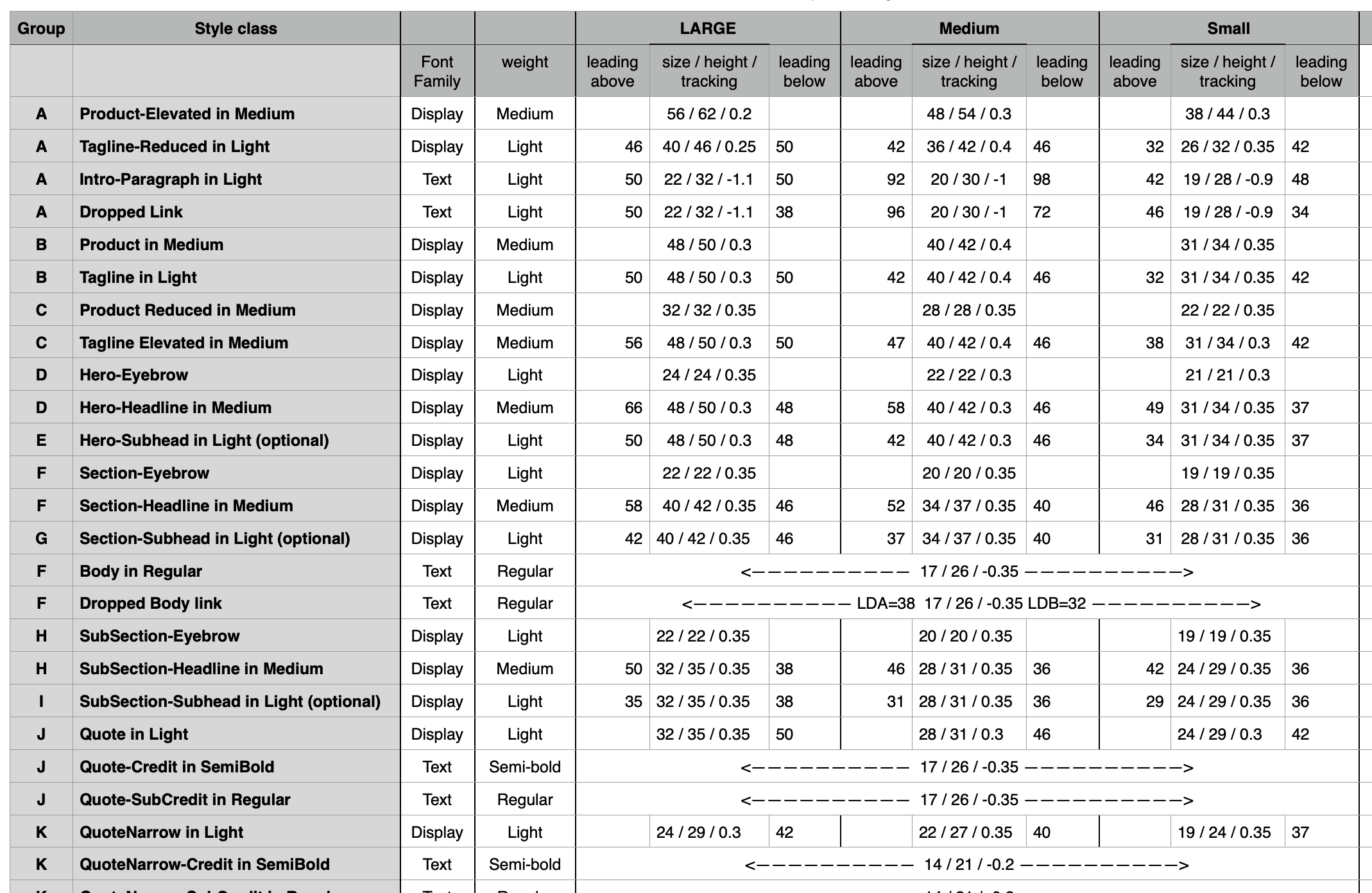
Type lockups are the foundation, with strict rules around vertical spacing and emphasis on styling by the semantic role of the text.
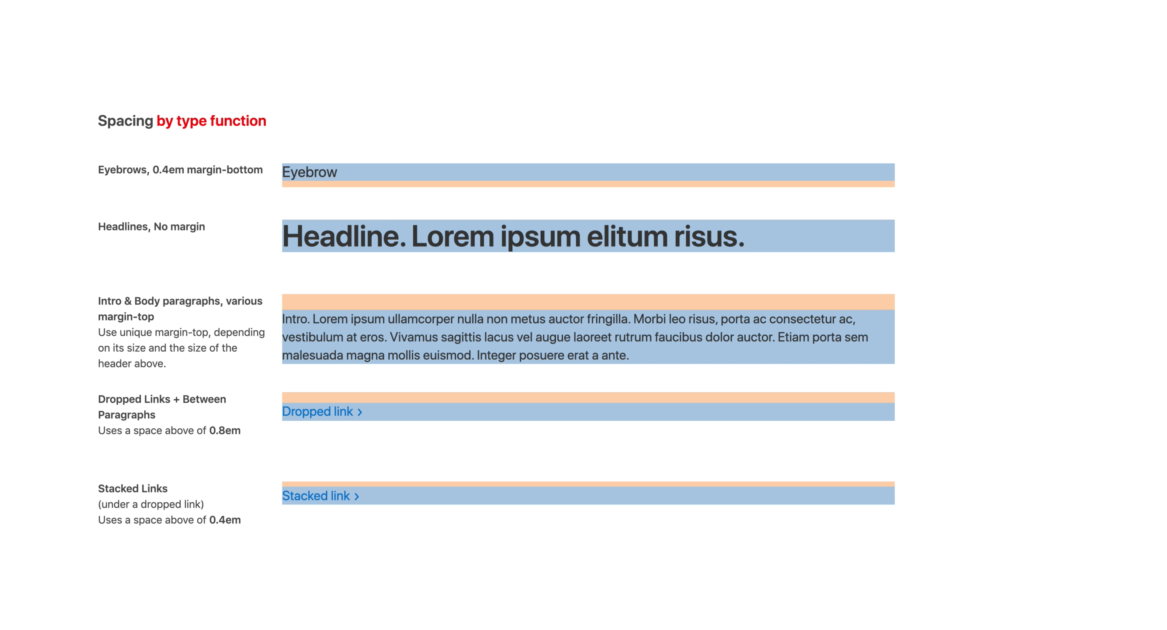
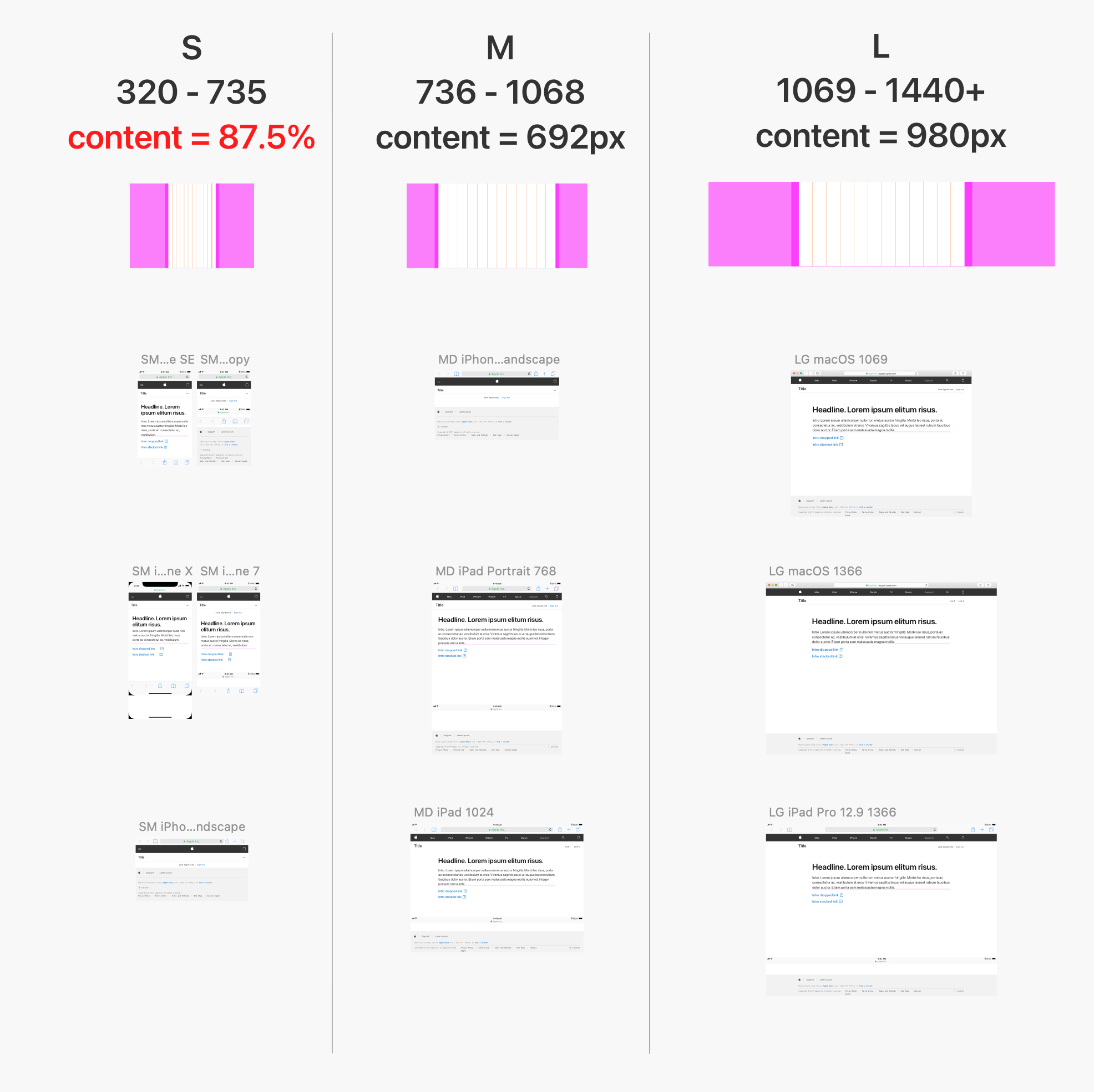
To better understand the logic behind sizing and spacing across breakpoints, I created a detailed analysis of the typographic styles.
Today, in my Figma remake, I used variables and modes to create tokens and abstractions allowing for easier analysis, updates, and closer connection to the CSS.
Challenge: The MarCom system was not designed for us
We had to figure out how to make it work for our needs
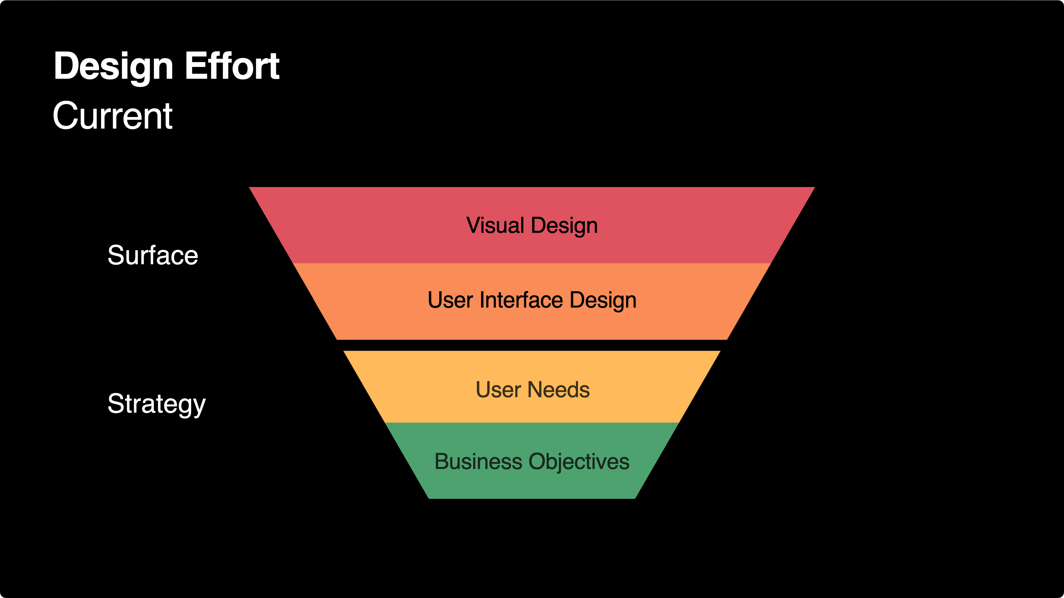
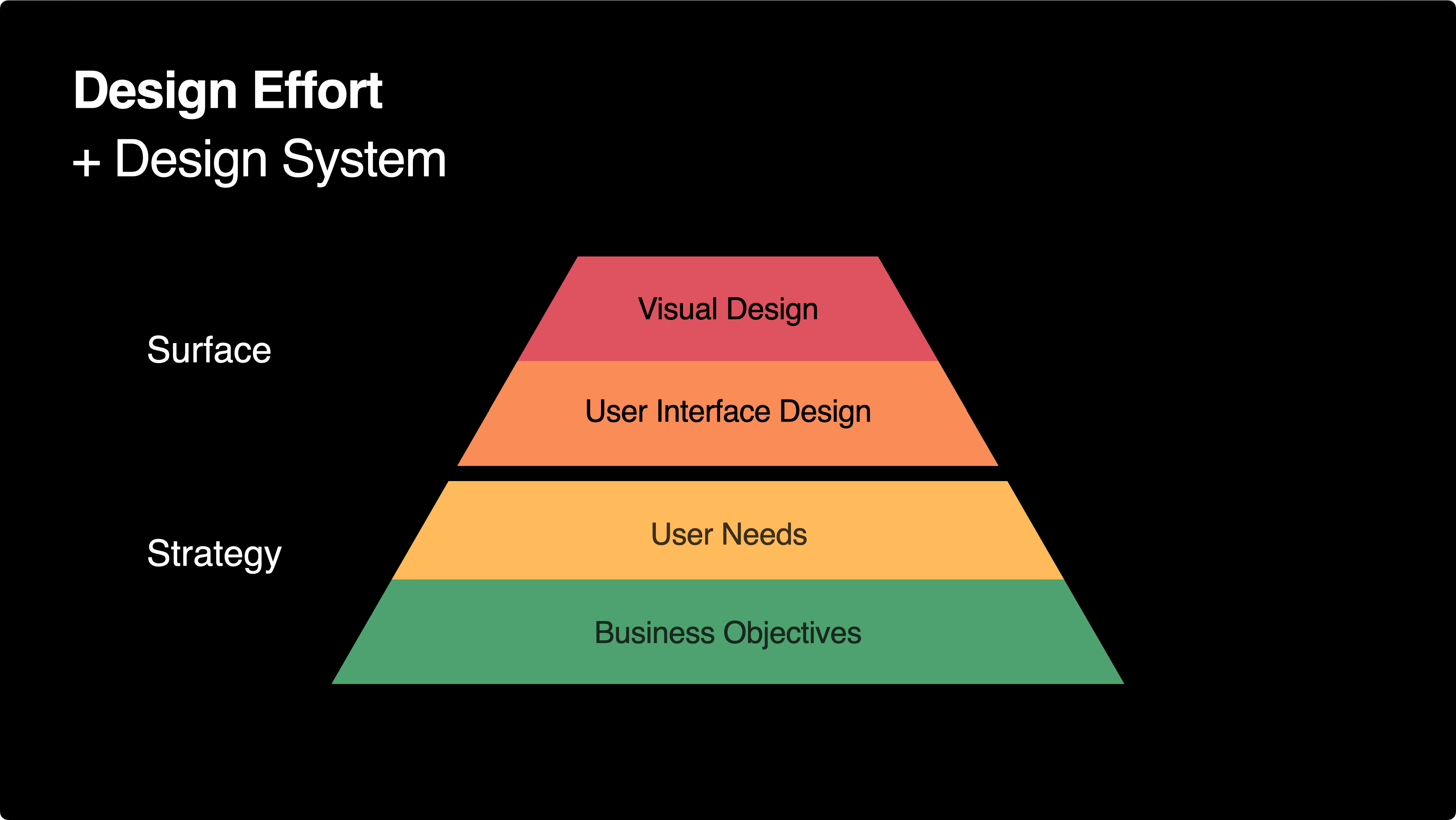
MarCom’s typography was designed for marketing pages with large, short taglines, but lacked guidance for information-dense scenarios like our support articles and tools. I set out to create the missing standards.
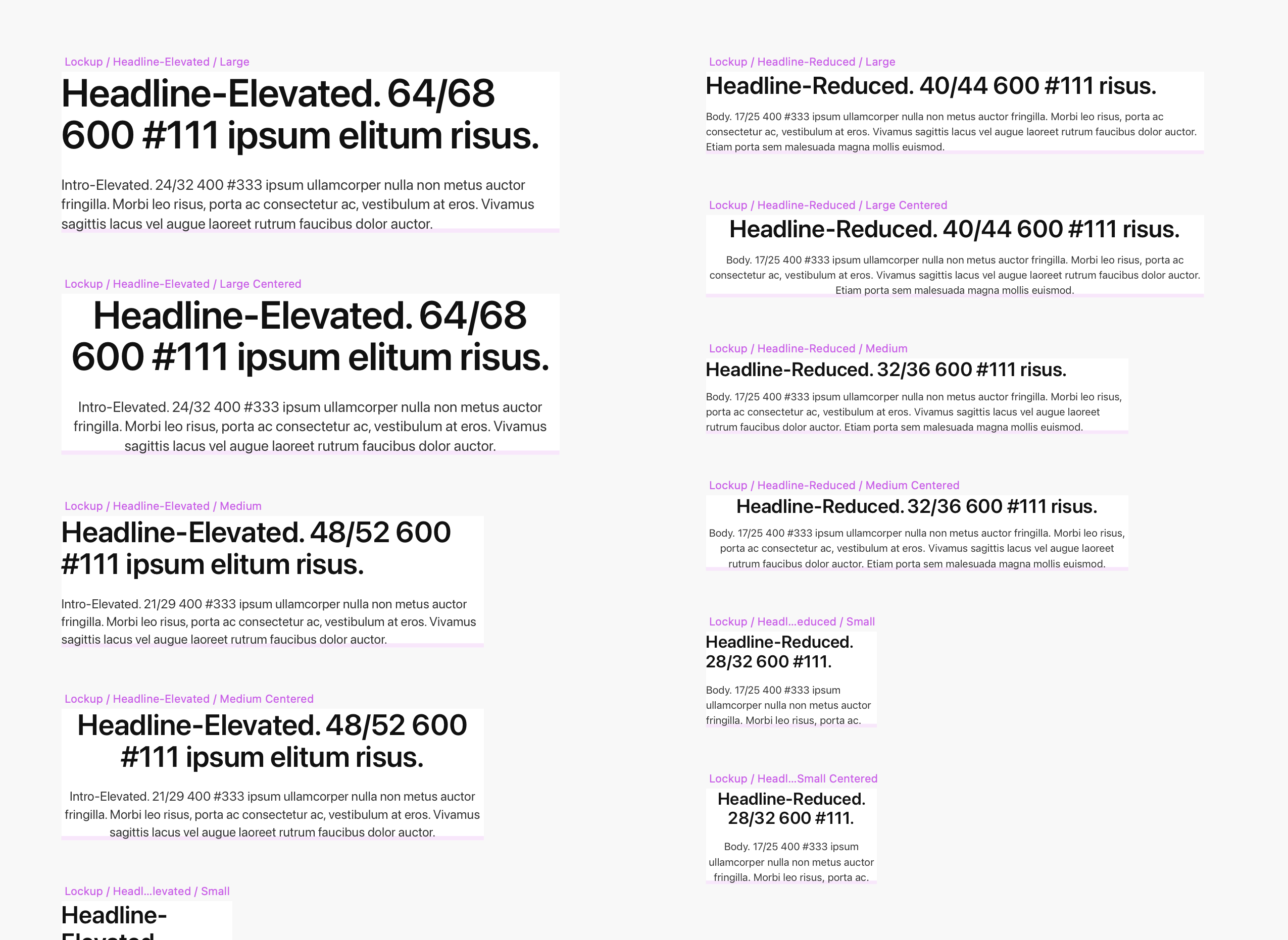
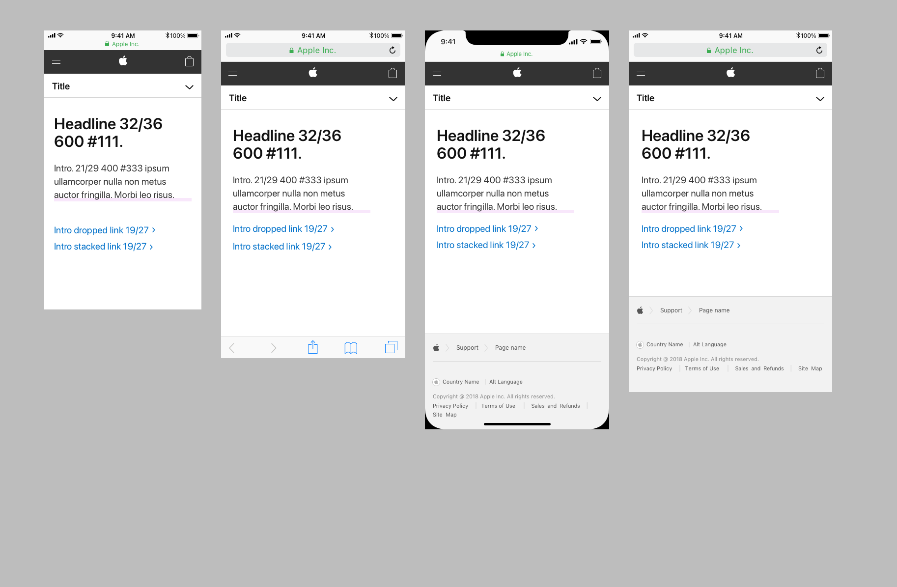
Type matrix from the design kit. Note my usage guidance in the left column
To determine how to appropriately apply these new lockups and styles, I examined marketing pages and experimented with applying the lockups to our existing pages and tools. The FTE and I then reviewed these explorations with our creative director to make final decisions.
Exploring a scenario not in the system
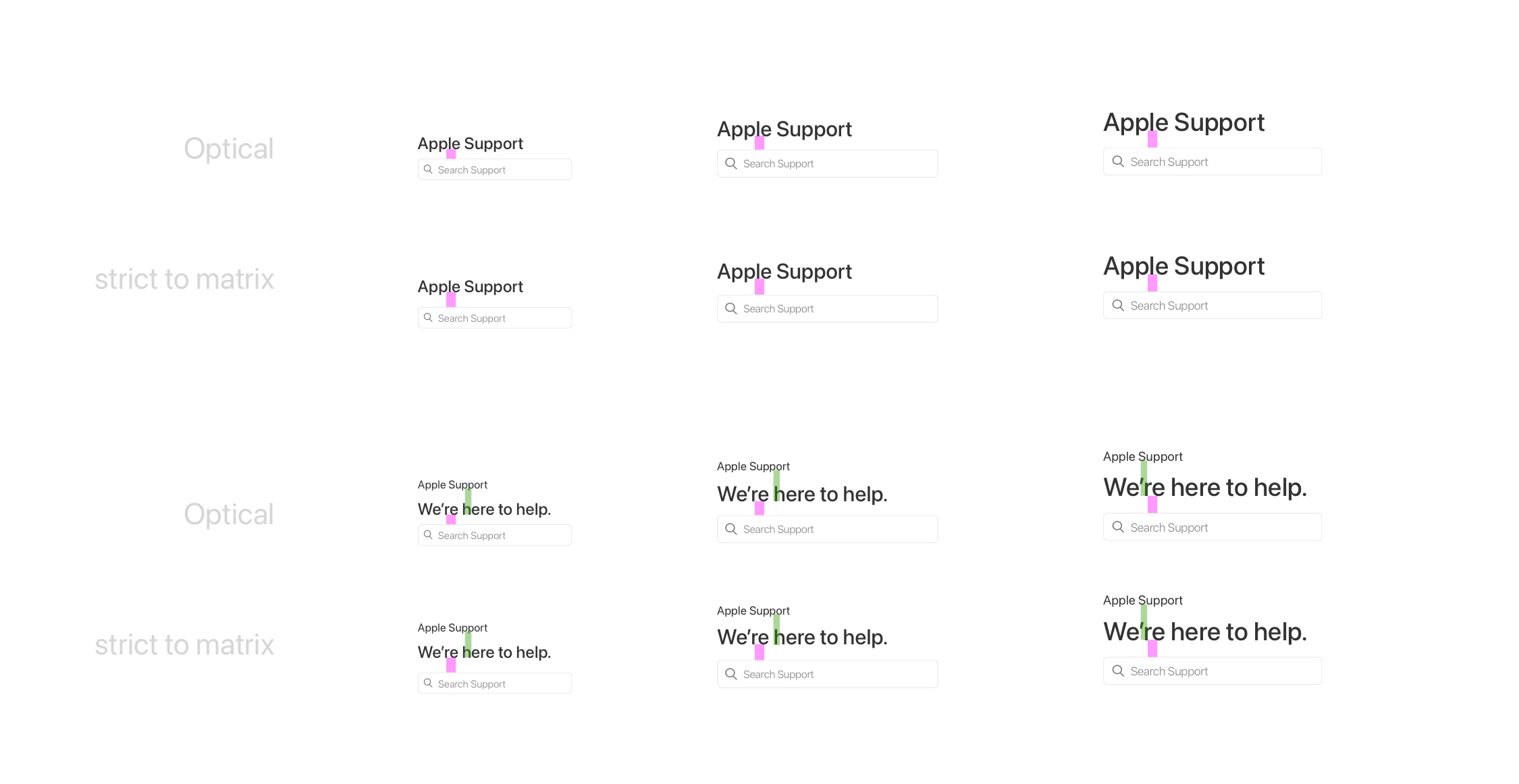
I tried using dynamic spacing based on applying the golden ratio to the header size, but it broke vertical rhythm and was overly complicated to implement. We opted for a more standard set of optical spacing units.
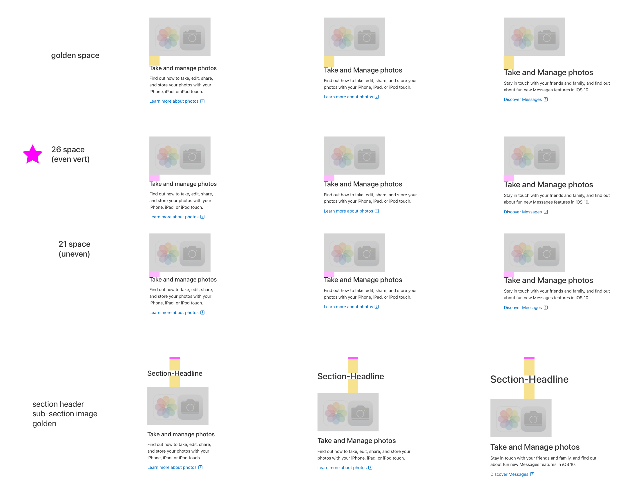
Exploring vertical spacing defaults between image and text
Testing different header levels in the same breakpoint
Accessibility overrides
Accessibility is a high priority in AppleCare. I identified contrast, text size, and button size issues in the MarCom system, confirmed changes with the creative director, and updated the design kit components. I shared these overrides in governance meetings for the broader team to consider adopting into their core components.
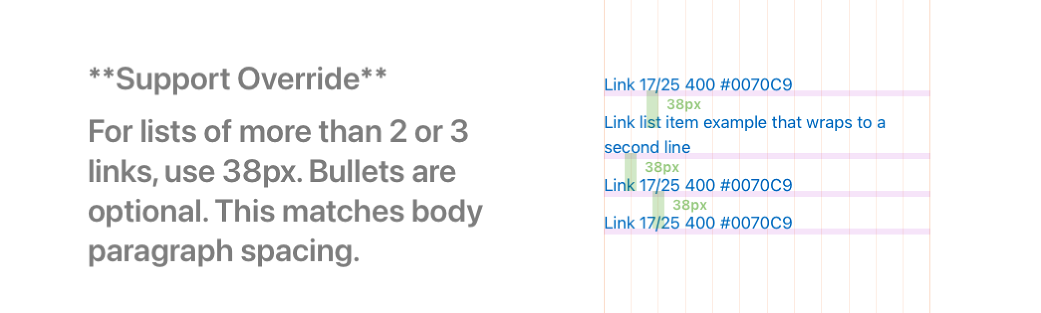
Taller spacing makes our link lists more accessible
HTML to Sketch - Building our first design kit
To make the system usable for our team and others, I manually rebuilt components as Sketch symbols, based on my analysis of the HTML component site. At first it was just the typography matrix, rules, and styles.
Type Lockups
For lockups, I built symbols with nested margin symbols as a workaround to maintain vertical spacing when changing text content (a Sketch limitation at the time). Adjusting the margin style let me hide it after manually setting content height. Later, I added the Anima plugin to enable symbols to properly hug content.
In my Figma remake, I used auto layout and margin variables, breakpoint modes for type styles, and properties for text alignment. Did you check out my Figma file?
Enhancing the kit based on needs
Custom components
When a shared need arose without an existing solution, I designed a new component and added it to our design kit. For example, this Support-specific local navigation component provides a unified way to display authentication status across applications.
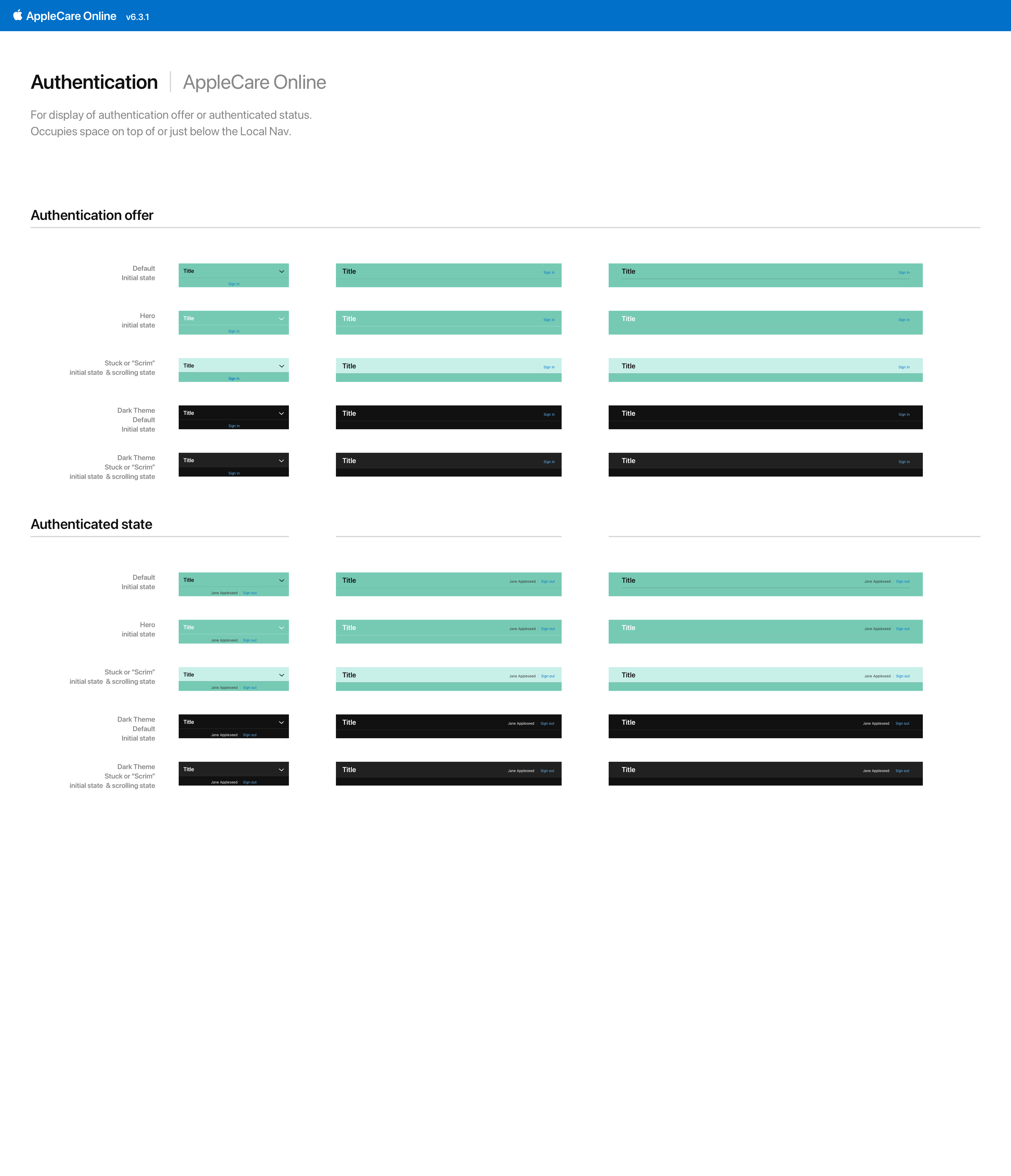
Local nav with authentication variants. The green represents background photography
The team asked for guidance on responsive design
In response, I gave training sessions on our grid strategy and added device templates with browser chrome and global components, so no one had to start from a blank artboard.
Early design kit file device templates
I held training sessions and made videos on how to use the design kit

Video demonstrating responsive symbols in the design kit.
Removing barriers for Engineering
Engineering managers had cited inconsistent UI as a barrier to framework adoption, so the design kits and reviews directly addressed this.
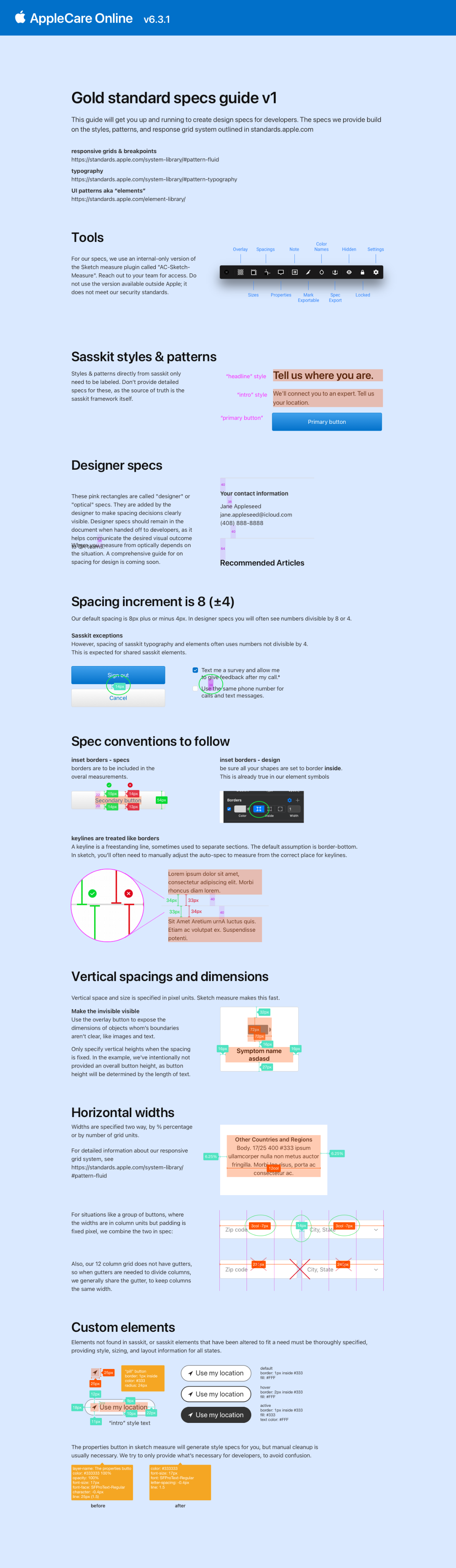
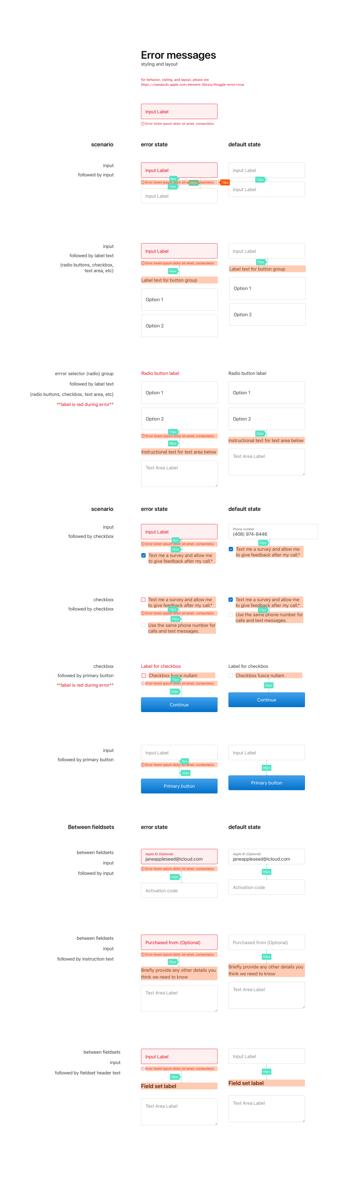
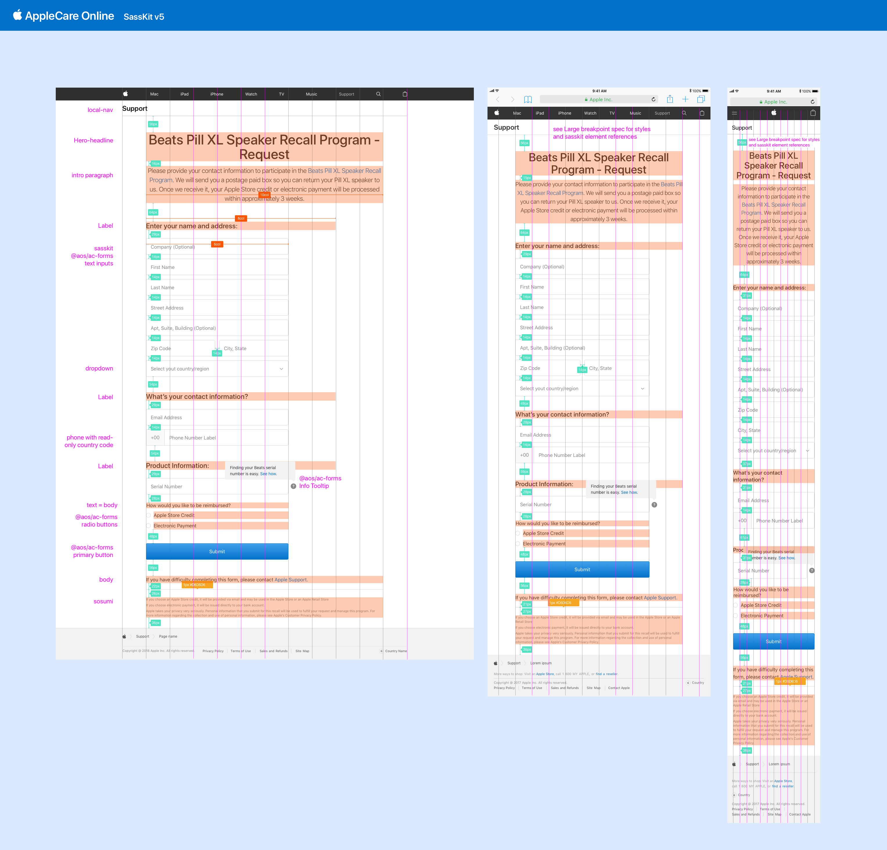
Another challenge was incomplete specs in mockups. To solve this, I created gold-standard examples for design specifications, selected a spec plugin, and trained the team to use it. I emphasized labeling text styles and showing element widths in grid units. This was crucial before it became common for devs to interactively inspect mockups.
“Gold standard” specifications
I continuously updated the design kits and communicated changes to impacted teams
Marcom released a new updated version every few months. Calling out changes between versions was essential for setting expectations, especially for shifts like moving from light to heavier font weights.
Since most teams copied system styles rather than linking to the MarCom SASS, clearly highlighting differences helped facilitate manual CSS updates.
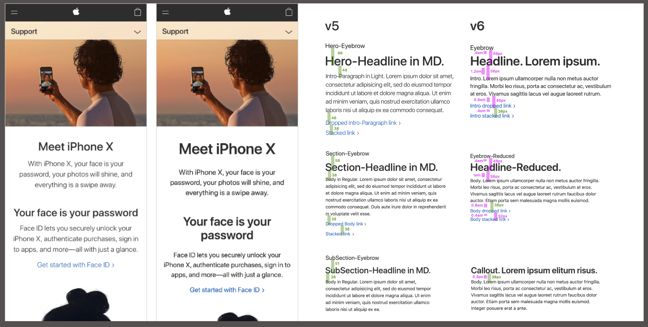
Changes between MarCom system v5 and v6 with example designs starting at different header levels
Extending Impact Across Apple Teams
Having demonstrated expertise and helped drive adoption, I was referred by the MarCom design lead to advise the Apple Product Documentation and Contact Center UX teams in their own system adoption efforts.
Challenges & Learnings
Influence without control
Listening, facilitating, and being flexible were just as important as being clear and persistent in driving change. Understanding partners’ goals and incentives was critical to successful collaboration.
Meet resistance with empathy and optimism
Change is uncomfortable. I listened to concerns and helped colleagues see that standardization meant fewer surface decisions and more time for strategic thinking. I emphasized shared ownership and invited participation in creating our own library of Support components—this was ours, and together we would shape it into what we needed.
Negotiating product roadmaps
PMs were slow to make space for visual UI updates on their roadmaps. In AppleCare, PMs are incentivized to keep costs down, so it was a difficult choice to allocate development points for visual refinement over new features.
To persuade, the FTE and I met with each product team to understand their needs and challenges. By showing a willingness to collaborate, we found opportunities in roadmaps where visual work fit naturally and agreed on a reasonable level of adoption.
Technical compromise
While we secured commitments to update UI styles and patterns, PMs understandably could not commit to fully joining a SASS framework they didn’t control. The compromise for most teams was to adopt the styles and patterns, but isolate or recreate the styling to avoid unexpected updates. This was a practical first step toward a shared visual language across all of apple.com.
Impact
A more cohesive look and feel across Support experiences
Better consistency with all of apple.com
Delivered more efficiently than ever
Update
AppleCare now has a React-based UI framework
Our foundational work paved the way for today’s modern design system infrastructure.
Achievements
As lead designer of design systems and operations, I
- Drove adoption of the MarCom design system and standards
- Created and continuously updated the design system toolkit
- Managed cross-functional stakeholders and communicated changes
- Developed design processes and standards criteria
- Mentored the team and cultivated a strong design culture
- Led design critiques, forums, office hours, and reviews

case study
Elevating performance with Design Systems & Operations
How I tripled productivity for the AppleCare Support design team while also improving quality and morale.
Role
Lead Designer
Employer
Apple
Timeline
18 mos
Core Team
Me, FTE
Apple Support pages and their foundational components and standards
Context
Millions of customers globally come to support.apple.com to get help with their Apple products.
Serving customers in 100+ countries in 30 languages with 10,000+ articles, discussion forums, AppleCare service tools, and live or scheduled support, including Genius Bar booking, the Support site’s scale and complexity made UI consistency a challenge for our 12 person design team. It was time for a design system.
While Support leadership was hesitant to fund the creation of a design system, Marketing Communications (MarCom) had recently built one for apple.com’s marketing pages. Adopting MarCom’s system would allow AppleCare Support to take its first steps toward a shared component infrastructure.
Problem
The design team couldn’t keep up with partner requests.
Quality and consistency was slipping.
Our process wasn’t scaling. Contractors added capacity but required significant guidance because standards and pattern knowledge were tribal and not documented.
Engineering flagged UI inconsistency as a blocker to adopting a shared component framework.
Factors
Fragmented team culture and workflows
No formal design system or shared UI kits
No formal standards or review gates
Solution
To address our needs, I developed and implemented a “Team Elevation Plan” to support the design team across three areas
Culture & Collaboration
Establish and run weekly design critiques, forums, and office hours, to foster communication and shared perspective.
Design System & Tools
Provide the necessary awareness, training, and tools to drive adoption of the MarCom design system framework.
Standards & Processes
Formalize expectations, documentation, and review gates to ensure consistency for more seamless development.
Key Artifacts
Design Kit (Sketch File)
Starter files containing foundational styles, components, and templates. My goal was to make it simpler to designs across three breakpoints with consistency.
Figma Update
To show how I’d build this design kit today, I remade it in Figma. Improvements:
- Variable modes for breakpoints and light/dark theme
- Tokens for type styles, for ease of maintenance
- Refactored type lockup components into one using variants & properties
Check out the Figma File
password
I’ll-be-back
In Figma, I built text lockups so they automatically adapt to the breakpoint.
Standards
Reference docs with guidance for our Support use cases. My goal was to standardize how we spaced and spec’d mockups, so engineering could confidently begin to use shared components across AppleCare projects.
Processes & Reviews
To accelerate contractors and ensure components and standards were applied correctly, the two design managers and I established clear structures and expectations for deliverables and procedures by project type.
We introduced gate reviews to keep work on track. The creative director (CD) administered the strategic gates, and I administered the standards gates.

Results
3x
Faster design delivery for 12 UX designers
10,000+
Updated pages and app screens
0 ➔ 1
Design operations established
Process
I began by initiating a relationship with the MarCom design systems team
We discussed shared goals, and the rationale of their system. I became the point of contact for AppleCare, and joined their system governance meetings.
We earned buy-in across AppleCare teams
The FTE and I presented to teams and leadership across AppleCare. We shared what design systems are, their value, and how we might use the MarCom system. This socialization helped build trust and momentum for adoption.
To understand the MarCom system, I deconstructed it
Type lockups are the foundation, with strict rules around vertical spacing and emphasis on styling by the semantic role of the text.
To better understand the logic behind sizing and spacing across breakpoints, I created a detailed analysis of the typographic styles.
Today, in my Figma remake, I used variables and modes to create tokens and abstractions allowing for easier analysis, updates, and closer connection to the CSS.
Challenge: The MarCom system was not designed for us
We had to figure out how to make it work for our needs
MarCom’s typography was designed for marketing pages with large, short taglines, but lacked guidance for information-dense scenarios like our support articles and tools. I set out to create the missing standards.
Type matrix from the design kit. Note my usage guidance in the left column
To determine how to appropriately apply these new lockups and styles, I examined marketing pages and experimented with applying the lockups to our existing pages and tools. The FTE and I then reviewed these explorations with our creative director to make final decisions.
Exploring a scenario not in the system
I tried using dynamic spacing based on applying the golden ratio to the header size, but it broke vertical rhythm and was overly complicated to implement. We opted for a more standard set of optical spacing units.
Exploring vertical spacing defaults between image and text
Testing different header levels in the same breakpoint
Accessibility overrides
Accessibility is a high priority in AppleCare. I identified contrast, text size, and button size issues in the MarCom system, confirmed changes with the creative director, and updated the design kit components. I shared these overrides in governance meetings for the broader team to consider adopting into their core components.
Taller spacing makes our link lists more accessible
HTML to Sketch - Building our first design kit
To make the system usable for our team and others, I manually rebuilt components as Sketch symbols, based on my analysis of the HTML component site. At first it was just the typography matrix, rules, and styles.
Type Lockups
For lockups, I built symbols with nested margin symbols as a workaround to maintain vertical spacing when changing text content (a Sketch limitation at the time). Adjusting the margin style let me hide it after manually setting content height. Later, I added the Anima plugin to enable symbols to properly hug content.
In my Figma remake, I used auto layout and margin variables, breakpoint modes for type styles, and properties for text alignment. Did you check out my Figma file?
Enhancing the kit based on needs
Custom components
When a shared need arose without an existing solution, I designed a new component and added it to our design kit. For example, this Support-specific local navigation component provides a unified way to display authentication status across applications.
Local nav with authentication variants. The green represents background photography
The team asked for guidance on responsive design
In response, I gave training sessions on our grid strategy and added device templates with browser chrome and global components, so no one had to start from a blank artboard.
Early design kit file device templates
I held training sessions and made videos on how to use the design kit
Video demonstrating responsive symbols in the design kit.
Removing barriers for Engineering
Engineering managers had cited inconsistent UI as a barrier to framework adoption, so the design kits and reviews directly addressed this.
Another challenge was incomplete specs in mockups. To solve this, I created gold-standard examples for design specifications, selected a spec plugin, and trained the team to use it. I emphasized labeling text styles and showing element widths in grid units. This was crucial before it became common for devs to interactively inspect mockups.
“Gold standard” specifications
I continuously updated the design kits and communicated changes to impacted teams
Marcom released a new updated version every few months. Calling out changes between versions was essential for setting expectations, especially for shifts like moving from light to heavier font weights.
Since most teams copied system styles rather than linking to the MarCom SASS, clearly highlighting differences helped facilitate manual CSS updates.
Changes between MarCom system v5 and v6 with example designs starting at different header levels
Extending Impact Across Apple Teams
Having demonstrated expertise and helped drive adoption, I was referred by the MarCom design lead to advise the Apple Product Documentation and Contact Center UX teams in their own system adoption efforts.
Challenges & Learnings
Influence without control
Listening, facilitating, and being flexible were just as important as being clear and persistent in driving change. Understanding partners’ goals and incentives was critical to successful collaboration.
Meet resistance with empathy and optimism
Change is uncomfortable. I listened to concerns and helped colleagues see that standardization meant fewer surface decisions and more time for strategic thinking. I emphasized shared ownership and invited participation in creating our own library of Support components—this was ours, and together we would shape it into what we needed.
Negotiating product roadmaps
PMs were slow to make space for visual UI updates on their roadmaps. In AppleCare, PMs are incentivized to keep costs down, so it was a difficult choice to allocate development points for visual refinement over new features.
To persuade, the FTE and I met with each product team to understand their needs and challenges. By showing a willingness to collaborate, we found opportunities in roadmaps where visual work fit naturally and agreed on a reasonable level of adoption.
Technical compromise
While we secured commitments to update UI styles and patterns, PMs understandably could not commit to fully joining a SASS framework they didn’t control. The compromise for most teams was to adopt the styles and patterns, but isolate or recreate the styling to avoid unexpected updates. This was a practical first step toward a shared visual language across all of apple.com.
Impact
A more cohesive look and feel across Support experiences
Better consistency with all of apple.com
Delivered more efficiently than ever
Update
AppleCare now has a React-based UI framework
Our foundational work paved the way for today’s modern design system infrastructure.
Achievements
As lead designer of design systems and operations, I
- Drove adoption of the MarCom design system and standards
- Created and continuously updated the design system toolkit
- Managed cross-functional stakeholders and communicated changes
- Developed design processes and standards criteria
- Mentored the team and cultivated a strong design culture
- Led design critiques, forums, office hours, and reviews

case study
Elevating performance with Design Systems & Operations
How I tripled productivity for the AppleCare Support design team while also improving quality and morale.
Role
Lead Designer
Employer
Apple
Timeline
18 mos
Core Team
Me, FTE
3x
Faster design delivery
10,000+
Updated pages and app screens
0 ➔ 1
Design operations established
Apple Support pages and their foundational components and standards
Context
Millions of customers globally visit support.apple.com to get help with their Apple products.
Serving customers in 100+ countries in 30 languages with 10,000+ articles, discussion forums, AppleCare service tools, and live or scheduled support, including Genius Bar booking, the Support site’s scale and complexity made UI consistency a challenge for our 12 person design team. It was time for a design system.
While Support leadership was hesitant to fund the creation of a design system, Marketing Communications (MarCom) had recently built one for apple.com’s marketing pages. Adopting MarCom’s system would allow AppleCare Support to take its first steps toward a shared component infrastructure.
Problem
The design team couldn’t keep up with partner requests.
Quality and consistency was slipping.
Our process wasn’t scaling. Contractors added capacity but required significant guidance because standards and pattern knowledge were tribal and not documented.
Engineering flagged UI inconsistency as a blocker to adopting a shared component framework.
Factors
Fragmented team culture and workflows
No formal design system or shared UI kits
No formal standards or review gates
Solution
To address our needs, I developed and implemented a “Team Elevation Plan” to support the design team across three areas
Culture & Collaboration
Establish and run weekly design critiques, forums, and office hours, to foster communication and shared perspective.
Design System & Tools
Provide the necessary awareness, training, and tools to drive adoption of the MarCom design system framework.
Standards & Processes
Formalize expectations, documentation, and review gates to ensure consistency for more seamless development.
Key Artifacts
Design Kit (Sketch File)
Starter files containing foundational styles, components, and templates. My goal was to make it simpler to designs across three breakpoints with consistency.
Figma Update
To show how I’d build this design kit today, I remade it in Figma. Improvements:
- Variable modes for breakpoints and light/dark theme
- Tokens for type styles, for ease of maintenance
- Refactored type lockup components into one using variants & properties
Check out the Figma File
password
I’ll-be-back
In Figma, I built text lockups so they automatically adapt to the breakpoint.
Standards
Reference docs with guidance for our Support use cases. My goal was to standardize how we spaced and spec’d mockups, so engineering could confidently begin to use shared components across AppleCare projects.
Processes & Reviews
To accelerate contractors and ensure components and standards were applied correctly, the two design managers and I established clear structures and expectations for deliverables and procedures by project type.
We introduced gate reviews to keep work on track. The creative director (CD) administered the strategic gates, and I administered the standards gates.

Results
3x
Faster design delivery for 12 UX designers
10,000+
Updated pages and app screens
0 ➔ 1
Design operations established
Process
I began by initiating a relationship with the MarCom design systems team
We discussed shared goals, and the rationale of their system. I became the point of contact for AppleCare, and joined their system governance meetings.
We earned buy-in across AppleCare teams
The FTE and I presented to teams and leadership across AppleCare. We shared what design systems are, their value, and how we might use the MarCom system. This socialization helped build trust and momentum for adoption.
To understand their system, I deconstructed it
Type lockups are the foundation, with strict rules around vertical spacing and emphasis on styling by the semantic role of the text.
To better understand the logic behind sizing and spacing across breakpoints, I created a detailed analysis of the typographic styles.
Today, in my Figma remake, I used variables and modes to create tokens and abstractions allowing for easier analysis, updates, and closer connection to the CSS.
Challenge
The MarCom system was not designed for us
We had to make it work for our needs
MarCom’s typography was designed for marketing pages with large, short taglines, but lacked guidance for information-dense scenarios like our support articles and tools. I set out to create those standards.
Type matrix from the design kit. Note my usage guidance in the left column
To determine how to appropriately apply these new lockups and styles, I examined marketing pages and experimented with applying the lockups to our existing pages and tools. The FTE and I then reviewed these explorations with our creative director to make final decisions.
Exploring a scenario not in the system
I tried using dynamic spacing based on applying the golden ratio to the header size, but it broke vertical rhythm and was overly complicated to implement. We opted for a more standard set of optical spacing units.
Exploring vertical spacing defaults between image and text
Testing different header levels in the same breakpoint
Accessibility overrides
Accessibility is a high priority in AppleCare. I identified contrast, text size, and button size issues in the MarCom system, confirmed changes with the creative director, and updated the design kit components. I shared these overrides in governance meetings for the MarCom team to consider adopting into their core components.
Taller spacing makes our link lists more accessible
HTML to Sketch - Building our first design kit
To make the system usable for our team and others, I manually rebuilt components as Sketch symbols, based on my analysis of the HTML component site. At first it was just the typography matrix, rules, and styles.
Type Lockups
For lockups, I built symbols with nested margin symbols as a workaround to maintain vertical spacing when changing text content (a Sketch limitation at the time). Adjusting the margin style let me hide it after manually setting content height. Later, I added the Anima plugin to enable symbols to properly hug content.
In my Figma remake, I used auto layout and margin variables, breakpoint modes for type styles, and properties for text alignment. Did you check out my Figma file?
Enhancing the kit based on needs
Custom components
When a shared need arose without an existing solution, I designed a new component and added it to our design kit. For example, this Support-specific local navigation component provides a unified way to display authentication status across applications.
Local nav with authentication variants. The green represents background photography
The team asked for guidance on responsive design
In response, I gave training sessions on our grid strategy and added device templates with browser chrome and global components, so no one had to start from a blank artboard.
Early design kit file device templates
I held trainings and made videos on how to use the design kit
Video demonstrating responsive symbols in the design kit.
Removing barriers for Engineering
Engineering managers had cited inconsistent UI as a barrier to framework adoption, so the design kits and reviews directly addressed this.
Another challenge was incomplete specs in mockups. To solve this, I created gold-standard examples for design specifications, selected a spec plugin, and trained the team to use it. I emphasized labeling text styles and showing element widths in grid units. This was crucial before it became common for devs to interactively inspect mockups.
“Gold standard” specifications
I continuously updated the kits and communicated changes to impacted teams
Marcom released a new updated version every few months. Calling out changes between versions was essential for setting expectations, especially for shifts like moving from light to heavier font weights.
Since most teams copied system styles rather than linking to the MarCom SASS, clearly highlighting differences helped facilitate manual CSS updates.
Changes between MarCom system v5 and v6 with example designs starting at different header levels
Extending impact across Apple teams
Having demonstrated expertise and helped drive adoption, I was referred by the MarCom design lead to advise the Apple Product Documentation and Contact Center UX teams in their own system adoption efforts.
Challenges & Learnings
Influence without control
Listening, facilitating, and being flexible were just as important as being clear and persistent in driving change. Understanding partners’ goals and incentives was critical to successful collaboration.
Meet resistance with empathy and optimism
Change is uncomfortable. I listened to concerns and helped colleagues see that standardization meant fewer surface decisions and more time for strategic thinking. I emphasized shared ownership and invited participation in creating our own library of Support components—this was ours, and together we would shape it into what we needed.
Negotiating product roadmaps
PMs were slow to make space for visual UI updates on their roadmaps. In AppleCare, PMs are incentivized to keep costs down, so it was a difficult choice to allocate development points for visual refinement over new features.
To persuade, the FTE and I met with each product team to understand their needs and challenges. By showing a willingness to collaborate, we found opportunities in roadmaps where visual work fit naturally and agreed on a reasonable level of adoption.
Technical compromise
While we secured commitments to update UI styles and patterns, PMs understandably could not commit to fully joining a SASS framework they didn’t control. The compromise for most teams was to adopt the styles and patterns, but isolate or recreate the styling to avoid unexpected updates. This was a practical first step toward a shared visual language across all of apple.com.
Impact
A more cohesive look and feel across Support experiences
Better consistency with all of apple.com
Delivered more efficiently than ever
Update
AppleCare now has a React-based UI framework
Our foundational work paved the way for today’s modern design system infrastructure.
Achievements
As lead designer on this initiative, I
- Drove adoption of the MarCom design system and standards
- Created and continuously updated the design system toolkit
- Managed cross-functional stakeholders and communicated changes
- Developed design processes and standards criteria
- Mentored the team and cultivated a strong design culture
- Led design critiques, forums, office hours, and reviews