
case study
Guiding patients on their surgical journey
How I designed an app to support patients on their joint replacement surgery journey. Superior outcomes require accurate expectations.
Role
Sr. Product Designer
Employer
Hinge Health
Timeline
4 mos
Core Team
Me, PM, 3 Devs
The journey guide
Context
Hinge Health’s remote physical therapy service helps people reduce pain and improve mobility.
Employers offer the service as an employee benefit. Users receive a customized exercise program delivered by the Hinge Health app and measured with wearable sensors. Each user is assigned both a health coach and a physical therapist, who consult, monitor, and communicate with the customer through the app.
My Role
I was the sole product designer, joining mid-project to take over for another designer.
I worked closely with the product manager, and we were supported by a program manager, a health coach, and a physical therapist.
Weeks before development began, an engineering lead and two developers were added to the team.
Responsible for
Journey Mapping
Concepts
UX & UI Design
Prototyping
Visual Design
Design Specs
contributed to
UX Research
Strategy
Scoping
Opportunity
Design the app experience for the new joint surgery program
To be competitive in the employee benefits market, Hinge Health needed to expand it’s continuum of care to include support for patients who’ve chosen to have joint replacement surgery.
User Goals
- Prepare for surgery
- Successful procedure
- Recover with minimal pain and maximal outcomes
Business Goals
- Show positive customer sentiment
- Launch in time to meet commitments
- Future: show superior outcomes
Process
I quickly caught up with a project in-flight
met with the previous designer and PM to absorb the research learnings thus far, including their recent patient and surgeon interviews.
To fill gaps, I interviewed additional experts
I interviewed several coaches and physical therapists (PTs) who've helped patients go through joint replacement surgeries, to understand the patient mindset and journey.
Insights
Patients need & clinicians struggle to provide:
Proper expectation setting
Pain management support
Emotion management support
Pre-op exercise plans
Outside research confirms that having accurate expectations about preparation, recovery, and results are strong indicators of successful clinical outcomes.
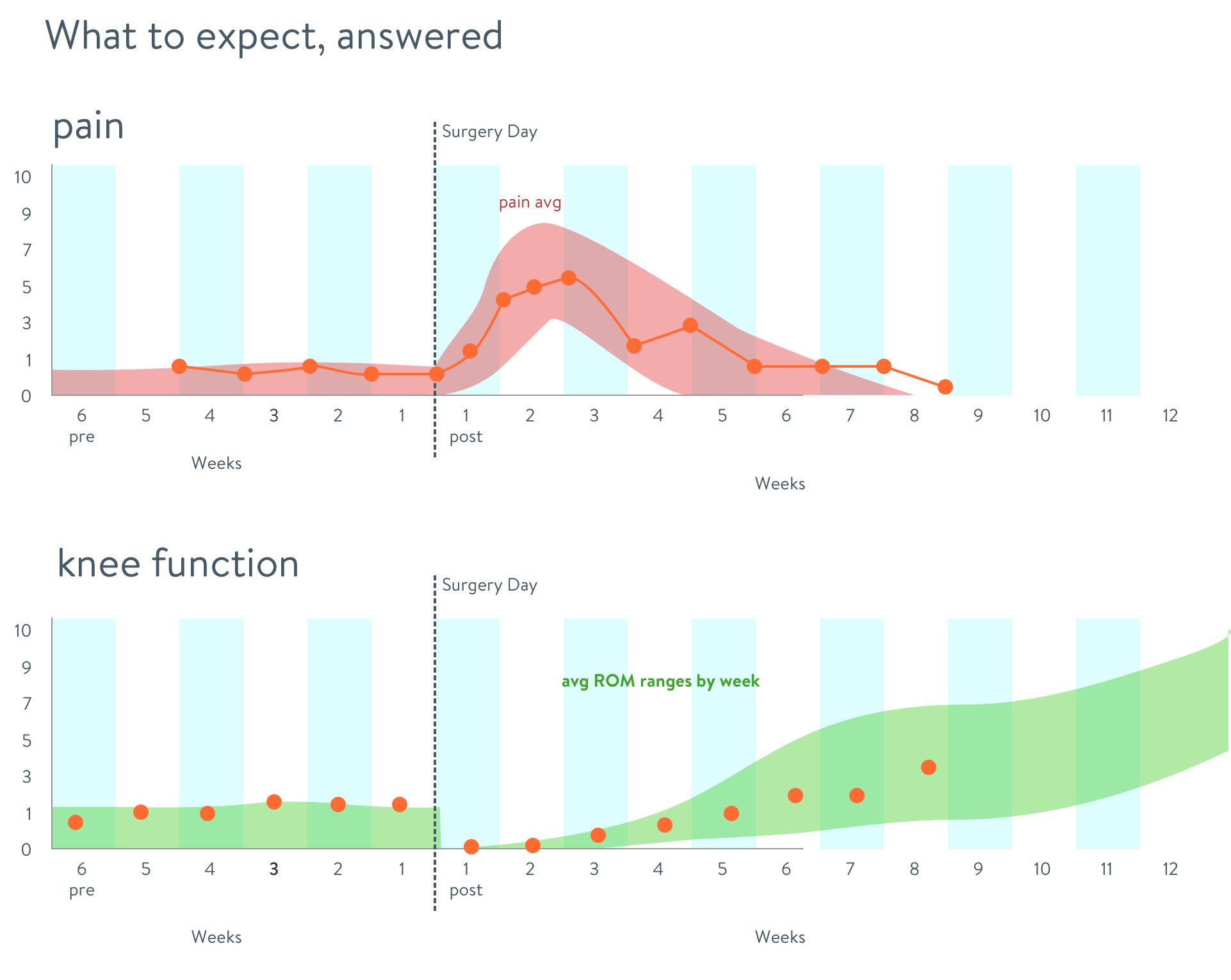
I mapped out a typical exercise therapy program and healing journey.
This exercise allowed us to align existing content to the journey, and plan for new content to fill gaps. It also enabled me to define healing milestones.
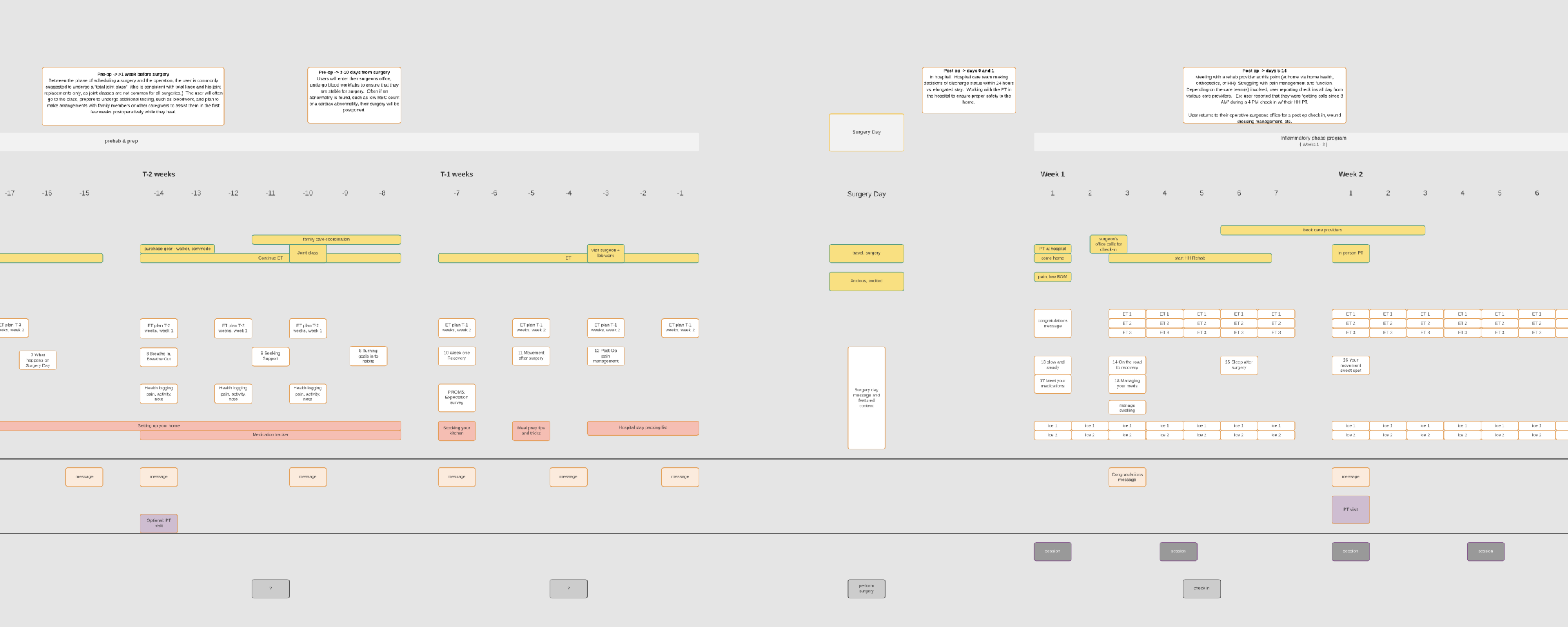
Patient actions and exercises in the weeks before and after surgery
I found best practices & competitors
- In the UK, patients attend “joint school” classes to prepare.
- Some hospitals provide a thorough book, but it’s hard to parse.
- Rehab apps display tasks and performance data.
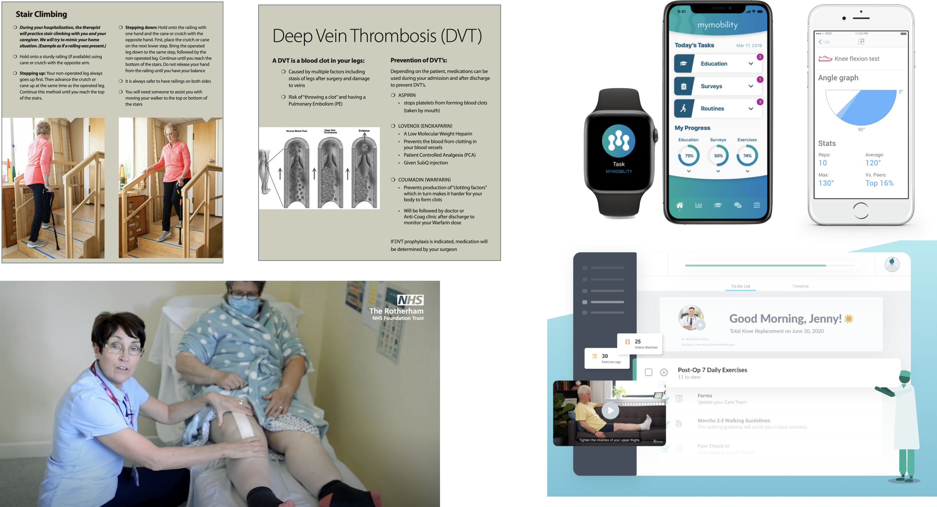
There is an opportunity to improve the accuracy of patient expectations through more timely and accessible education.
Thoughts, themes, context
To understand the problem space, the PM and I synthesized research, which informed concept generation.
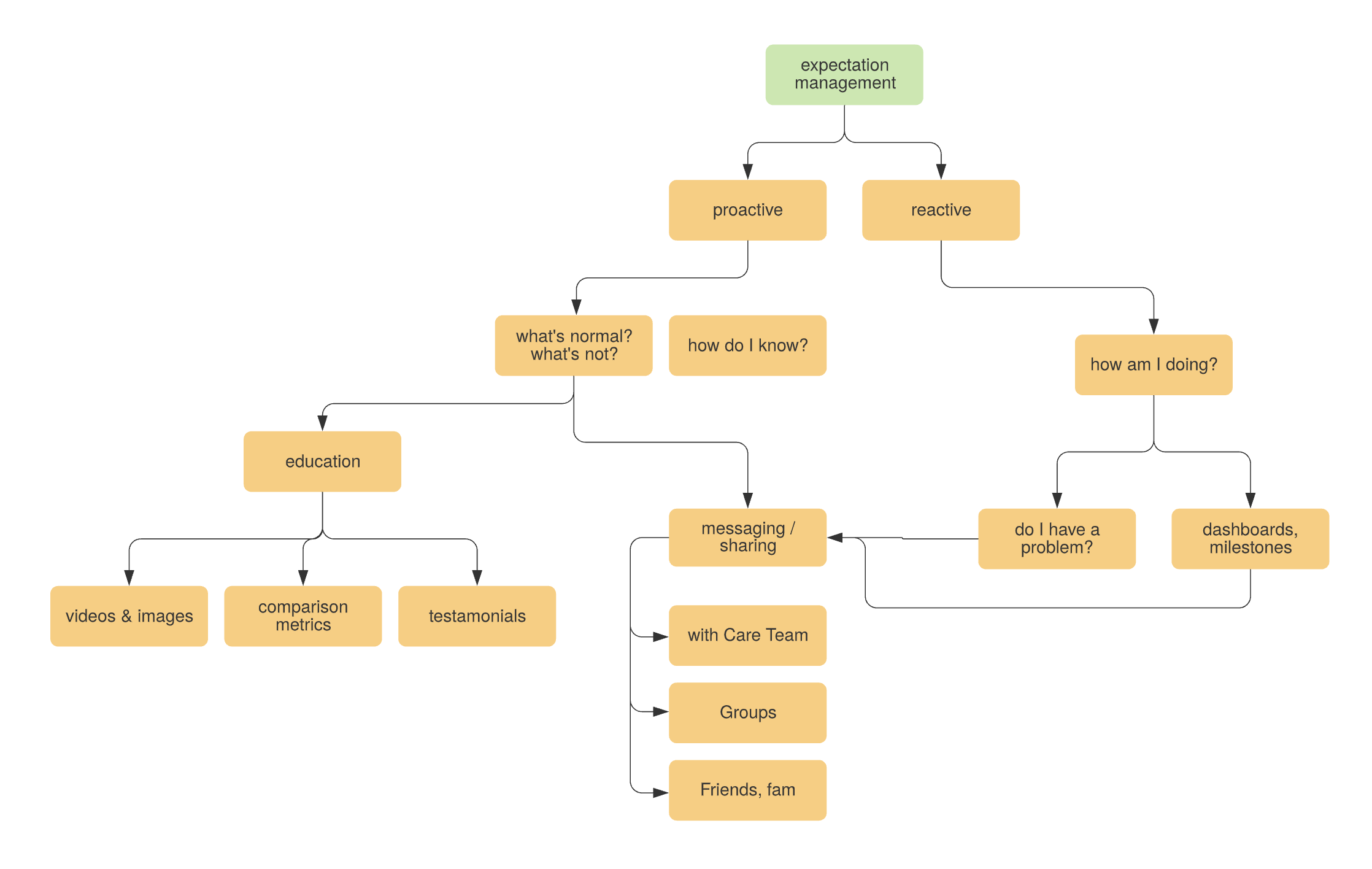
Patient questions and sources of answers
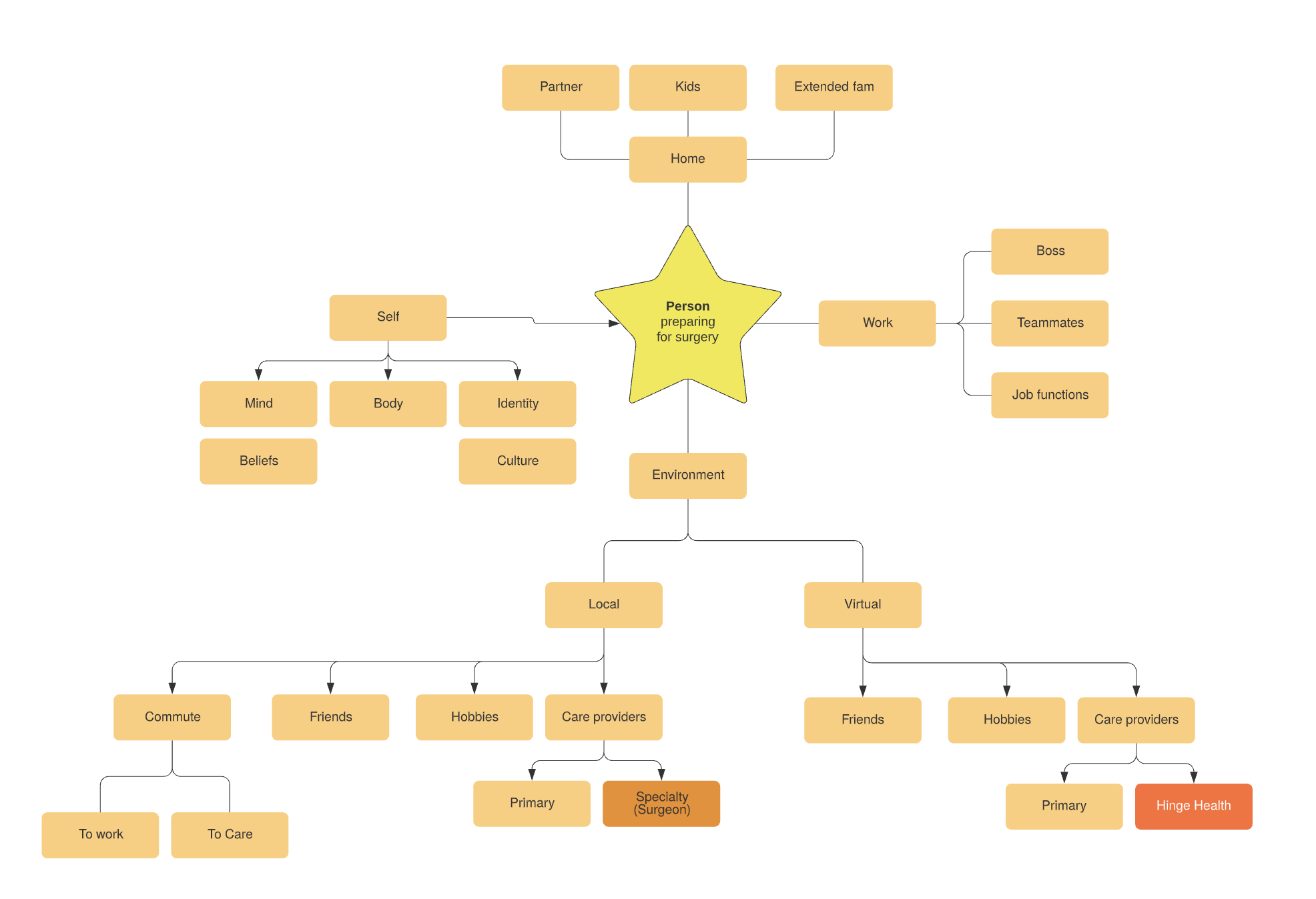
The territory surrounding a surgery patient
Clustering themes gave structure to the creation of requirements and concepts
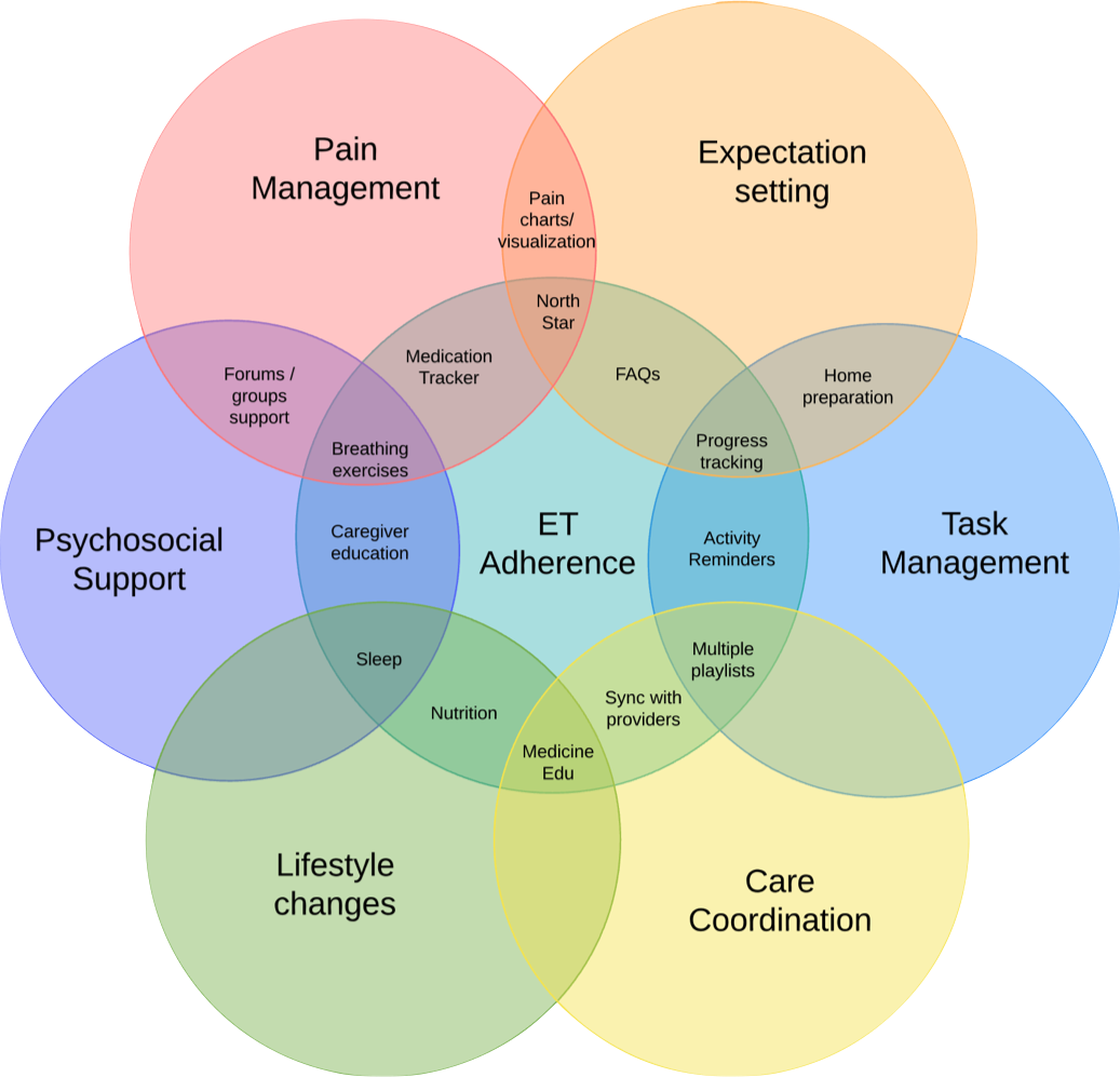
Concepts beyond curated content
Certainly we would leverage existing knowledge base articles to serve surgery-related educational content. This was the most feasible and efficient solution to the primary issue of expectation setting.
But first, we wanted to diverge and explore other ways to serve the user and care team. I came up with concepts to address the various patient wants and needs, and shared them back to our physical therapists and coaches.
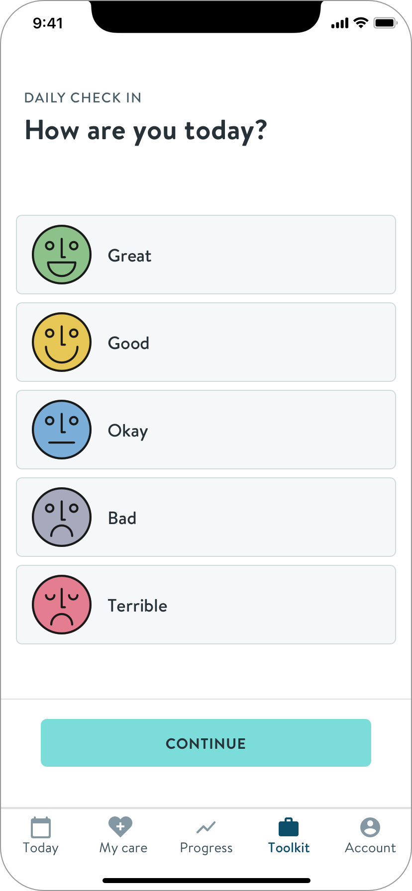
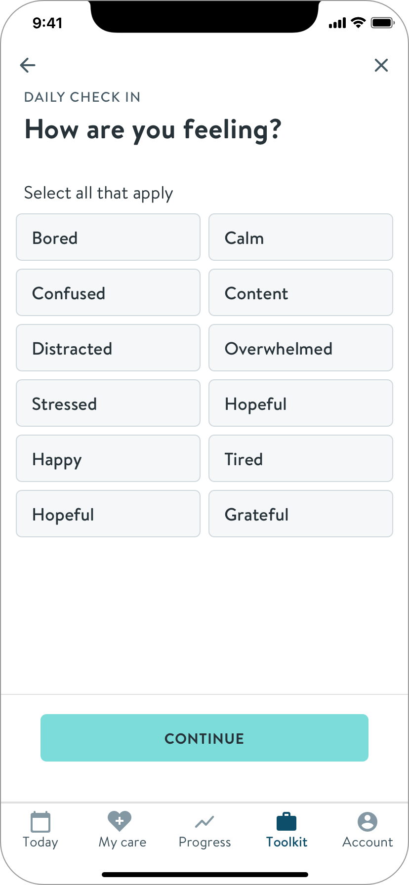
Emotional check-ins
Adding emotional check ins to daily exercise therapy would help coaches better know when and how to check in with emotional support.
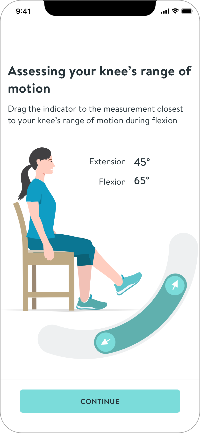
How to measure ROM with a swollen knee?
Upon learning from PTs that our wearable sensors are difficult to use on swollen knees, I came up with ideas for patients to self-report range of motion (ROM). A key learning is that high accuracy isn’t necessary at this stage of healing.
Iterations of a self-reporting knee range of motion module.
Micro content
I took the common themes of the journey and thought about how they could be a set of cards or an expert FAQ.
How am I doing? What’s normal?
Patients’ primary concern is how they’re doing. This concept quantifies and contextualizes their progress and pain, within a range backed by data.
I learned that while joint surgery is a well-worn path, everyone’s progress and experience is unique, especially regarding pain, because it is measured subjectively. Normal ranges are not feasible to identify. This feedback led to the design of milestone cards containing more general descriptions.
While mapping your progress is possible and helpful, comparisons to others is not
Make to learn
Many ideas were worth pursuing in future releases. More importantly, sharing these artifacts helped me quickly learn what’s important, revealed constraints, and informed the final MVP design.
Scoping to address resource challenges
The PM, PgM and I discussed what we could achieve given the circumstances, and decided to focus on a static content solution for initial MVP.
Though a tad threadbare, this direction would address the primary user need.
Factors
No engineers, arrival date unknown
25% of one writer's time to create journey overview content
Hard deadline
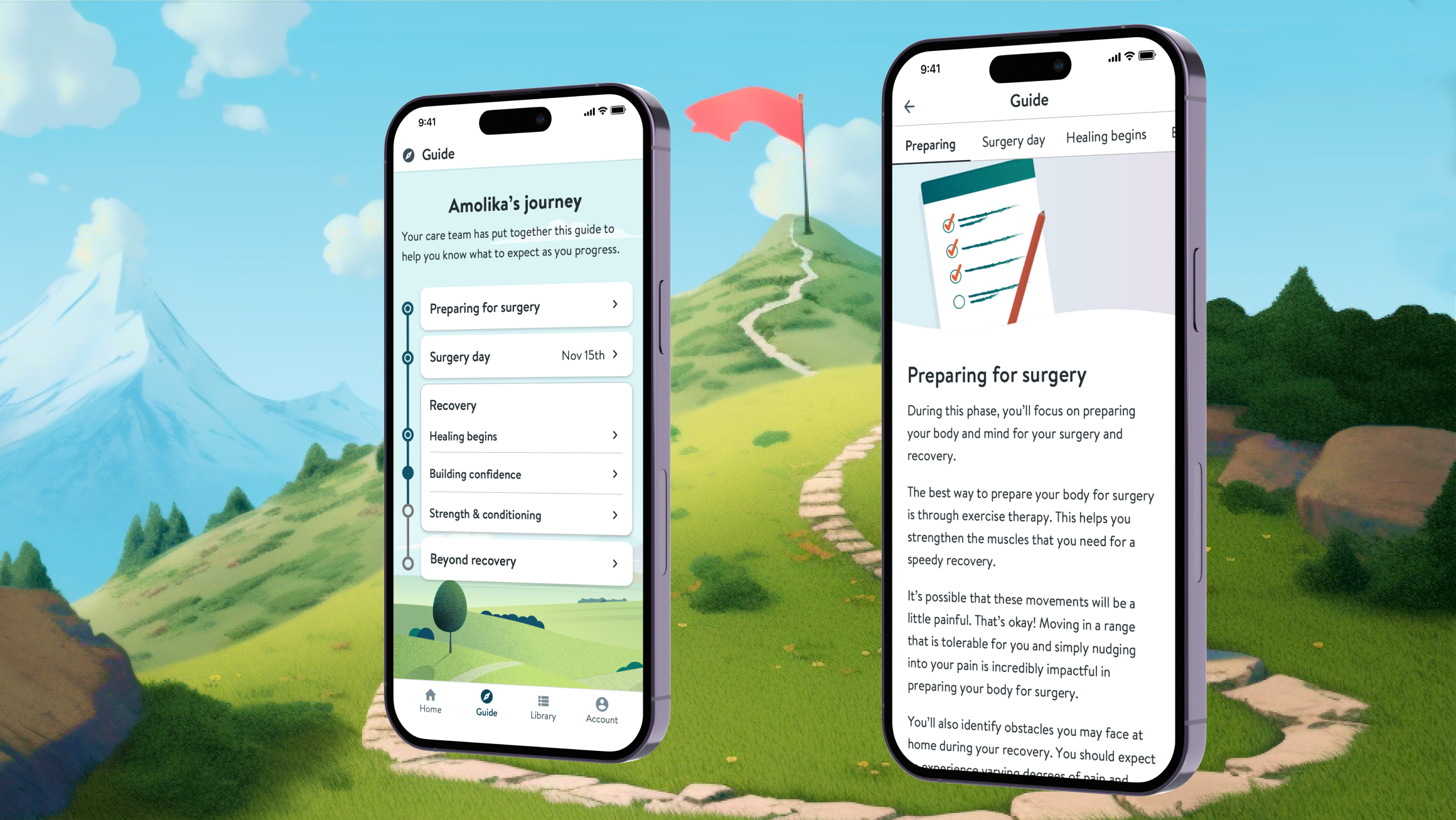
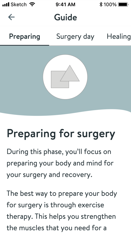
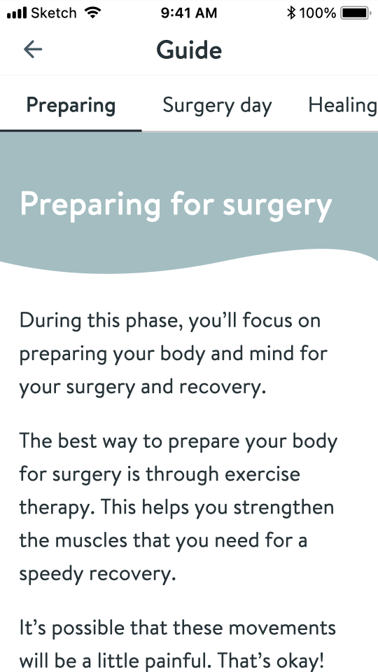
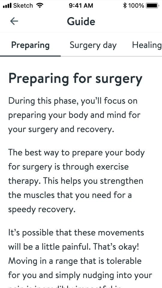
The Journey Guide
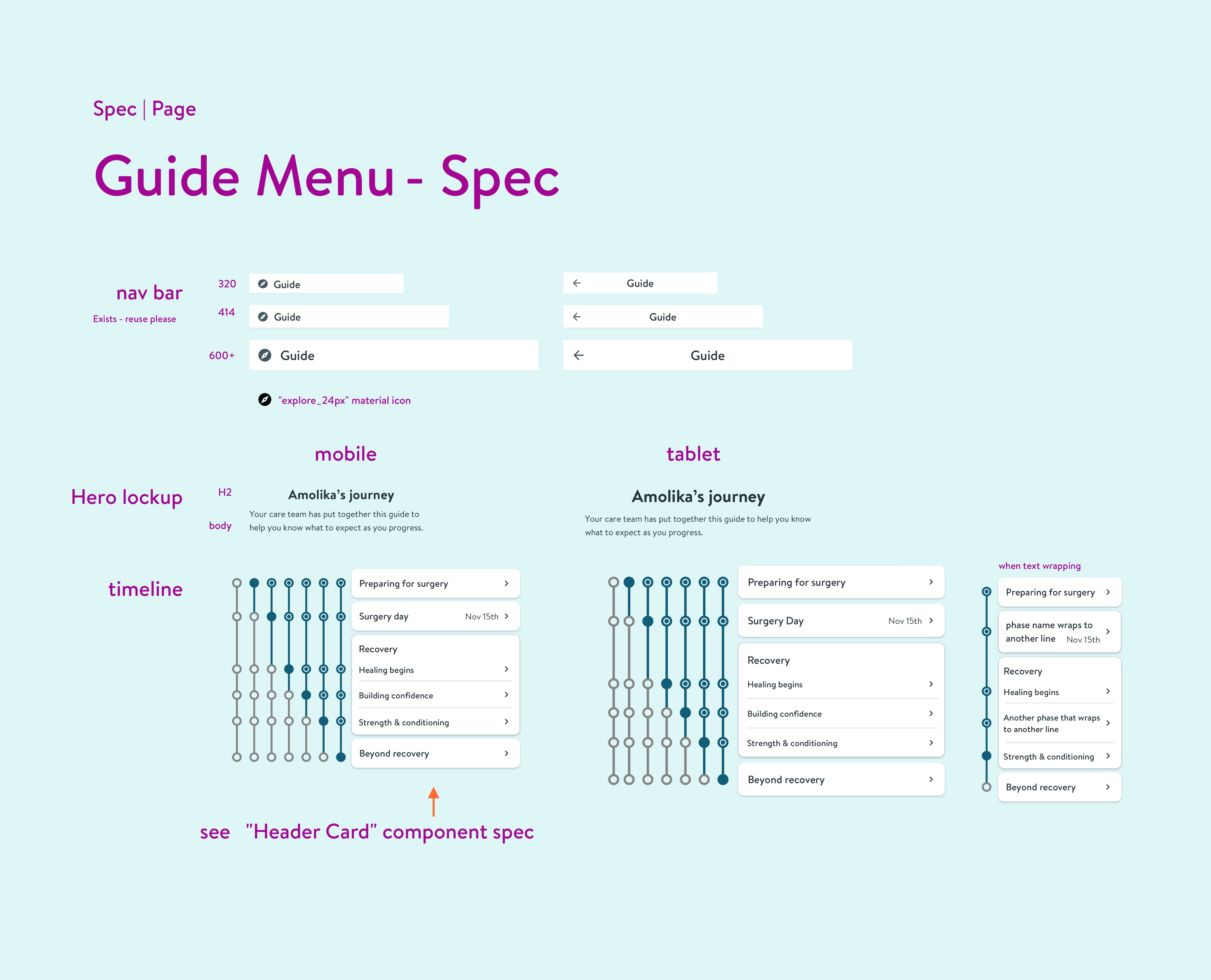
Architecture to encourage exploration
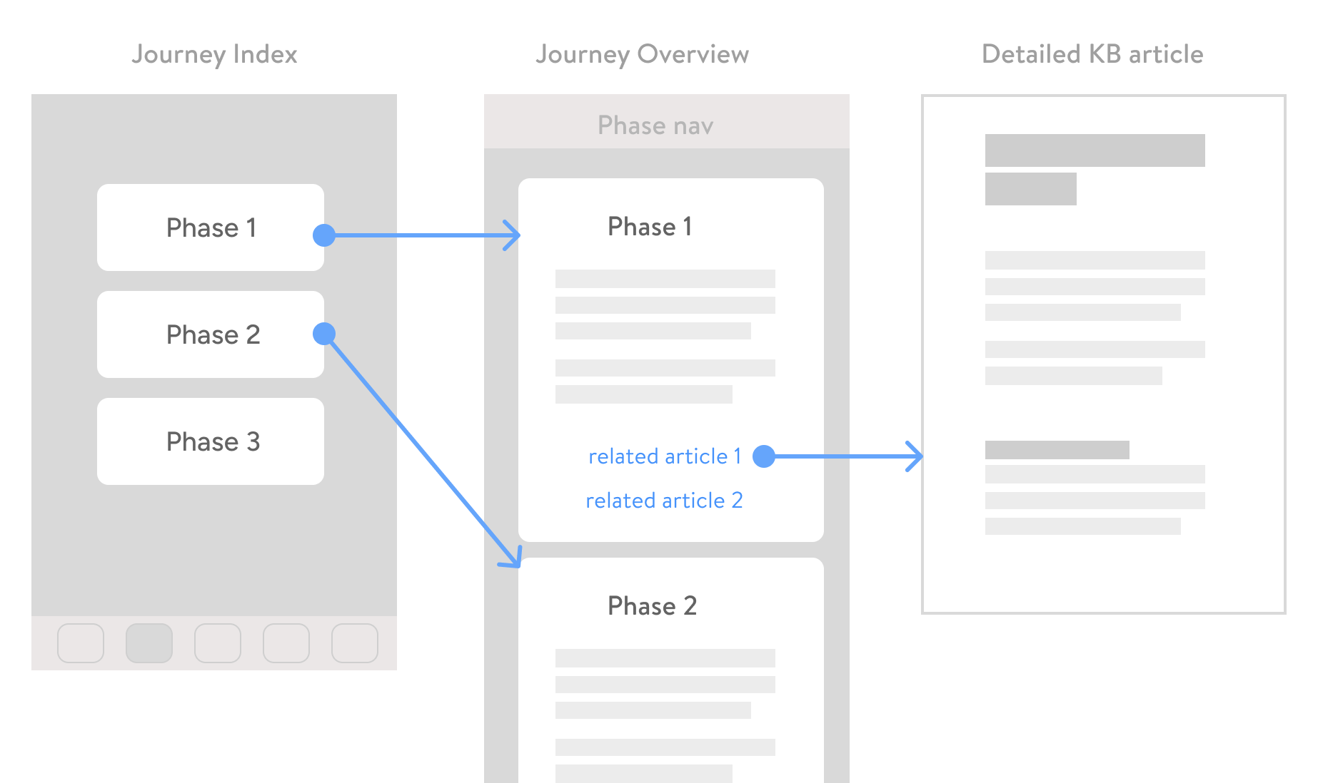
IA of the journey guide section of the surgery program app
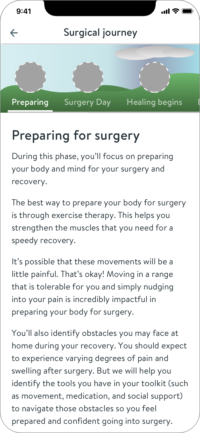
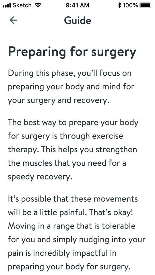
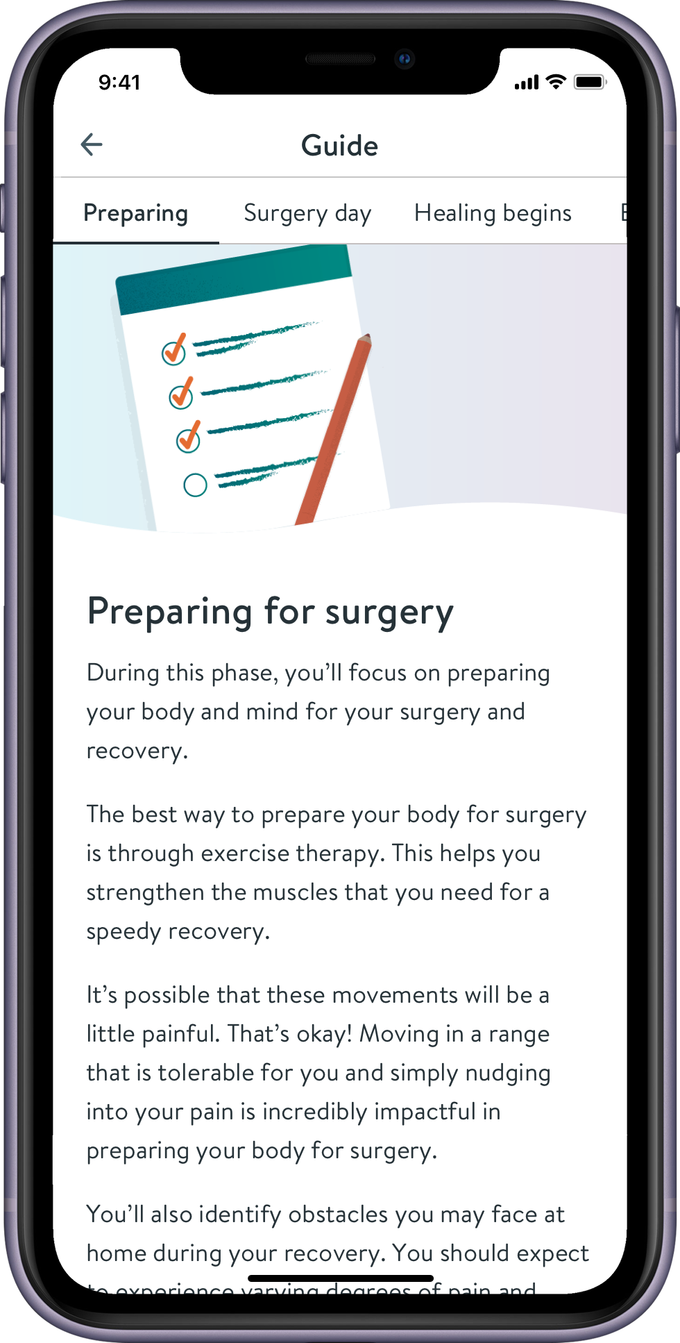
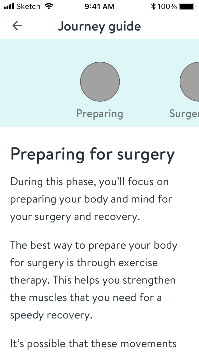
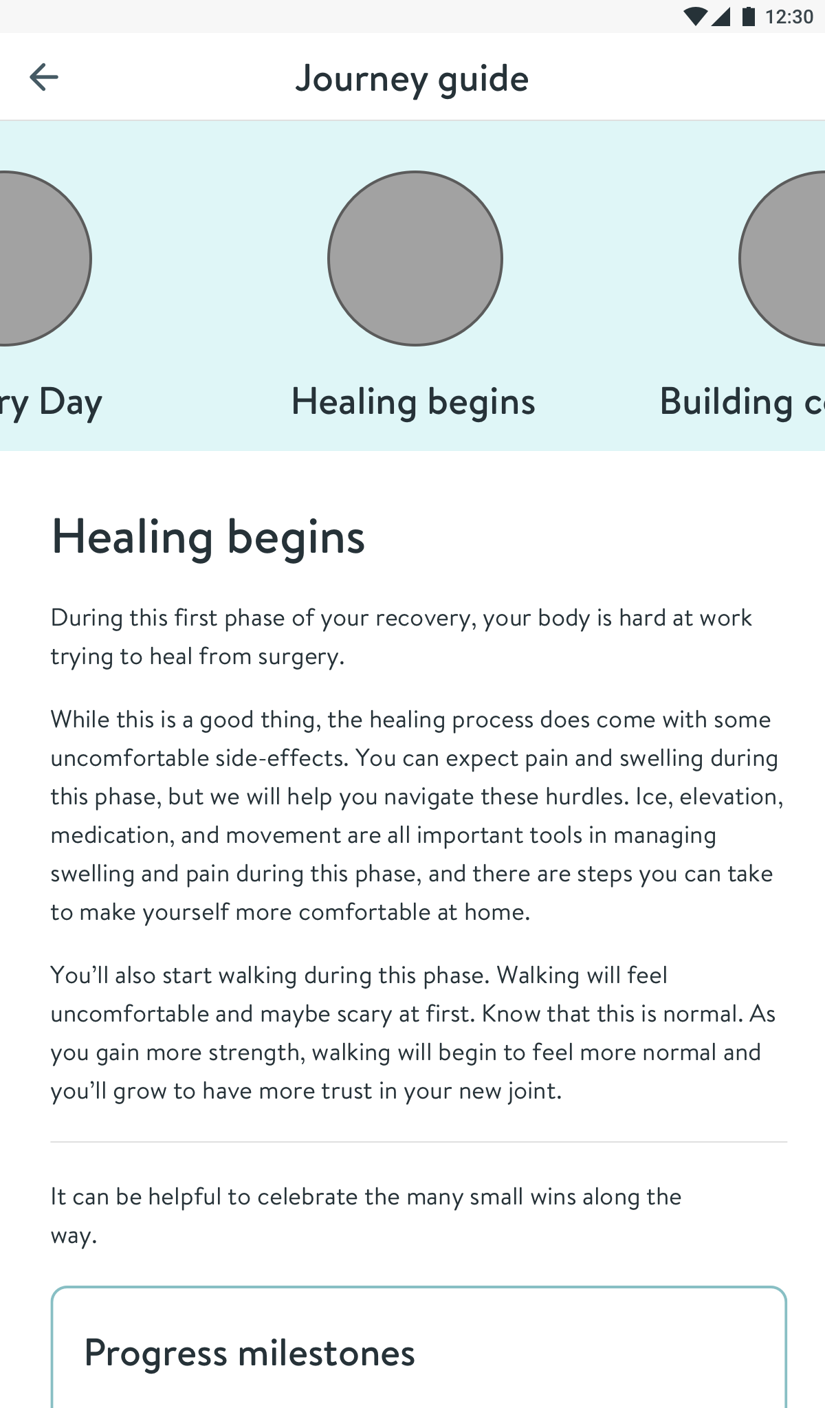
I designed a guide containing short phase overviews in a single page. This would encourage users to naturally read beyond the current phase. Each phase overview also contains links to relevant articles.
Later on, I validated the structure and navigation internally with a Sketch prototype.
To help patients track their preparation, I explored ideas including statuses and to-dos.
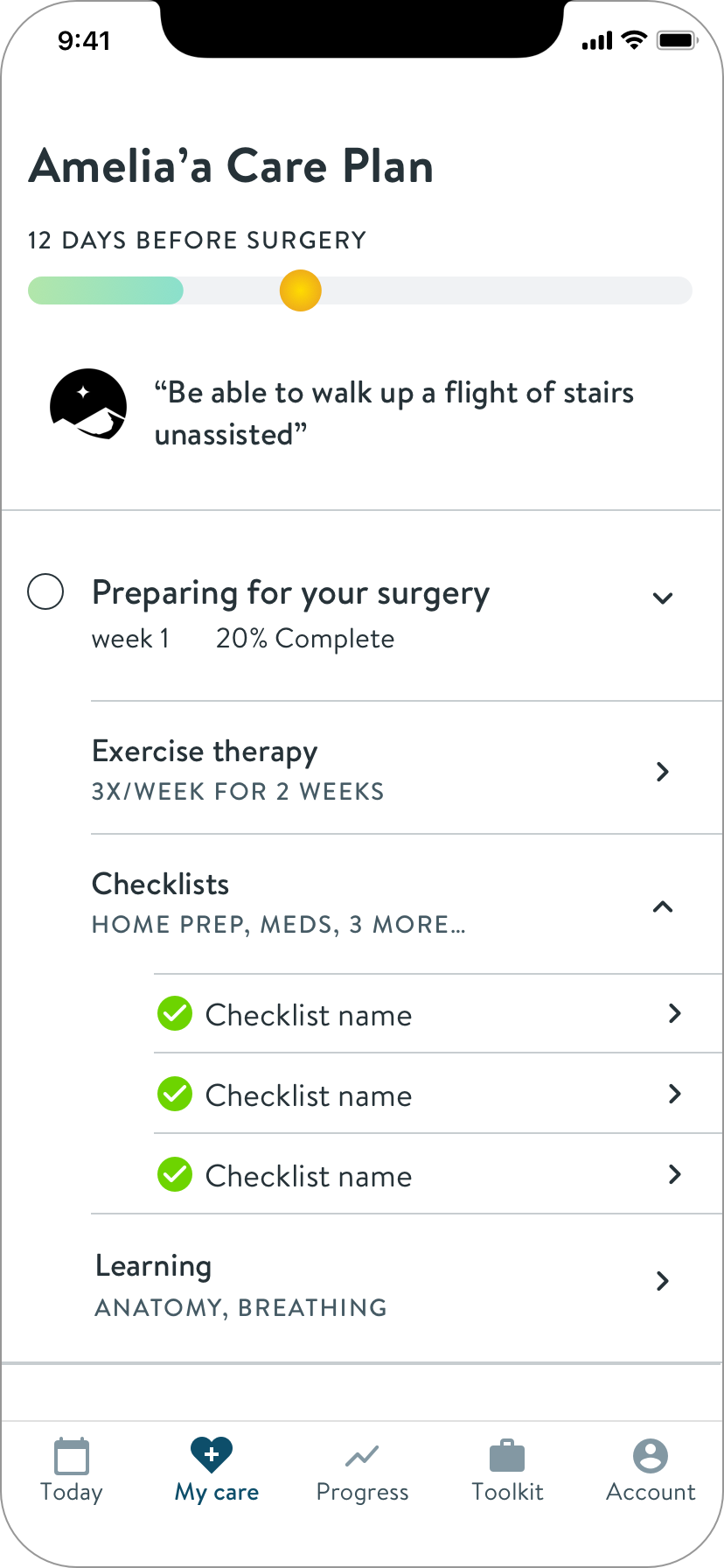
But without engineers, I had to simplify further to manage timeline risk. I needed to bring delight and value without features requiring state memory.
I pivoted to design for simple delight
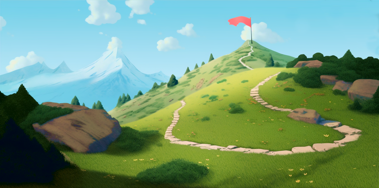
Hinge Health’s branding uses illustrations of nature landscapes. I loved the metaphor of hiking a mountain to describe the surgery journey.
To add delight, I came up with a mural style horizontal navigation that would also serve as the image for each journey section.
The creative director and our illustrator liked the idea, and committed to making the imagery.
Wireframe of the “mural nav” concept across our mobile breakpoints
After our engineers joined, they expressed concerns about the complexity of a nav containing images. Given the time remaining, and word that the illustration was behind schedule, I simplified to individual images to further reduce risk.
Visual design
To create visual design consistent with the rest of the Hinge Health app, I reached out to a lead designer to learn the tribal standards and best UIs to reference. I shared iterations in design critiques to help me accelerate and decide.
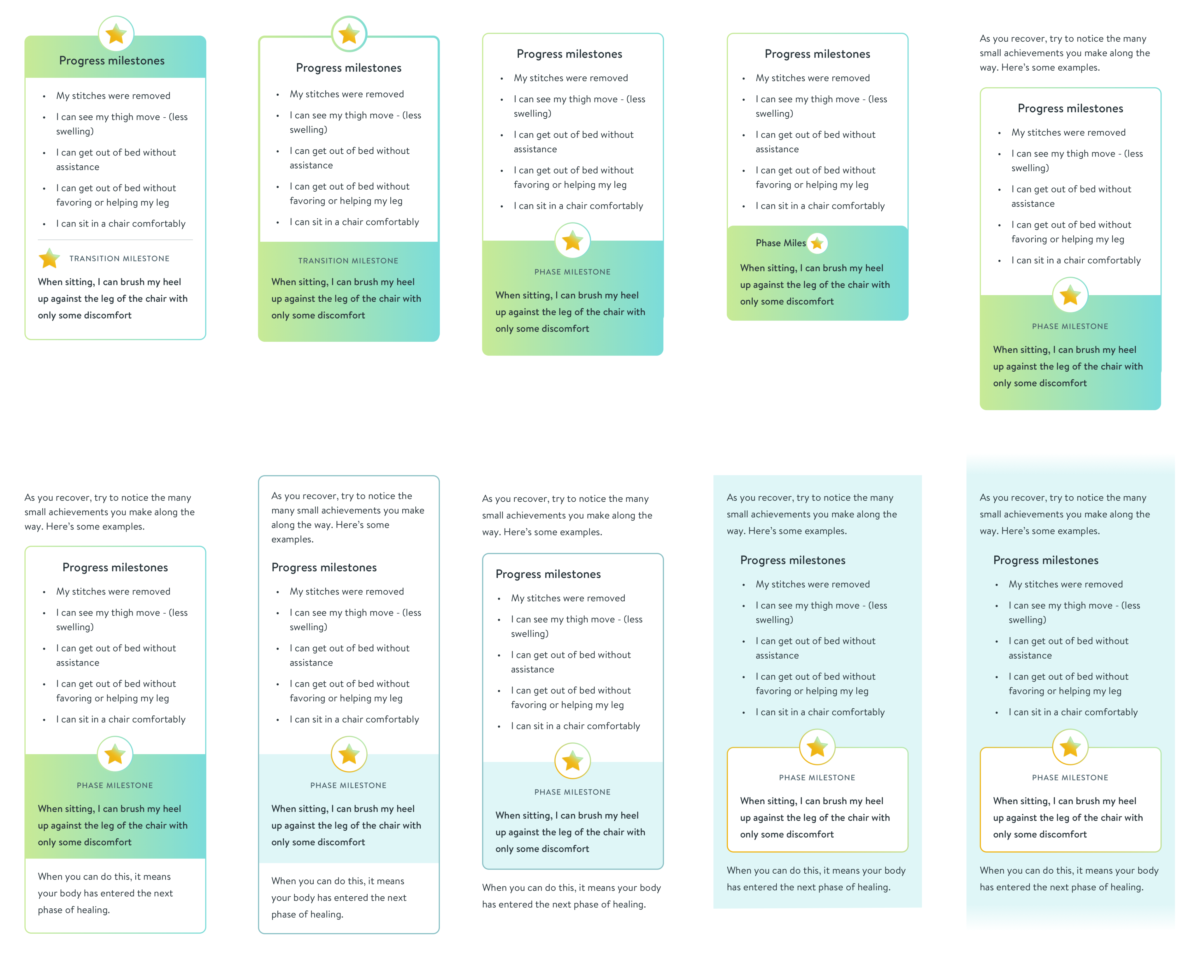
Iterations on the progress milestone card
Guide iterations, playing with visual elements
I made a separate animation prototype for the “sticky scrolling nav”
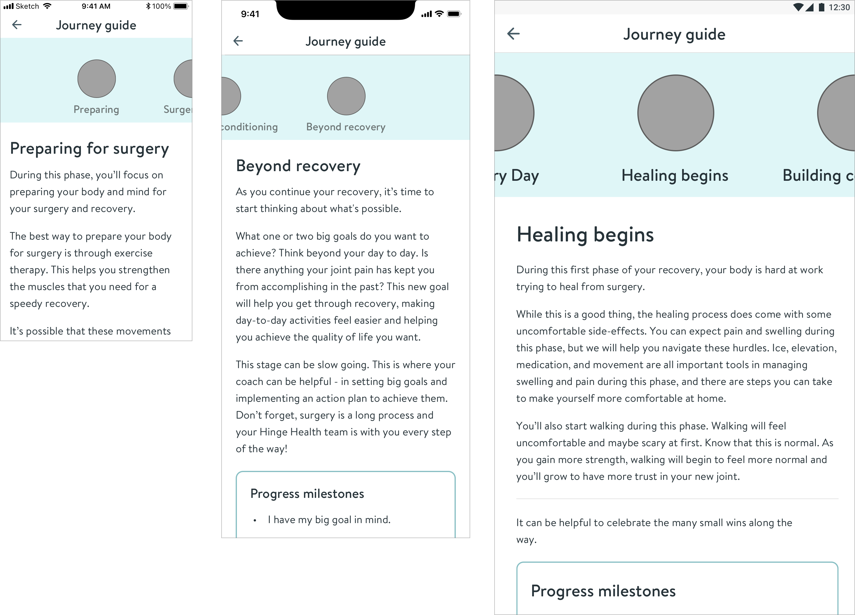
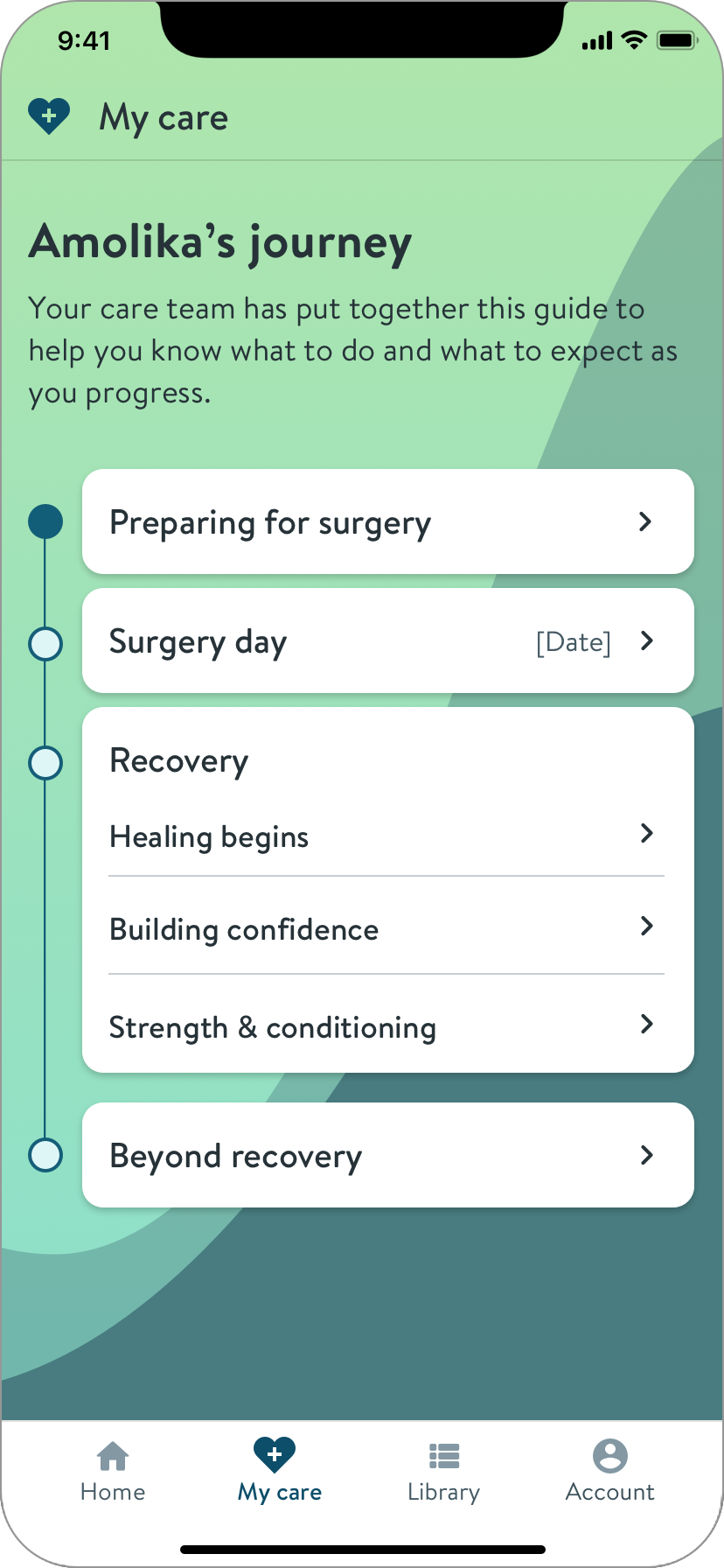
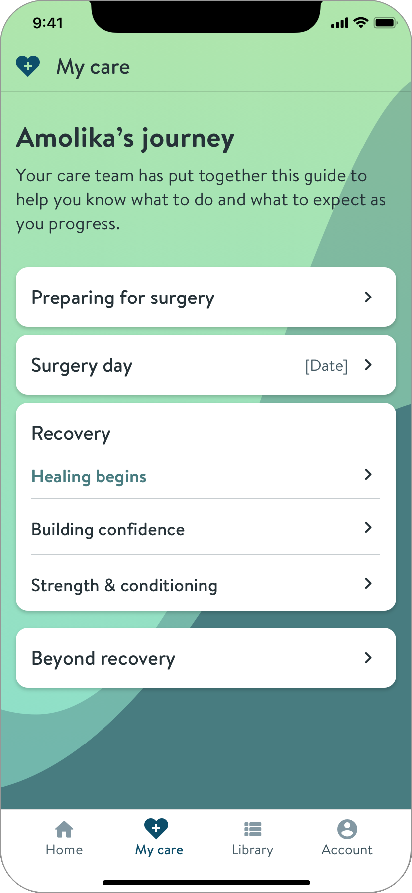
This pattern makes it clear what phase you’re reading, and allows easy movement between phases.
To communicate the idea, I made an animation using Keynote, because the interactions are beyond Sketch’s capabilities.
I also shared an examples of the pattern in the wild. This gave the engineers a clear understanding.
The illustrations were delayed.
I presented alternates, and we decided as a team.
Images
Background color
Plain
Plain, no nav
We agreed to plan for “Images,” with “Plain” as a temporary solution if necessary.
I provided final screens and responsive component specs to our engineers.
Home screen breakpoints and example variant
Example specs, component states for the guide index screen
Solution
The Hinge Health app for surgery program members
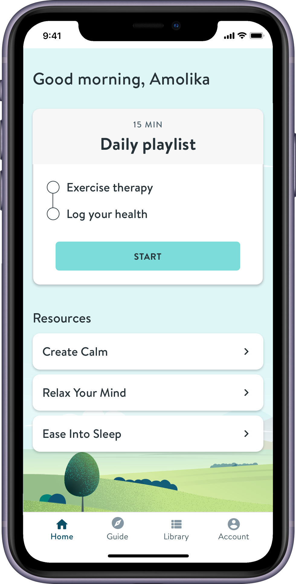
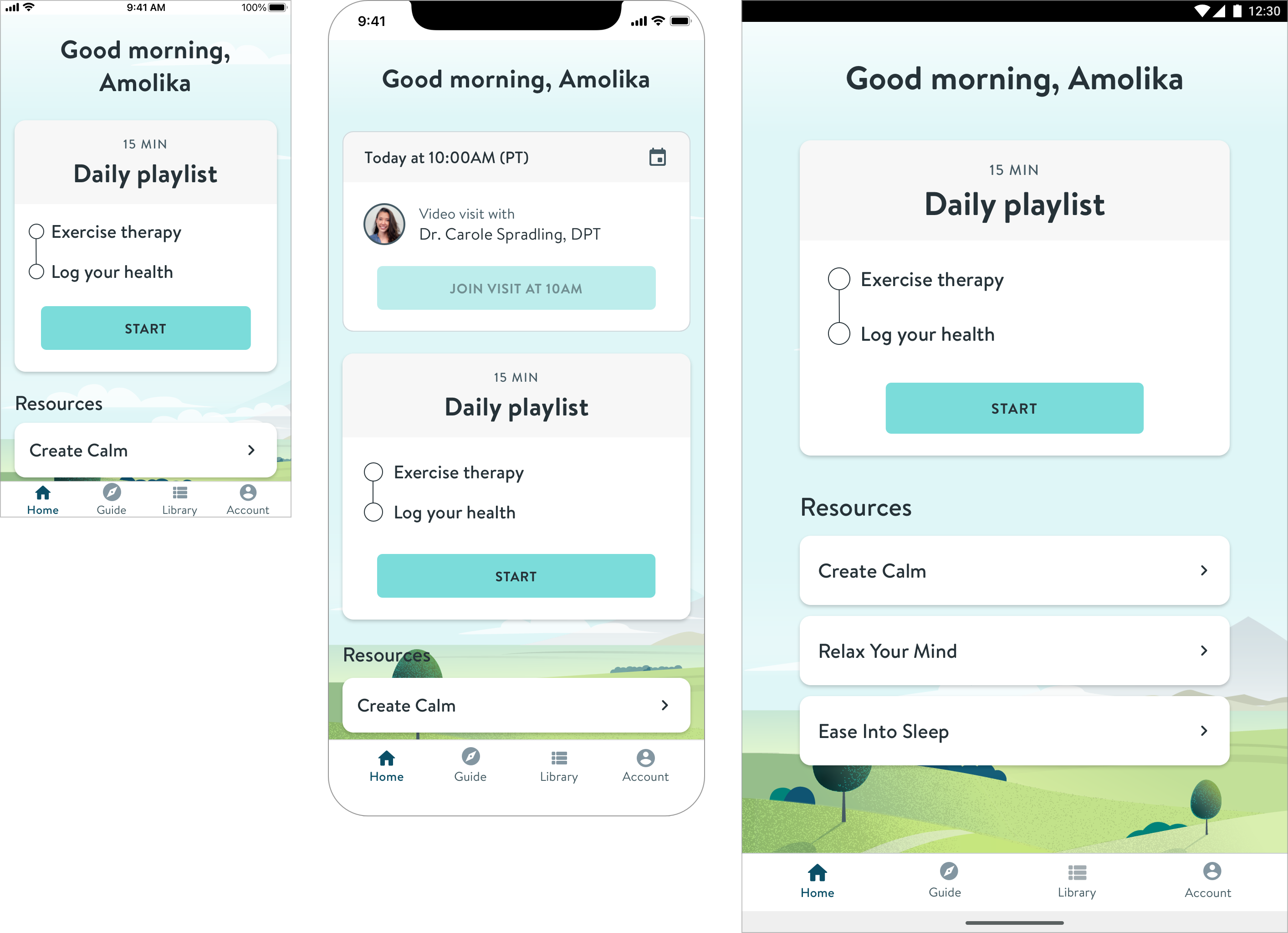
Relevant Resources
Quick access to guided mediations focusing on the most difficult aspects of recovery
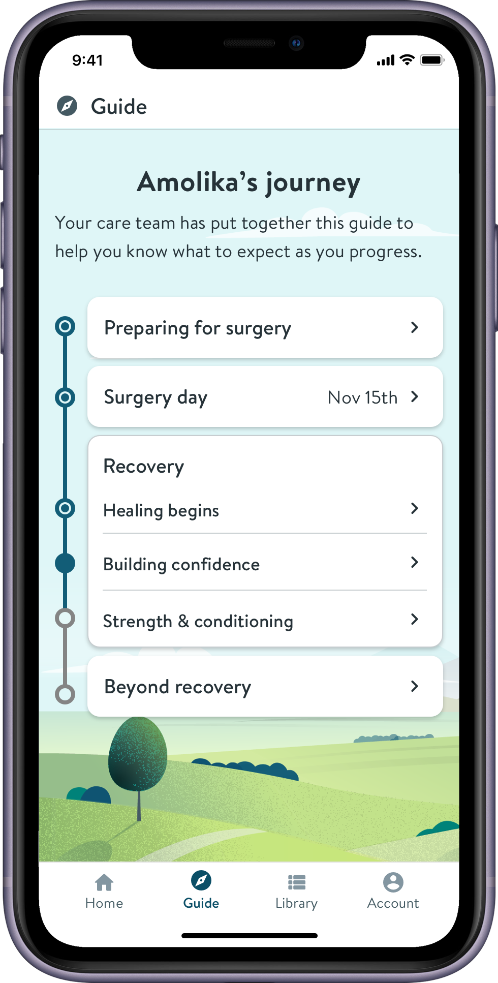
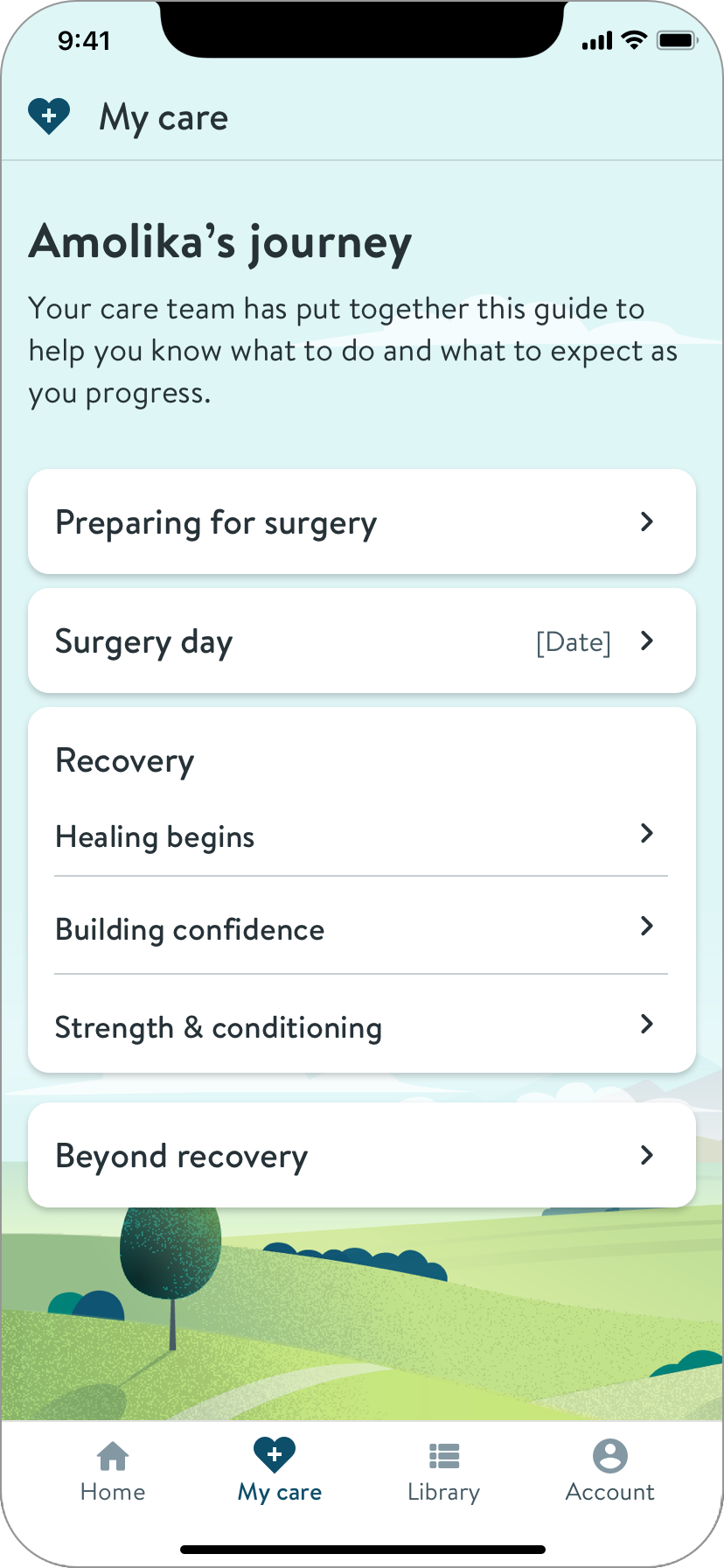
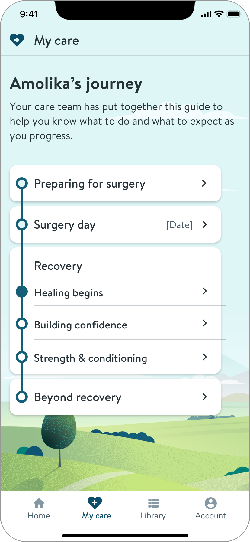
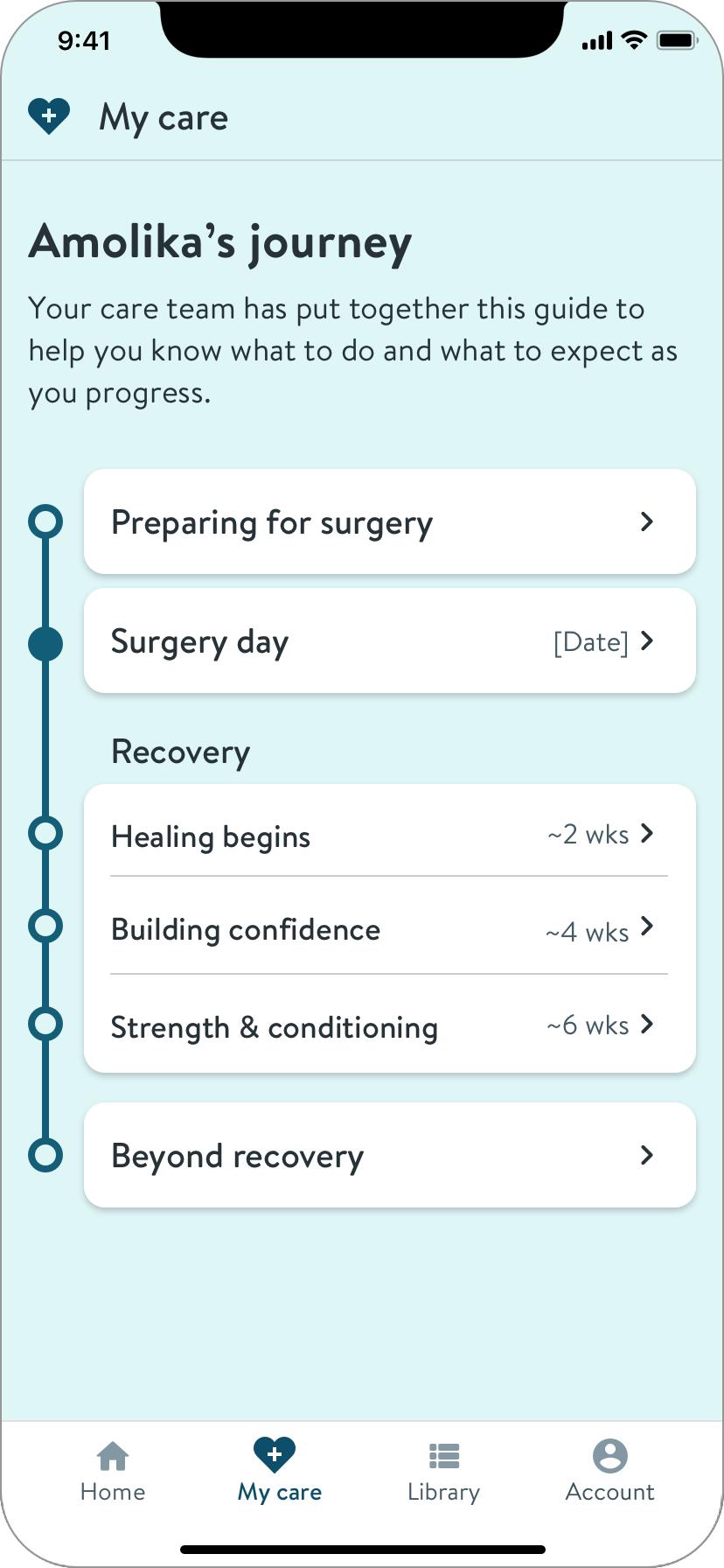
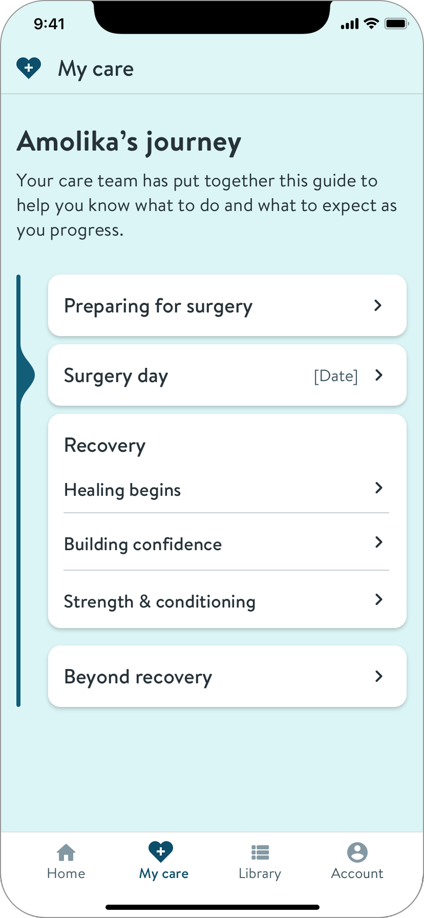
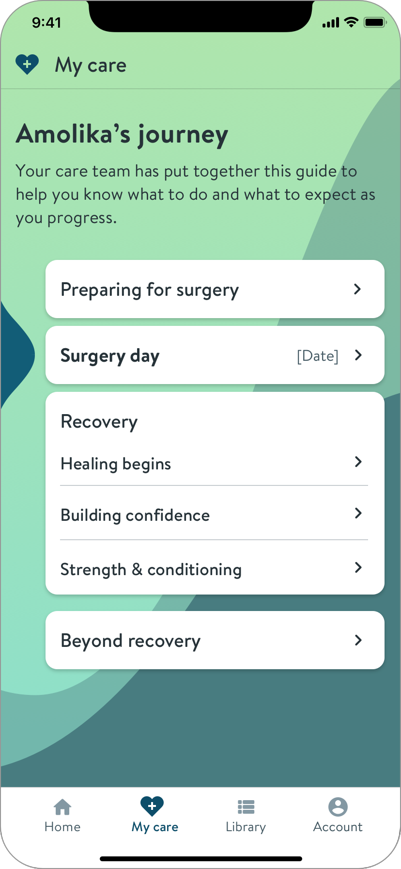
Journey Index
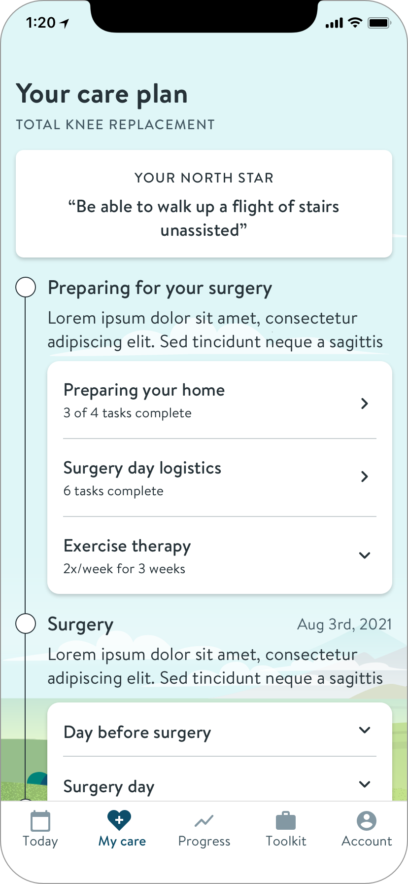
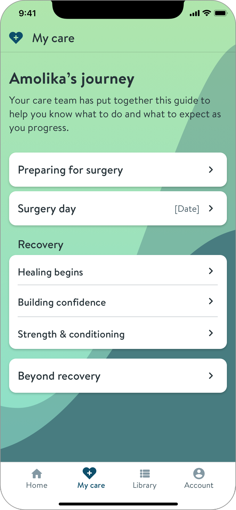
Clearly lays out the journey and your progress
Journey overview
Scrollable to encourage reading ahead, each phase contains links to relevant articles.
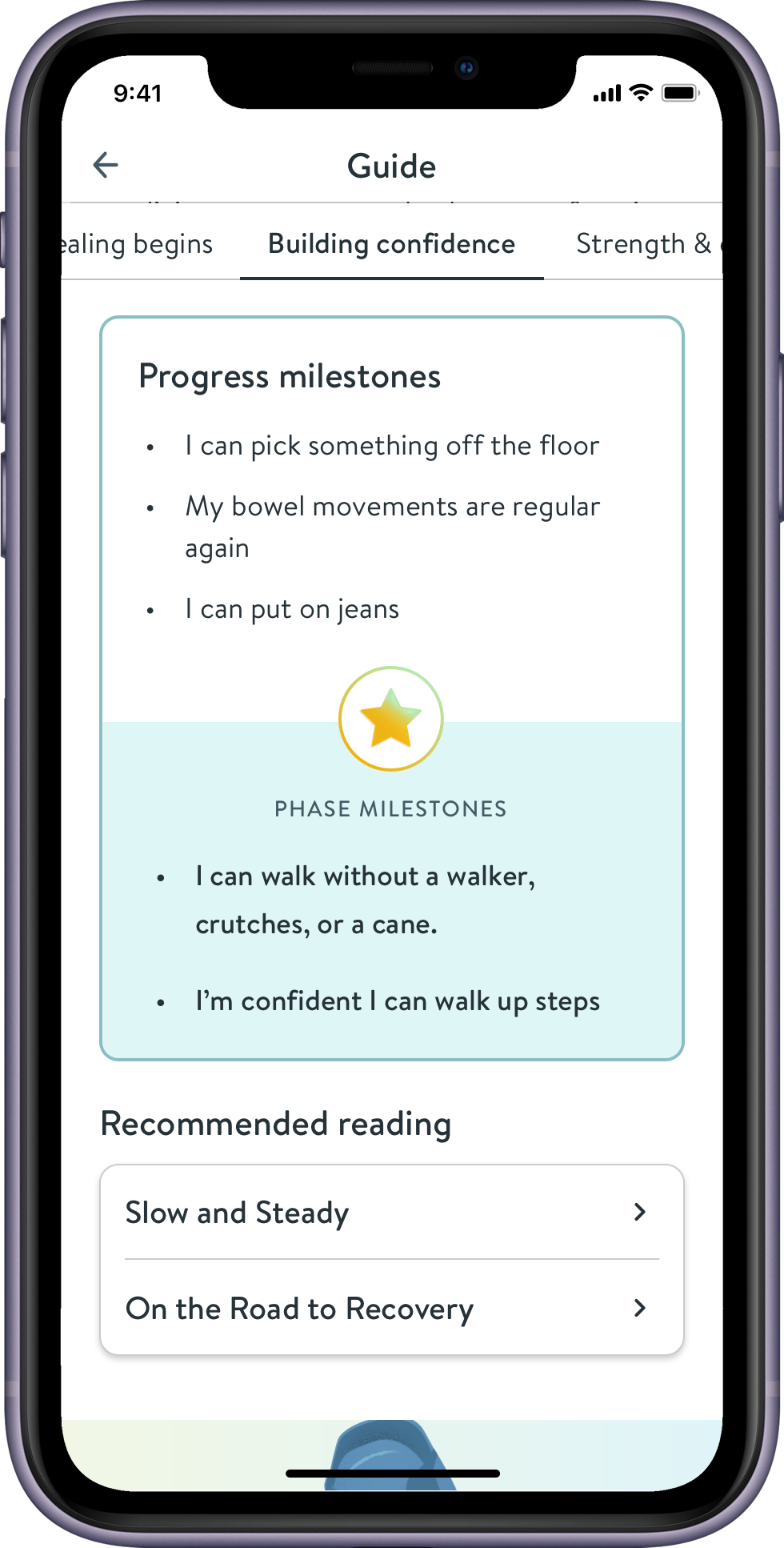
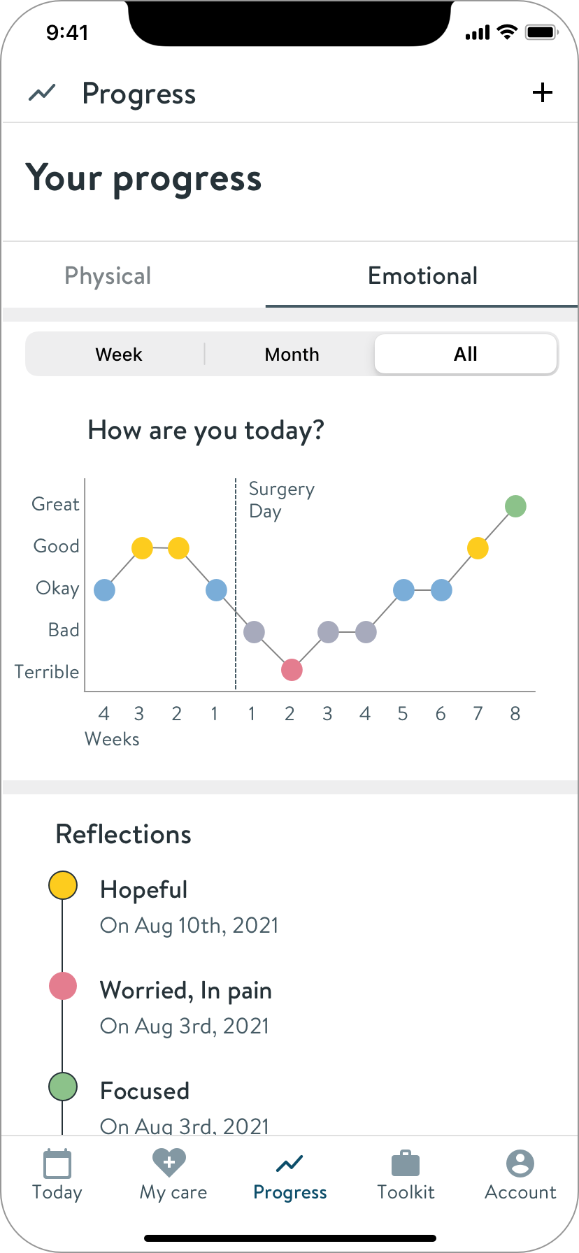
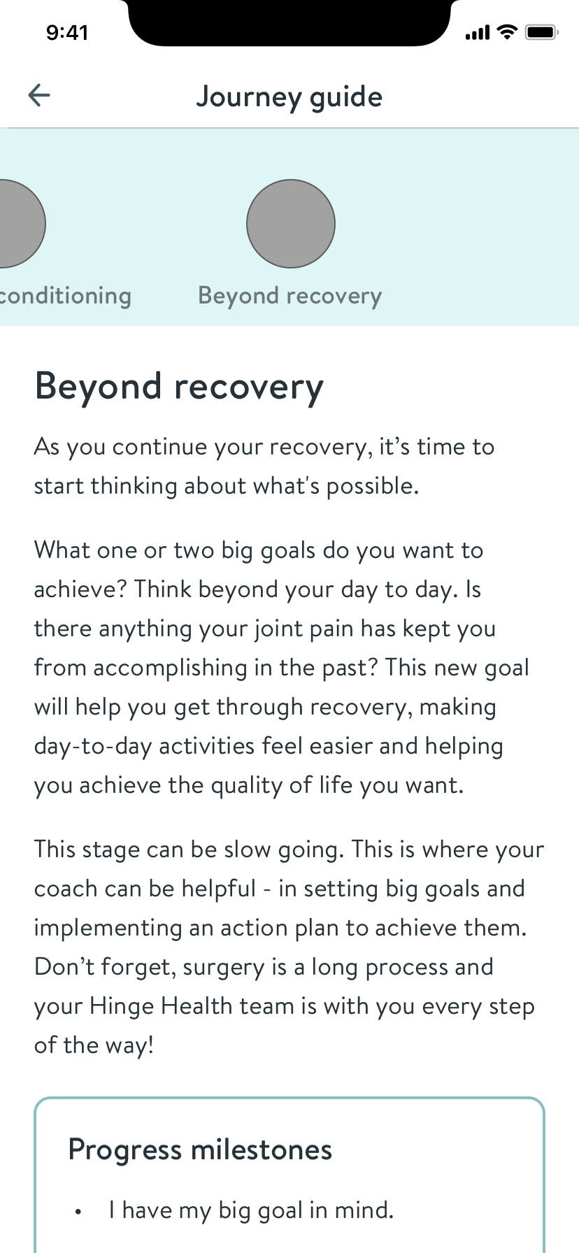
Milestones
What’s normal? Clear markers in each phase help patients understand where they are in recovery.
Recording of the live app in use

Results
92
Net Promoter Score
41
Patients served
0 ➔ 1
Delivered in 4 months
Goals Achieved


Provide patients with relevant content and tools for success on their journey
Show positive customer sentiment
Launch in time to meet sales commitments
Achievements
As senior designer on this initiative, I
- Researched the patient journey and clinician rehab protocols
- Uncovered high value unmet needs and addressed them with a content experience
- Explored solutions broadly before choosing a direction
- Was resourceful and pragmatic in response to engineering resource challenges
- Partnered with creatives to add non-technical delight
- Onboarded engineers and led MVP UI scoping sessions

case study
Guiding patients on their surgical journey
How I designed an app to support patients on their joint replacement surgery journey. Superior outcomes require accurate expectations.
Role
Sr. Product Designer
Employer
Hinge Health
Timeline
4 mos
Core Team
Me, PM, 3 Devs
The journey guide
Context
Hinge Health’s remote physical therapy service helps people reduce pain and improve mobility.
Employers offer the service as an employee benefit. Users receive a customized exercise program delivered by the Hinge Health app and measured with wearable sensors. Each user is assigned both a health coach and a physical therapist, who consult, monitor, and communicate with the customer through the app.
My Role
I was the sole product designer, joining mid-project to take over for another designer.
I worked closely with the product manager, and we were supported by a program manager, a health coach, and a physical therapist.
Weeks before development began, an engineering lead and two developers were added to the team.
Responsible for
Journey Mapping
Concepts
UX & UI Design
Prototyping
Visual Design
Design Specs
contributed to
UX Research
Strategy
Scoping
Opportunity
Design the app experience for the new joint surgery program
To be competitive in the employee benefits market, Hinge Health needed to expand it’s continuum of care to include support for patients who’ve chosen to have joint replacement surgery.
User Goals
- Prepare for surgery
- Successful procedure
- Recover with minimal pain and maximal outcomes
Business Goals
- Show positive customer sentiment
- Launch in time to meet commitments
- Future: show superior outcomes
Process
I quickly caught up with a project in-flight
met with the previous designer and PM to absorb the research learnings thus far, including their recent patient and surgeon interviews.
To fill gaps, I interviewed additional experts
I interviewed several coaches and physical therapists (PTs) who've helped patients go through joint replacement surgeries, to understand the patient mindset and journey.
Insights
Patients need & clinicians struggle to provide:
Proper expectation setting
Pain management support
Emotion management support
Pre-op exercise plans
Outside research confirms that having accurate expectations about preparation, recovery, and results are strong indicators of successful clinical outcomes.
I mapped out a typical exercise therapy program and healing journey.
This exercise allowed us to align existing content to the journey, and plan for new content to fill gaps. It also enabled me to define healing milestones.
Patient actions and exercises in the weeks before and after surgery
I found best practices & competitors
- In the UK, patients attend “joint school” classes to prepare.
- Some hospitals provide a thorough book, but it’s hard to parse.
- Rehab apps display tasks and performance data.
There is an opportunity to improve the accuracy of patient expectations through more timely and accessible education.
Thoughts, themes, context
To understand the problem space, the PM and I synthesized research, which informed concept generation.
Patient questions and sources of answers
The territory surrounding a surgery patient
Clustering themes gave structure to the creation of requirements and concepts
Concepts beyond curated content
Certainly we would leverage existing knowledge base articles to serve surgery-related educational content. This was the most feasible and efficient solution to the primary issue of expectation setting.
But first, we wanted to diverge and explore other ways to serve the user and care team. I came up with concepts to address the various patient wants and needs, and shared them back to our physical therapists and coaches.
Emotional check-ins
Adding emotional check ins to daily exercise therapy would help coaches better know when and how to check in with emotional support.
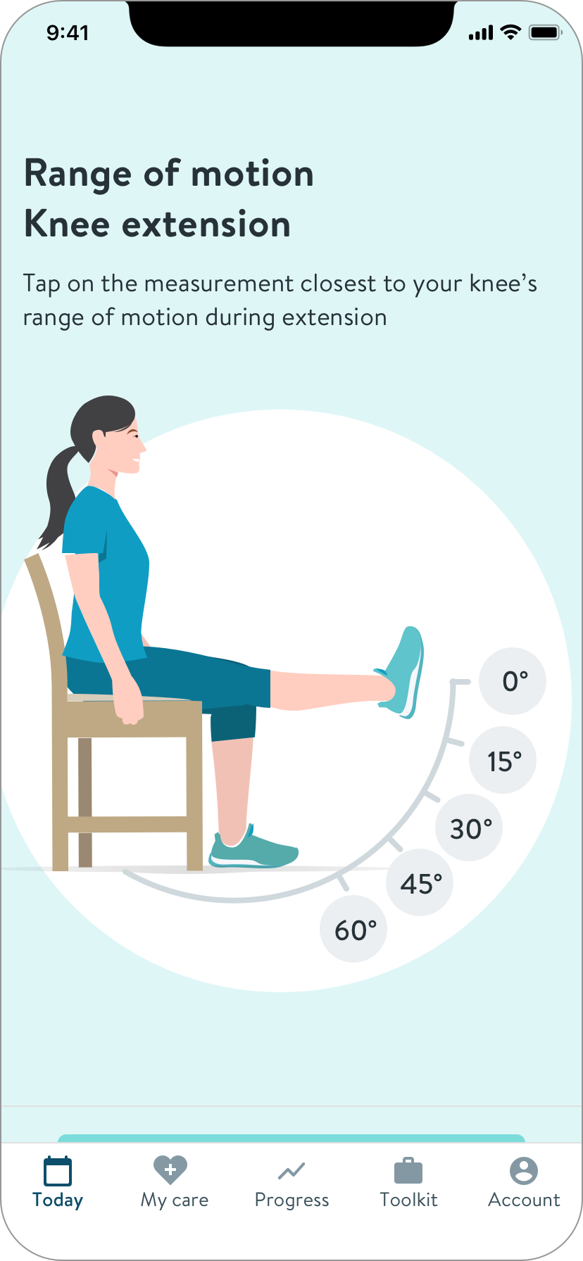
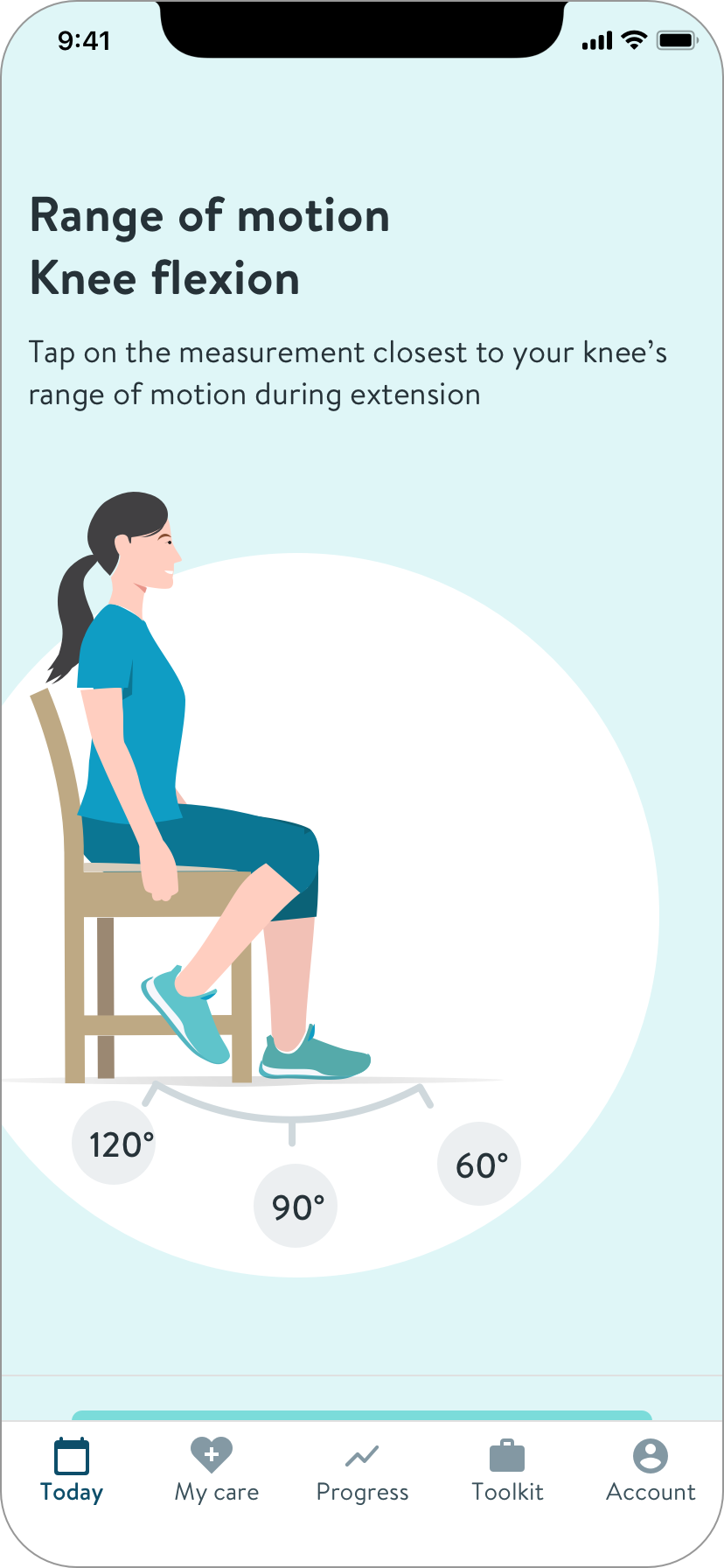
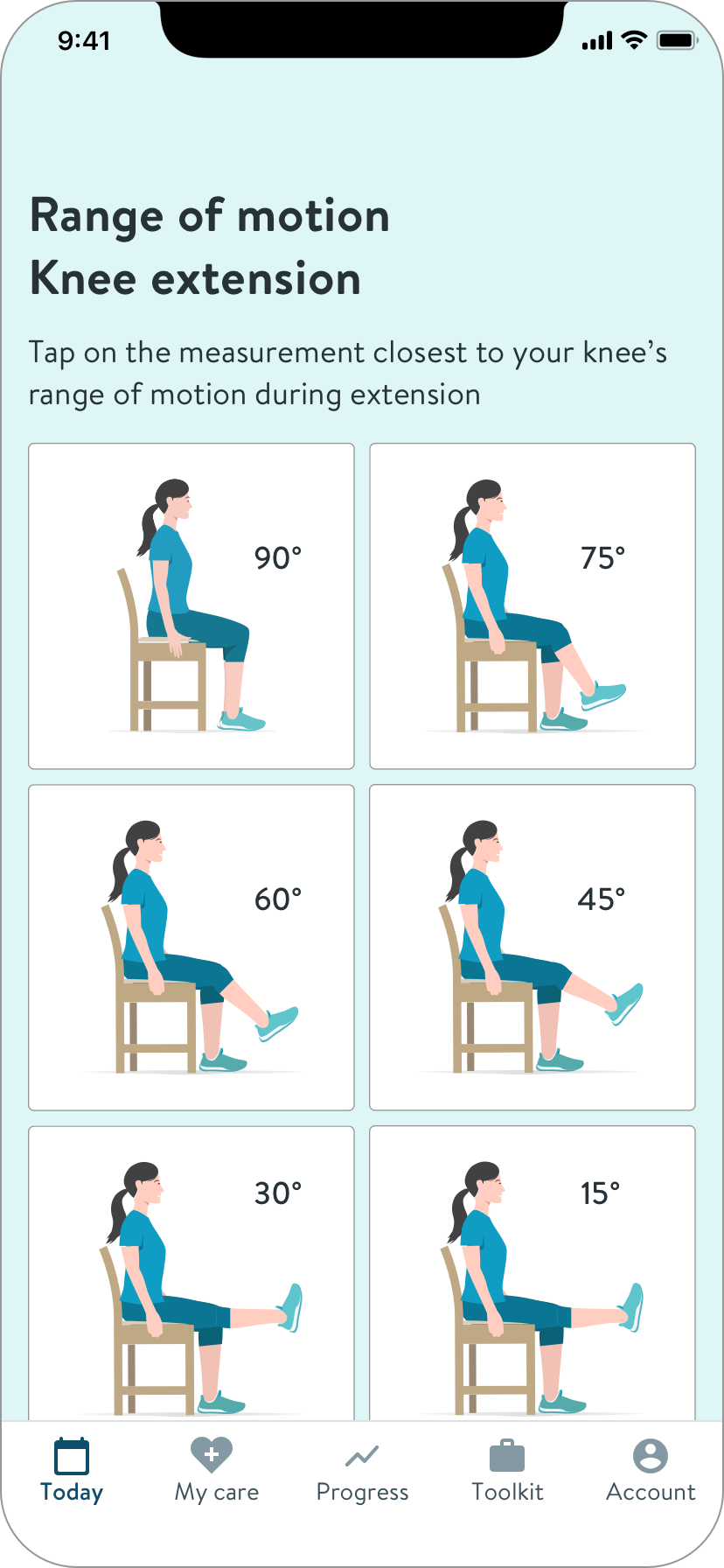
How to measure ROM with a swollen knee?
Upon learning from PTs that our wearable sensors are difficult to use on swollen knees, I came up with ideas for patients to self-report range of motion (ROM). A key learning is that high accuracy isn’t necessary at this stage of healing.
Iterations of a self-reporting knee range of motion module.
Micro content
I took the common themes of the journey and thought about how they could be a set of cards or an expert FAQ.
How am I doing? What’s normal?
Patients’ primary concern is how they’re doing. This concept quantifies and contextualizes their progress and pain, within a range backed by data.
I learned that while joint surgery is a well-worn path, everyone’s progress and experience is unique, especially regarding pain, because it is measured subjectively. Normal ranges are not feasible to identify. This feedback led to the design of milestone cards containing more general descriptions.
While mapping your progress is possible and helpful, comparisons to others is not
Make to learn
Many ideas were worth pursuing in future releases. More importantly, sharing these artifacts helped me quickly learn what’s important, revealed constraints, and informed the final MVP design.
Scoping to address resource challenges
The PM, PgM and I discussed what we could achieve given the circumstances, and decided to focus on a static content solution for initial MVP.
Though a tad threadbare, this direction would address the primary user need.
Factors
No engineers, arrival date unknown
25% of one writer's time to create journey overview content
Hard deadline
The Journey Guide
Architecture to encourage exploration
IA of the journey guide section of the surgery program app
I designed a guide containing short phase overviews in a single page. This would encourage users to naturally read beyond the current phase. Each phase overview also contains links to relevant articles.
Later on, I validated the structure and navigation internally with a Sketch prototype.
To help patients track their preparation, I explored ideas including statuses and to-dos.
But without engineers, I had to simplify further to manage timeline risk. I needed to bring delight and value without features requiring state memory.
I pivoted to design for simple delight
Hinge Health’s branding uses illustrations of nature landscapes. I loved the metaphor of hiking a mountain to describe the surgery journey.
To add delight, I came up with a mural style horizontal navigation that would also serve as the image for each journey section.
The creative director and our illustrator liked the idea, and committed to making the imagery.
Wireframe of the “mural nav” concept across our mobile breakpoints
After our engineers joined, they expressed concerns about the complexity of a nav containing images. Given the time remaining, and word that the illustration was behind schedule, I simplified to individual images to further reduce risk.
Visual design
To create visual design consistent with the rest of the Hinge Health app, I reached out to a lead designer to learn the tribal standards and best UIs to reference. I shared iterations in design critiques to help me accelerate and decide.
Iterations on the progress milestone card
Guide iterations, playing with visual elements
I made a separate animation prototype for the “sticky scrolling nav”
This pattern makes it clear what phase you’re reading, and allows easy movement between phases.
To communicate the idea, I made an animation using Keynote, because the interactions are beyond Sketch’s capabilities.
I also shared an examples of the pattern in the wild. This gave the engineers a clear understanding.
The illustrations were delayed.
I presented alternates, and we decided as a team.
Images
Background color
Plain
Plain, no nav
We agreed to plan for “Images,” with “Plain” as a temporary solution if necessary.
I provided final screens and responsive component specs to our engineers.
Home screen breakpoints and example variant
Example specs, component states for the guide index screen
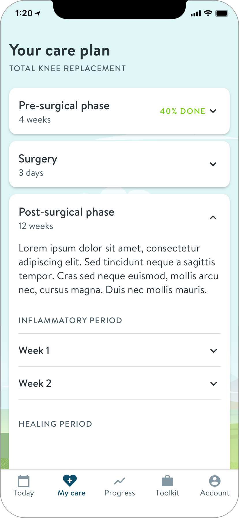
Solution
The Hinge Health app for surgery program members
Relevant Resources
Quick access to guided mediations focusing on the most difficult aspects of recovery
Journey Index
Clearly lays out the journey and your progress
Journey overview
Scrollable to encourage reading ahead, each phase contains links to relevant articles.
Milestones
What’s normal? Clear markers in each phase help patients understand where they are in recovery.
Recording of the live app in use

Results
92
Net Promoter Score
41
Patients served
0 ➔ 1
Delivered in 4 months
Goals Achieved
Provide patients with relevant content and tools for success on their journey
Show positive customer sentiment
Launch in time to meet sales commitments
Achievements
As senior designer on this initiative, I
- Researched the patient journey and clinician rehab protocols
- Uncovered high value unmet needs and addressed them with a content experience
- Explored solutions broadly before choosing a direction
- Was resourceful and pragmatic in response to engineering resource challenges
- Partnered with creatives to add non-technical delight
- Onboarded engineers and led MVP UI scoping sessions

case study
Guiding patients on their surgical journey
How I designed an app to support patients on their joint replacement surgery journey. Superior outcomes require accurate expectations.
Role
Sr. Product Designer
Employer
Hinge Health
Timeline
4 mos
Core Team
Me, PM, 3 Devs
92
NPS
41
patients served
0 ➔ 1
in 4 months
The journey guide
Context
Hinge Health’s remote physical therapy service helps people reduce pain and improve mobility.
Employers offer the service as an employee benefit. Users receive a customized exercise program delivered by the Hinge Health app and measured with wearable sensors. Each user is assigned both a health coach and a physical therapist, who consult, monitor, and communicate with the customer through the app.
My Role
I was the sole product designer, joining mid-project to take over for another designer.
I worked closely with the product manager, and we were supported by a program manager, a health coach, and a physical therapist.
Weeks before development began, an engineering lead and two developers were added to the team.
Responsible for
Journey Mapping
Concepts
UX & UI Design
Prototyping
Visual Design
Design Specs
contributed to
UX Research
Strategy
Scoping
Opportunity
Design the app experience for the new joint surgery program
To be competitive in the employee benefits market, Hinge Health needed to expand it’s continuum of care to include support for patients who’ve chosen to have joint replacement surgery.
User Goals
- Prepare for surgery
- Successful procedure
- Recover with minimal pain and maximal outcomes
Business Goals
- Show positive customer sentiment
- Launch in time to meet commitments
- Future: show superior outcomes
Process
I quickly caught up with a project in-flight
met with the previous designer and PM to absorb the research learnings thus far, including their recent patient and surgeon interviews.
To fill gaps, I interviewed additional experts
I interviewed several coaches and physical therapists (PTs) who've helped patients go through joint replacement surgeries, to understand the patient mindset and journey.
Insights
Patients need & clinicians struggle to provide:
Proper expectation setting
Pain management support
Emotion management support
Pre-op exercise plans
Outside research confirms that having accurate expectations about preparation, recovery, and results are strong indicators of successful clinical outcomes.
I mapped out a typical exercise therapy program and healing journey.
This exercise allowed us to align existing content to the journey, and plan for new content to fill gaps. It also enabled me to define healing milestones.
Patient actions and exercises in the weeks before and after surgery
I found best practices & competitors
- In the UK, patients attend “joint school” classes to prepare.
- Some hospitals provide a thorough book, but it’s hard to parse.
- Rehab apps display tasks and performance data.
There is an opportunity to improve the accuracy of patient expectations through more timely and accessible education.
Thoughts, themes, context
To understand the problem space, the PM and I synthesized research, which informed concept generation.
Patient questions and sources of answers
The territory surrounding a surgery patient
Clustering themes gave structure to the creation of requirements and concepts
Concepts beyond curated content
Certainly we would leverage existing knowledge base articles to serve surgery-related educational content. This was the most feasible and efficient solution to the primary issue of expectation setting.
But first, we wanted to diverge and explore other ways to serve the user and care team. I came up with concepts to address the various patient wants and needs, and shared them back to our physical therapists and coaches.
Emotional check-ins
Adding emotional check ins to daily exercise therapy would help coaches better know when and how to check in with emotional support.
How to measure ROM with a swollen knee?
Upon learning from PTs that our wearable sensors are difficult to use on swollen knees, I came up with ideas for patients to self-report range of motion (ROM). A key learning is that high accuracy isn’t necessary at this stage of healing.
Iterations of a self-reporting knee range of motion module.
Micro content
I took the common themes of the journey and thought about how they could be a set of cards or an expert FAQ.
How am I doing? What’s normal?
Patients’ primary concern is how they’re doing. This concept quantifies and contextualizes their progress and pain, within a range backed by data.
I learned that while joint surgery is a well-worn path, everyone’s progress and experience is unique, especially regarding pain, because it is measured subjectively. Normal ranges are not feasible to identify. This feedback led to the design of milestone cards containing more general descriptions.
While mapping your progress is possible and helpful, comparisons to others is not
Make to learn
Many ideas were worth pursuing in future releases. More importantly, sharing these artifacts helped me quickly learn what’s important, revealed constraints, and informed the final MVP design.
Scoping to address resource challenges
The PM, PgM and I discussed what we could achieve given the circumstances, and decided to focus on a static content solution for initial MVP.
Though a tad threadbare, this direction would address the primary user need.
Factors
No engineers, arrival date unknown
25% of one writer's time to create journey overview content
Hard deadline
The Journey Guide
Architecture to encourage exploration
IA of the journey guide section of the surgery program app
I designed a guide containing short phase overviews in a single page. This would encourage users to naturally read beyond the current phase. Each phase overview also contains links to relevant articles.
Later on, I validated the structure and navigation internally with a Sketch prototype.
To help patients track their preparation, I explored ideas including statuses and to-dos.
But without engineers, I had to simplify further to manage timeline risk. I needed to bring delight and value without features requiring state memory.
I pivoted to design for simple delight
Hinge Health’s branding uses illustrations of nature landscapes. I loved the metaphor of hiking a mountain to describe the surgery journey.
To add delight, I came up with a mural style horizontal navigation that would also serve as the image for each journey section.
The creative director and our illustrator liked the idea, and committed to making the imagery.
Wireframe of the “mural nav” concept across our mobile breakpoints
After our engineers joined, they expressed concerns about the complexity of a nav containing images. Given the time remaining, and word that the illustration was behind schedule, I simplified to individual images to further reduce risk.
Visual design
To create visual design consistent with the rest of the Hinge Health app, I reached out to a lead designer to learn the tribal standards and best UIs to reference. I shared iterations in design critiques to help me accelerate and decide.
Iterations on the progress milestone card
Guide iterations, playing with visual elements
I made a separate animation prototype for the “sticky scrolling nav”
This pattern makes it clear what phase you’re reading, and allows easy movement between phases.
To communicate the idea, I made an animation using Keynote, because the interactions are beyond Sketch’s capabilities.
I also shared an examples of the pattern in the wild. This gave the engineers a clear understanding.
The illustrations were delayed.
I presented alternates, and we decided as a team.
Images
Background color
Plain
Plain, no nav
We agreed to plan for “Images,” with “Plain” as a temporary solution if necessary.
I provided final screens and responsive component specs to our engineers.
Home screen breakpoints and example variant
Example specs, component states for the guide index screen
Solution
The Hinge Health app for surgery program members
Relevant Resources
Quick access to guided mediations focusing on the most difficult aspects of recovery
Journey Index
Clearly lays out the journey and your progress
Journey overview
Scrollable to encourage reading ahead, each phase contains links to relevant articles.
Milestones
What’s normal? Clear markers in each phase help patients understand where they are in recovery.
Recording of the live app in use

Results
92
Net Promoter Score
41
Patients served
0 ➔ 1
Delivered in 4 months
Goals Achieved
Provide patients with relevant content and tools for success on their journey
Show positive customer sentiment
Launch in time to meet sales commitments
Achievements
As senior designer on this initiative, I
- Researched the patient journey and clinician rehab protocols
- Uncovered high value unmet needs and addressed them with a content experience
- Explored solutions broadly before choosing a direction
- Was resourceful and pragmatic in response to engineering resource challenges
- Partnered with creatives to add non-technical delight
- Onboarded engineers and led MVP UI scoping sessions